Paint color choices often keep me at night – especially when clients ask about versatile neutrals that won’t feel bland or dated.
Sherwin Williams Accessible Beige rises to this challenge, becoming a go-to choice for my design projects.
I’ll help you understand why this color stands out in today’s sea of paint options.
When you finish reading this post, you’ll know exactly what makes this shade special – from its subtle undertones to how it shifts in different lighting.
In this guide, I’ll walk you through:
- The qualities that make Accessible Beige unique
- Key things to consider before choosing this color
- Real examples of where it shines in homes
What is SW Accessible Beige?
Think of Accessible Beige as that perfect middle ground between warm and cool – it’s like finding that ideal temperature on your thermostat.
This Sherwin-Williams color sits in the greige family (a fancy way of saying it’s a beige with gray mixed in), making it more sophisticated than your typical beige.
Over the past few years, I’ve watched this color gain serious traction in home design. What makes it special?
It doesn’t shout, “look at me!” Instead, it creates this subtle, refined backdrop that makes everything else in your room shine.
Why Choose Accessible Beige?
Let me tell you why I keep coming back to this color for my projects:
First off, it’s a lighting champion. Whether you’re working with bright natural sunlight or cozy lamp light, this color keeps it cool (well, actually, its warmth!).
It won’t go pink on you at sunset or look dull on cloudy days.
I love how it plays nicely with everything – your oak cabinets, marble countertops, or brass light fixtures.
It’s like that friend who gets along with everyone at the party.
Undertones and LRV
Let’s talk numbers and undertones – but I promise to keep this simple! Accessible Beige has an LRV of 58 (Light Reflective Value if we’re being fancy).
In everyday terms? It sits right in that sweet spot where it’s light enough to keep rooms feeling open but not so light that it looks washed out.
Here’s what I find fascinating about this color: it has subtle green undertones. But don’t panic – we’re not discussing anything to make your walls look like a garden.
These undertones are a secret ingredient that keeps the color from feeling too warm or cool.
They help this color avoid that dreaded pink or yellow cast that makes some beiges feel dated.
How Accessible Beige Works in Different Lighting
Here’s my real-world experience with this color in different lighting situations:
In north-facing rooms, it takes on a slightly cooler personality. The color becomes more muted and sophisticated – perfect if you’re after that calm, collected vibe.
Put it in a south-facing room, though, and it really shows off its warm side.
The sunlight brings out its cozy qualities without making it feel heavy or overwhelming.
The most interesting part? This color shifts subtly throughout the day.
In morning light, it might appear lighter and brighter, while evening light brings out its warmer, more intimate side.
But unlike some other neutrals that can look drastically different, Accessible Beige stays true to its character.
Best Applications for Accessible Beige
Let me share where this color really shines in homes I’ve worked on:
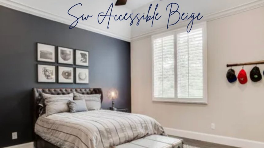
1. Living Rooms
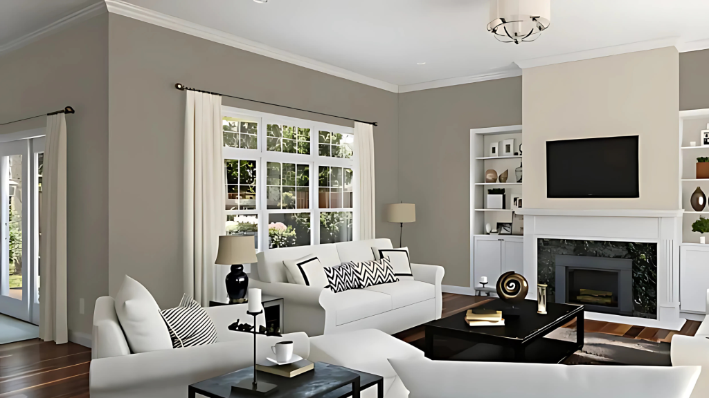
I’ve seen this color transform living rooms into the most inviting spaces. It provides this perfect backdrop that makes your furniture and art pop without competing for attention.
Plus, it helps create this flow when your living room opens to other spaces.
2. Kitchens
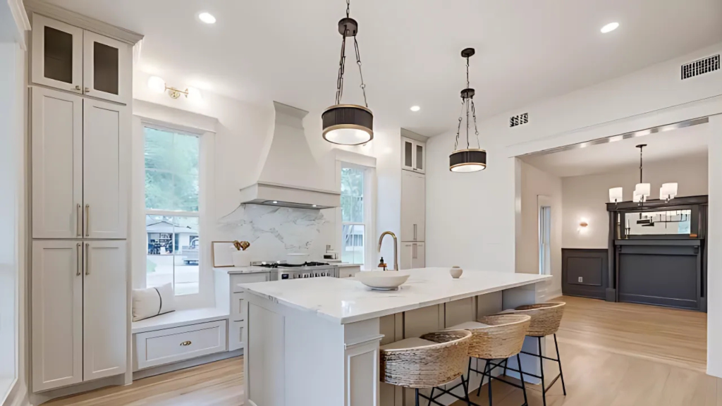
It is one of my favorite spots for Accessible Beige!
It pairs beautifully with both white cabinets and stainless steel appliances. What do I love most? It adds warmth without making your kitchen feel like it’s stuck in the early 2000s beige era.
3. Bathrooms
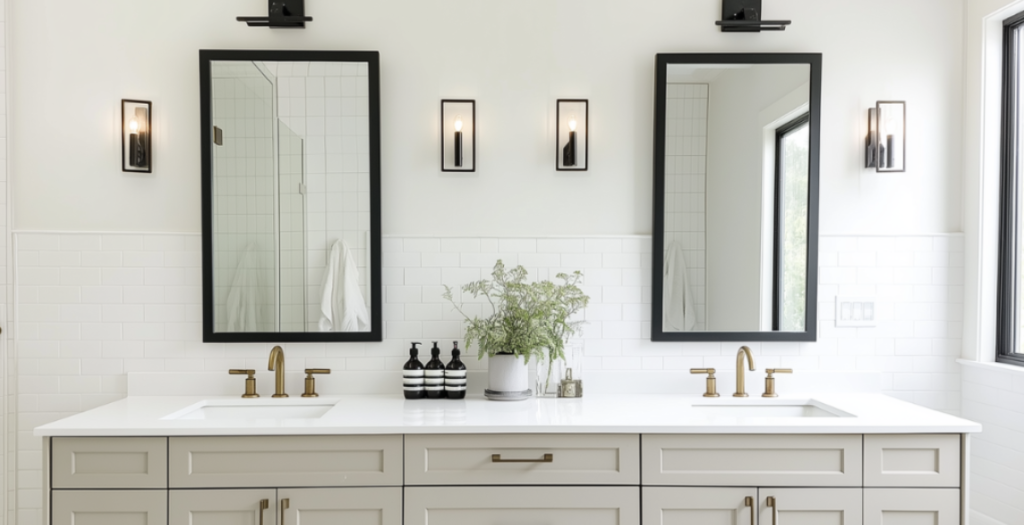
In bathrooms, this color takes on an almost spa-like quality. It works wonders with marble, chrome, or brass fixtures, making those white tiles look intentional rather than stark.
4. Exterior Use
On home exteriors, this color shows a whole different side of its personality:
As a main house color, it reads more like a soft cream in natural light – not too beige or gray. That perfect neutral won’t make your neighbors raise their eyebrows but still stands out enough to look fresh.
It offers this subtle contrast for trim work that can elevate darker exterior colors.
I’ve seen it work magic alongside stone facades and brick, tying everything together without looking too matched.
Complementary Colors and Pairings
Let’s talk about playing matchmaker with Accessible Beige! After trying countless combinations, here’s what I’ve found works best:
SW Extra White is my go-to partner for trim and ceilings. It creates a crisp, clean look without feeling stark.
Pure White and High Reflective White are also solid choices, especially if you want a softer transition.
Looking to add some personality? I love pairing this color with Evergreen Fog – they’re like best friends who bring out the best in each other.
Muted blues and deeper earth tones also play nicely, adding depth without overwhelming the space.
Comparison with Other Popular Neutrals
Let me break down how Accessible Beige stacks up against its popular cousins:
Agreeable Gray feels like the cool sibling – it leans more toward the gray side.
While Accessible Beige brings that cozy warmth to your space, Agreeable Gray keeps things slightly more reserved.
Natural Tan? Think of it as Accessible Beige’s lighter, more outgoing cousin. It’s got more color to it, while Accessible Beige keeps things more subtle and sophisticated.
Then there’s Edgecomb Gray, which is lighter and cooler in personality. Where Accessible Beige adapts to almost any situation, Edgecomb Gray stays more consistent in its cooler tones.
| Feature | SW Accessible Beige | SW Agreeable Gray | SW Natural Tan | BM Edgecomb Gray |
|---|---|---|---|---|
| Brand | Sherwin-Williams | Sherwin-Williams | Sherwin-Williams | Benjamin Moore |
| LRV (Light Reflectance Value) | 58 | 60 | 65 | 63 |
| Undertones | Warm beige with greige tones | Warm gray with beige tones | Warm tan with a subtle greige feel | Soft greige with warm undertones |
| Warm or Cool? | Warm neutral | Balanced warm/cool | Warm neutral | Warm neutral |
| Best For | Cozy, inviting spaces | Versatile, works in most rooms | Soft, earthy, minimalistic styles | Classic, timeless interiors |
| Works Well With | Creams, warm whites, natural wood tones | Cooler and warmer tones, white trim | Earthy tones, soft whites, wood accents | Whites, greiges, warm wood tones |
| Ideal Room Types | Living rooms, bedrooms, open floor plans | Living rooms, kitchens, hallways | Minimalist and modern spaces | Traditional and transitional rooms |
| Pairs Well With | Shoji White, Alabaster, Tony Taupe | Pure White, Extra White, Mega Greige | Greek Villa, Snowbound, Soft Suede | White Dove, Simply White, Revere Pewter |
Practical Tips and Recommendations
Here’s what I tell my clients about testing this color:
Don’t skip the sampling step! Paint large swatches on all walls – trust me, the same color can look totally different on opposite walls.
I’ve seen it happen too many times to count.
Want to make life easier? Try Samplize peel-and-stick samples.
They’re my secret weapon for testing colors without turning my clients’ homes into paint store.
Common Mistakes to Dodge
Let me save you from some headaches:
First up – resist the temptation to color match across brands.
I’ve learned this hard: What looks like Accessible Beige in one brand can be completely different in another.
Please avoid using super creamy whites for your trim. They’ll make Accessible Beige look muddy, and nobody wants that!
Conclusion
As we wrap up our look at SW Accessible Beige, it’s clear why this paint color continues to win over homeowners and designers alike.
Its subtle mix of warm and cool tones creates spaces that feel both current and lasting.
Like how a good neutral scarf pulls together an outfit without stealing the show, this color lets your furniture, art, and decor take center stage while quietly supporting the overall design.
Remember – paint colors are personal choices that depend on your space, light, and style.
While Accessible Beige offers remarkable flexibility, testing it in your specific environment remains key to success.
When used thoughtfully, this versatile neutral can help create fresh and timeless rooms.