Your neighbor’s living room stops you in your tracks, but your own space falls flat. What’s their secret? It’s not an expensive makeover or fancy furniture—it’s gradation rhythm.
This hidden design trick makes rooms feel balanced and flowing, even on a budget. It’s the difference between “nice stuff” and a space that truly works.
Think of gradation like music that slowly gets louder or softer. In your home, it might be furniture that shifts from tall to short across a room. Or colors that move from dark to light along a wall.
Many people struggle with rooms that feel jumbled or boring. Gradation rhythm fixes both problems by creating movement your eyes want to follow.
This guide will show you simple ways to use gradation in your own space. You’ll learn how to make your home feel more put-together without needing fancy design skills or a big budget.
What is Gradation Rhythm in Interior Design?
Have you ever watched a sunset fade from bright orange to soft pink to deep purple? That’s gradation in nature—and it works just as beautifully in your home.
Gradation rhythm is like telling a visual story that unfolds as you move through a space.
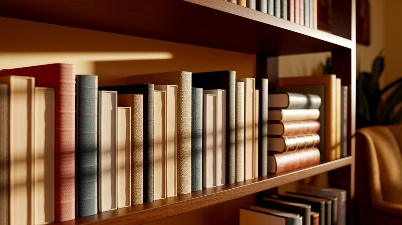
It’s when your living room rug starts with deep blue near the couch and lightens as it stretches toward the dining area. Or when your bookshelf displays objects that shift from chunky ceramics to delicate glass pieces.
Unlike boring repetition (same lamp, same lamp, same lamp), gradation creates visual excitement. And it’s much more subtle than abrupt contrast, which can feel jarring—like jumping from ice water into a hot tub!
The magic of gradation is how it pulls you through a room without you even noticing. Your brain loves these smooth transitions.
How Gradation Rhythm Creates Visual Flow
Gradation works like an invisible path for your eyes to follow. When items shift from tall to short or dark to light, your gaze naturally moves along with them.
Gradation can guide visitors from the entry toward a window view in quiet spaces. In busy rooms, it helps sort the chaos by giving the eye a clear direction to travel.
Top designers use this trick daily—dark wood at one end of a kitchen slowly changing to white cabinets at the other end makes the room feel larger and more organized.
Examples of Gradation Rhythm in Interior Design
Let’s peek into some real homes to see how gradation rhythm creates spaces that feel “just right” without breaking the bank.
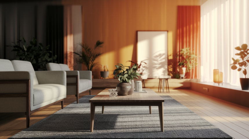
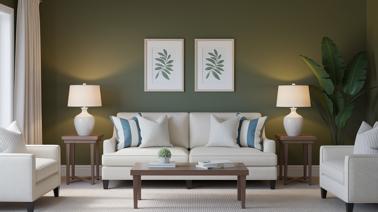
Living Rooms: The Size Shift
Many well-designed living rooms use a subtle height pattern that instantly puts visitors at ease. A tall bookcase might stand in the corner, followed by a medium-height sideboard, a low coffee table, and finally, small footstools near the window.
This height gradation creates a natural flow that guides the eye across the room.
Try it: Arrange furniture from tallest to shortest in one direction. The change doesn’t need to be dramatic—even a subtle height shift can make a room feel more organized.
Bedrooms: Color Waves for Better Sleep

Some of the most relaxing bedrooms effectively use color gradation. When wall paint, bedding, and rugs move from deeper blues near the headboard to lighter blues near the window, the space naturally promotes calm and rest.
Try it: Pick one color and use it in three shades—dark, medium, and light—as you move across your bedroom. This simple trick can make even a small bedroom feel bigger and more peaceful.
Kitchens: The Texture Ride
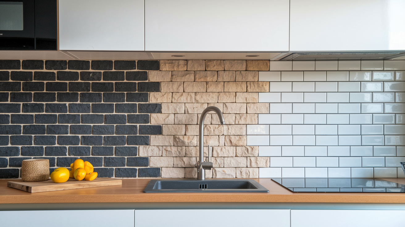
Kitchens often feel flat because everything has the same smooth, hard surfaces. A thoughtfully designed kitchen creates texture gradation instead.
A backsplash might start with rough stone tiles behind the stove, shift to medium-textured ceramic tiles along the counters, and end with smooth glass tiles near the dining area.
Try it: Mix textures in your kitchen from rough to smooth. When arranged thoughtfully, even small items like dish towels, cutting boards, and containers can create this effect.
How to Implement Gradation Rhythm in Your Interior
Ready to try gradation rhythm at home? Here are simple ways to get started:
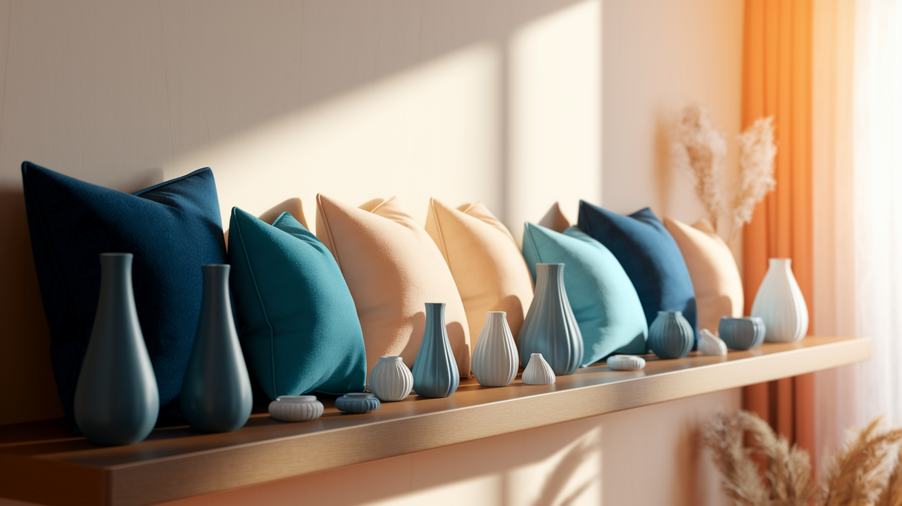
Create a Flowing Color Story
- Pick a color you love, then gather items in dark, medium, and light shades of it.
- Place the darkest shade in your main focal area, then gradually move to lighter shades outward.
- For an easy start, use just three shades of pillows across your sofa.
Play with Height and Scale
- Arrange objects from tall to short along a path in your room.
- On shelves, place books or decor in descending height order.
- Use taller plants or lamps on one side of a room, medium ones in the middle, and shorter ones at the other end.
Mix Textures Thoughtfully
- Move from rough to smooth textures across a space.
- Layer different fabric types on your bed or sofa – chunky knit, cotton, then silk.
- In dining areas, use textured placemats, smooth plates, and glossy glassware to create a texture journey.
Remember: Small, steady changes work better than big jumps. When in doubt, add a middle piece between extremes.
Other Interior Design Rhythm Techniques
While gradation creates flowing transitions, other rhythm types bring different energies to a room:
Repetition
Uses the same element multiple times to create a sense of order. Many designers place matching lamps on both ends of a sofa or identical chairs around a dining table. This technique builds a calm, stable feeling that helps tie a room together without much effort.
Try it: Pick one item you love and repeat it three times in a space. This could be the same picture frame in different spots or three matching vases along a mantel.
Progression
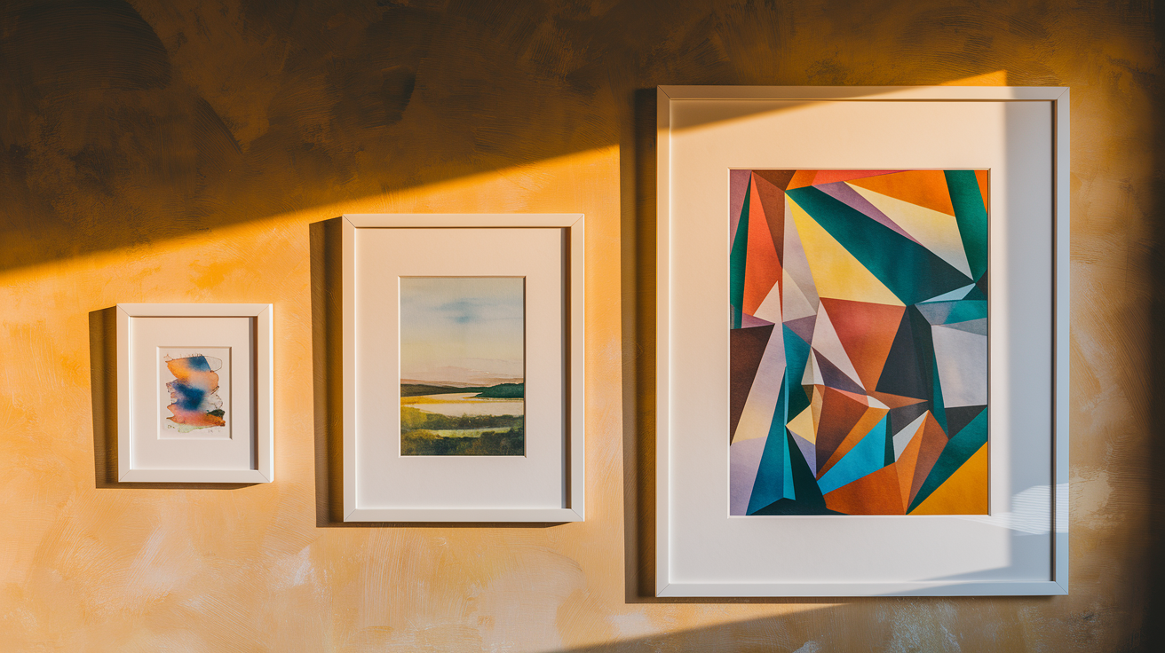
Shows clear step-by-step changes, often in size or number. You might see a wall with small, medium, and large art pieces grouped. Unlike gradation’s subtle shifts, progression makes more obvious jumps that add a sense of movement.
Try it: Hang a set of three similar pictures or mirrors in clearly different sizes on a blank wall to create a strong visual pattern.
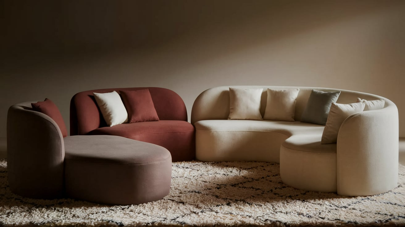
Contrast
Pairs opposite elements for visual excitement. The most striking rooms often combine light and dark colors or soft and hard materials in the same space. This technique creates energy and drama in a space that might otherwise feel too quiet.
Try it: Add a dark accent chair to a light-colored room, or place smooth glass items next to rough woven baskets on a shelf.
Radiation
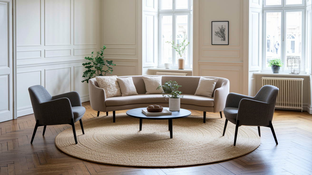
Arranges elements spreading outward from a central point. This pattern appears in round rugs, sunburst mirrors, or furniture arranged around a coffee table. Radiation makes a natural focal point and creates a sense of unity throughout the room.
Try it: Arrange your seating in a circle around a coffee table instead of the typical straight-line setup facing a TV.
Alternation
Uses a pattern that switches back and forth between elements. You’ll spot this in striped patterns or cushions that alternate colors across a sofa. This simple technique adds playful energy to spaces that need a bit of movement.
Try it: Line up books on a shelf by alternating horizontal and vertical stacks to create rhythm without buying anything new.
Common Mistakes to Avoid with Gradation Rhythm
Even simple design tricks can go wrong. Watch out for these common gradation pitfalls:
- Making changes too drastic—gradation needs gentle shifts, not jumps.
- Using too many elements—stick to 3-5 items in your gradation sequence.
- Forgetting to plan a direction—decide if your gradation moves left to right, top to bottom, etc.
- Mixing too many gradation types at once—master one type before combining color, size, and texture.
- Creating gradation that fights with your room’s flow—arrange items along natural traffic patterns.
- Using items with strong patterns that distract from the gradation effect.
- Placing gradation elements too far apart—keep them close enough to see the connection.
- Ignoring lighting—shadows can hide your careful gradation work if poorly lit.
The Smooth Path to Better Design
Gradation rhythm isn’t just designer talk—it’s a practical tool that makes any space feel more put-together. You don’t need to redo your entire home.
Start with just one area: maybe the pillows on your sofa or the items on your coffee table. Arrange them from dark to light, big to small, or rough to smooth.
Take a photo before and after your gradation experiment. The difference will surprise you! Even small changes create that “something special” feeling that makes a house feel like a thoughtfully designed home.
Ready to try?
The best designs often hide their tricks in plain sight. Now that you know the secret of gradation rhythm, you’ll start seeing it everywhere—and your home will never look the same again.