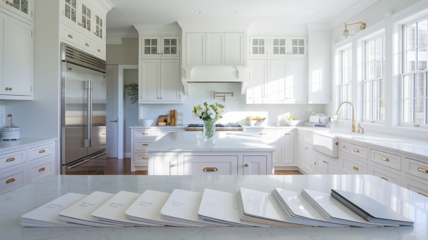
The perfect white paint for kitchen cabinets remains the most sought-after yet difficult-to-find element in kitchen design.
While white cabinets create the timeless, clean aesthetic that dominates modern kitchens, selecting the specific white can derail even the most carefully planned renovations.
Not all whites perform equally—undertones, light reflectance values, and finish options dramatically impact how white cabinets read in your unique space.
The wrong white can appear jarringly stark, disappointingly dingy, or surprisingly pink against adjacent materials.
This guide cuts through the confusion, highlighting truly superior white paint options that professional designers consistently recommend, explaining exactly why they work, and providing practical insights on selecting the ideal white for your specific kitchen conditions.
How White Kitchen Cabinets Create a Timeless, High-End Look?
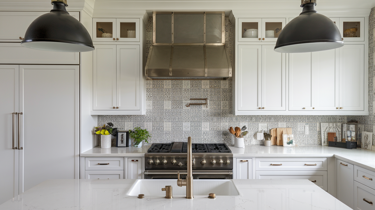
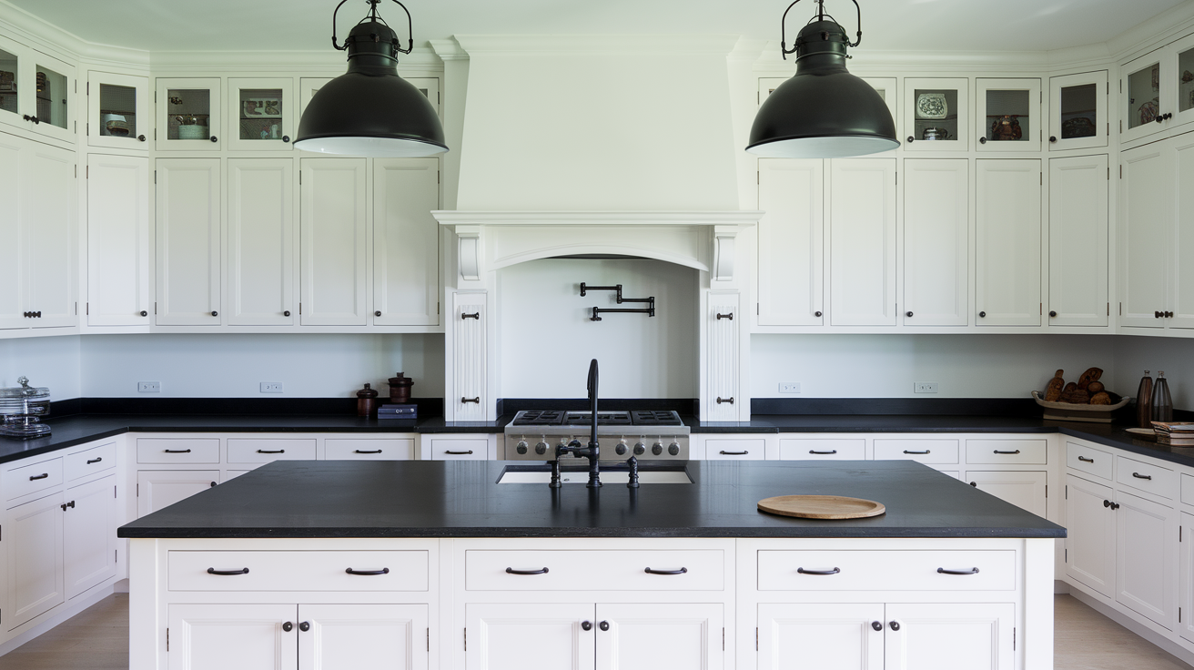
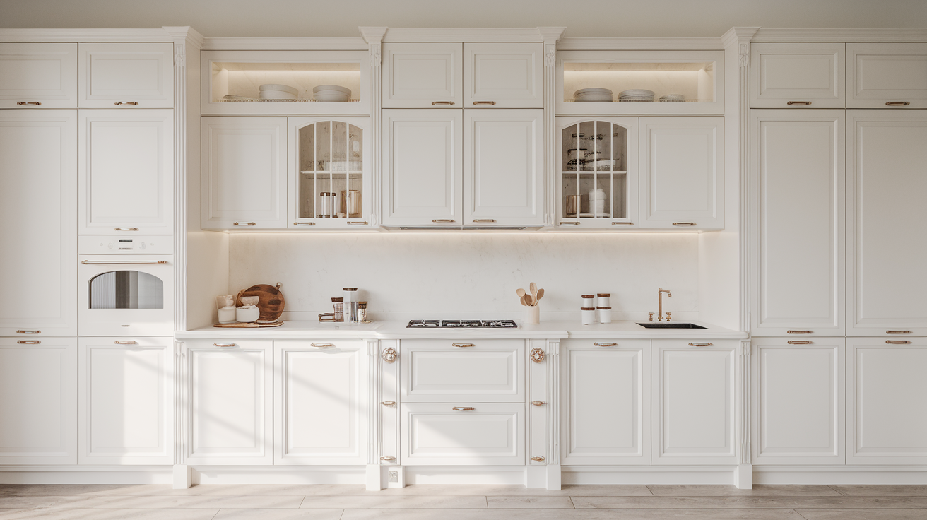
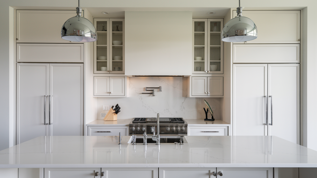
White kitchen cabinets change spaces with their clean, architectural presence.
The pristine finish creates a gallery-like backdrop that showcases premium hardware, clean countertops, and statement lighting.
White cabinets reflect light—instantly making spaces feel larger and more open than darker alternatives.
They establish a neutral foundation that allows luxury materials like marble, brass fixtures, or custom range hoods to command attention.
The monochromatic palette creates visual continuity that makes even moderately priced kitchens appear more expensive.
Best White Paint Colors for Kitchen Cabinets
Choosing the right white paint for cabinets transforms your space into a bright, elegant canvas for any design style. Here are the top white paint colors that designers consistently recommend for kitchen
1. Benjamin Moore Chantilly Lace (OC-65)
Color Profile: A clean, bright white with barely-there cool undertones, LRV of 92.2, available in multiple finishes with semi-gloss or satin recommended for cabinets.
Why It Works for Kitchen Cabinets: Creates a crisp, gallery-like backdrop that makes countertops and hardware pop without competing with other design elements.
Design Coordination: Pairs beautifully with marble countertops, stainless steel, and works with both warm and cool metals for a versatile foundation.
Real-World Examples: Photographers and designers favor this white for its ability to photograph true to color without appearing stark or clinical in actual spaces.
Maintenance Considerations:
- Touch-up recommendations: Keep a small jar labeled with the exact formula, as this true white must match precisely during touch-ups.
- Long-term wear expectations: Maintains its bright white appearance with minimal yellowing over time, though may show scuffs more readily than creamier whites.
2. Sherwin-Williams Alabaster (SW 7008)
Color Profile: A soft, warm white with subtle beige undertones, LRV of 82, which makes it bright but not glaring, available in ProClassic or Emerald Urethane for cabinets.
Why It Works for Kitchen Cabinets: Creates a soft, welcoming atmosphere that flatters food and people alike while hiding minor dirt and fingerprints better than brighter whites.
Design Coordination: Complements natural stone, especially warmer marbles and granites, and pairs perfectly with brushed brass or bronze hardware.
Real-World Examples: Featured in countless designer kitchens including Joanna Gaines’ projects for its ability to look sophisticated rather than stark.
Maintenance Considerations:
- Touch-up recommendations: Applies smoothly even years later with proper preparation and can be easily matched across paint brands.
- Long-term wear expectations: Slight yellowing may occur over 5+ years, especially near cooking areas, but often enhances rather than detracts from its warmth.
3. Benjamin Moore White Dove (OC-17)
Color Profile: A soft white with warm gray and greige undertones, LRV of 85.38, making it bright enough for cabinets without appearing stark or clinical.
Why It Works for Kitchen Cabinets: Offers subtle depth that prevents the flat, builder-grade appearance while remaining timeless and compatible with changing decor trends.
Design Coordination: Works harmoniously with nearly every countertop material from butcher block to granite, and complements both warm and cool metal finishes.
Real-World Examples: Consistently ranks among designers’ most-specified whites for its versatility across traditional, transitional, and modern kitchen styles.
Maintenance Considerations:
- Touch-up recommendations: Blends seamlessly during touch-ups without obvious patching, even after years of kitchen exposure.
- Long-term wear expectations: Aged White Dove cabinets develop a pleasing patina rather than an obviously yellowed appearance, aging gracefully over time.
4. Sherwin-Williams Pure White (SW 7005)
Color Profile: A balanced white with subtle warm undertones but reads neutral overall, LRV of 84, providing brightness without starkness, ideal in satin or semi-gloss finish.
Why It Works for Kitchen Cabinets: Offers the perfect middle ground that works in both north and south-facing kitchens without shifting dramatically throughout the day.
Design Coordination: Functions as a true neutral that allows other design elements to shine, particularly well-suited to colorful backsplashes or statement island colors.
Real-World Examples: Professional painters frequently recommend it for its forgiving application properties and consistent appearance across varied lighting conditions.
Maintenance Considerations:
- Touch-up recommendations: Accepts touch-ups exceptionally well with minimal flashing or visible differences between old and new paint.
- Long-term wear expectations: Maintains its true color longer than most whites, with minimal yellowing even in areas exposed to cooking oils and sunlight.
5. Benjamin Moore Simply White (OC-117)
Color Profile: A slightly warm white with subtle yellow undertones, LRV of 91.7, creating a bright, cheerful appearance without feeling artificial or cold.
Why It Works for Kitchen Cabinets: Infuses kitchens with an inviting glow that enhances food preparation spaces while maintaining a clean, fresh aesthetic.
Design Coordination: Shines against blue-gray backsplashes, navy islands, or dark countertops where its subtle warmth creates pleasing contrast.
Real-World Examples: Named Benjamin Moore’s Color of the Year in 2016 for its versatility, it continues to dominate in designer kitchens for its photogenic qualities.
Maintenance Considerations:
- Touch-up recommendations: Requires careful blending during touch-ups as its subtle undertones can appear more pronounced in smaller areas.
- Long-term wear expectations: May develop a slightly more yellow cast over time, particularly in kitchens with gas cooking and minimal natural light.
6. Sherwin-Williams Snowbound (SW 7004)
Color Profile: A cooler white with soft gray undertones, LRV of 83, providing sophistication without starkness, excellent in satin or semi-gloss cabinet finishes.
Why It Works for Kitchen Cabinets: Creates a clean, contemporary look that pairs beautifully with cool-toned countertops like Carrara or gray quartz.
Design Coordination: Enhances stainless steel appliances and chrome or nickel hardware while providing subtle contrast against true white walls.
Real-World Examples: Particularly successful in open concept spaces where kitchen cabinets need to coordinate with cooler colors in adjacent living areas.
Maintenance Considerations:
- Touch-up recommendations: Maintains color consistency well during touch-ups, though may require light sanding of adjacent areas for seamless blending.
- Long-term wear expectations: Resists yellowing better than warmer whites, though may show more visible dirt and fingerprints due to its cooler base.
7. Benjamin Moore Swiss Coffee (OC-45)
Color Profile: A creamy, warm white with subtle beige undertones, LRV of 83.93, creating depth and character while remaining definitively white.
Why It Works for Kitchen Cabinets: Imparts a timeless, sophisticated warmth that flatters traditional kitchen designs and complements natural materials.
Design Coordination: Particularly beautiful with soapstone, butcher block, or warmer granite countertops and antique brass or bronze hardware.
Real-World Examples: A staple in high-end traditional kitchens, often featured in historic home renovations where stark whites would feel inappropriate.
Maintenance Considerations:
- Touch-up recommendations: Accepts touch-ups readily without obvious patches, though original paint should be stored properly to avoid formula shifts.
- Long-term wear expectations: Develops a pleasing antique quality over years that many homeowners appreciate rather than feeling the need to repaint.
8. Sherwin-Williams Extra White (SW 7006)
Color Profile: A bright, crisp white with slight cool undertones, LRV of 86, creating maximum brightness and contrast, ideal in satin or semi-gloss.
Why It Works for Kitchen Cabinets: Creates dramatic contrast with colorful backsplashes, dark countertops, or statement island colors for high-impact designs.
Design Coordination: Spectacular with black hardware, dark countertops, or as part of a black-and-white kitchen theme where contrast is the goal.
Real-World Examples: Frequently chosen for contemporary kitchens where its gallery-like appearance provides a clean backdrop for architectural elements.
Maintenance Considerations:
- Touch-up recommendations: Requires precise matching and excellent technique during touch-ups as its brightness makes patches more noticeable.
- Long-term wear expectations: Shows wear more readily than softer whites but maintains its crisp appearance with minimal yellowing when properly sealed.
9. Farrow & Ball White Tie (No. 2002)
Color Profile: A soft ivory white with yellow undertones, lower LRV around 80, creating a gentle, antique appearance with Farrow & Ball’s signature depth.
Why It Works for Kitchen Cabinets: Imparts a heritage quality perfect for traditional or country kitchens where stark modern whites would feel out of place.
Design Coordination: Pairs exquisitely with natural stone, terracotta, and wood elements, especially with unlacquered brass or copper hardware.
Real-World Examples: Featured in many English country kitchens and historic renovations where its subtle depth enhances traditional cabinetry details.
Maintenance Considerations:
- Touch-up recommendations: Requires Farrow & Ball’s specialized approach to touch-ups, often needing a full cabinet face rather than spot treatment.
- Long-term wear expectations: Develops a patina over time that enhances its vintage appeal, though may require more frequent cleaning due to its softer tone.
10. Benjamin Moore Cloud White (OC-130)
Color Profile: A versatile white with balanced warm undertones, LRV of 87.35, bright enough for cabinets without appearing stark or sterile.
Why It Works for Kitchen Cabinets: Offers the perfect balance between clean and cozy, working well in kitchens with varying light conditions throughout the day.
Design Coordination: Accommodates both cool and warm decor elements, making it ideal for evolving kitchen styles and seasonal decor changes.
Real-World Examples: A longtime designer favorite for its chameleon-like ability to complement almost any kitchen style from coastal to farmhouse to traditional.
Maintenance Considerations:
- Touch-up recommendations: Blends exceptionally well during touch-ups, even after years of exposure to kitchen conditions.
- Long-term wear expectations: It ages gracefully with minimal yellowing, though it may develop subtle sheen differences in areas exposed to frequent cleaning.
11. Sherwin-Williams Dover White (SW 6385)
Color Profile: A rich, creamy white with yellow-beige undertones, LRV of 83, creating warmth and depth that feels established rather than newly painted.
Why It Works for Kitchen Cabinets: Creates an inviting, lived-in feel perfect for traditional kitchens while hiding minor imperfections and daily wear.
Design Coordination: Exceptional with travertine, beige granite, or cream marbles and gold or bronze hardware for a cohesive warm palette.
Real-World Examples: Particularly popular in Southern homes and traditional designs where stark whites would feel too contemporary or clinical.
Maintenance Considerations:
- Touch-up recommendations: Accepts touch-ups well, with minimal flashing or noticeable differences between original and touched-up areas.
- Long-term wear expectations: May yellow slightly over time, particularly in areas exposed to cooking oils, but often enhances its intentionally warm appearance.
12. Farrow & Ball All White (No. 2005)
Color Profile: A pure white with minimal undertones, moderate LRV around 86, creating a clean look with Farrow & Ball’s signature soft depth.
Why It Works for Kitchen Cabinets: Provides a clean slate that allows architectural details and hardware to take center stage without competing undertones.
Design Coordination: Functions as a true neutral that adapts to surrounding colors, making it ideal for kitchens with colorful appliances or bold accents.
Real-World Examples: Frequently specified by minimalist designers for its ability to appear intentional rather than builder-grade despite its lack of undertones.
Maintenance Considerations:
- Touch-up recommendations: Requires Farrow & Ball’s specialty approach, often needing full panel repainting rather than spot treatment for best results.
- Long-term wear expectations: Maintains its pure appearance longer than most whites but shows dirt and wear more readily due to its lack of masking undertones.
13. Sherwin-Williams Greek Villa (SW 7551)
Color Profile: A warm, muted white with subtle beige undertones, LRV of 84, creating a soft, Mediterranean-inspired warmth without yellowing.
Why It Works for Kitchen Cabinets: Offers a welcoming glow that flatters both food and people, perfect for kitchens that serve as gathering spaces.
Design Coordination: Pairs beautifully with terracotta, natural wood, and wrought iron elements in transitional or farmhouse kitchens.
Real-World Examples: Popular in open concept homes where kitchen cabinets need to harmonize with adjacent living spaces without appearing too stark.
Maintenance Considerations:
- Touch-up recommendations: Accepts touch-ups readily with minimal visible differences when applied carefully with the same paint batch.
- Long-term wear expectations: Develops a subtle patina that enhances rather than detracts from its warm, established appearance over years of use.
14. Behr Ultra Pure White
Color Profile: One of the brightest, crispest whites available with minimal undertones, very high LRV above 90, creating maximum brightness and reflection.
Why It Works for Kitchen Cabinets: Delivers a clean, contemporary look that maximizes light in darker kitchens while creating dramatic contrast with other elements.
Design Coordination: Excellent with boldly colored backsplashes, dramatic countertops, or as part of high-contrast black and white kitchen designs.
Real-World Examples: Frequently chosen for smaller kitchens where its reflective qualities help spaces feel larger and more open.
Maintenance Considerations:
- Touch-up recommendations: Requires careful technique as its brightness makes patches more noticeable; best results come from repainting entire cabinet faces.
- Long-term wear expectations: Shows dirt and wear more readily than softer whites but maintains its bright appearance with minimal yellowing when properly sealed.
15. Benjamin Moore Decorator’s White (OC-149)
Color Profile: A cool white with subtle gray undertones, LRV of 87.35, creating a sophisticated, contemporary appearance without feeling clinical.
Why It Works for Kitchen Cabinets: Creates a clean, architectural look that complements modern design elements while providing subtle depth.
Design Coordination: Pairs exceptionally well with Carrara marble, cool-toned quartz, and brushed nickel or chrome hardware for a cohesive modern aesthetic.
Real-World Examples: A go-to for designers creating sleek, contemporary kitchens where its subtle coolness enhances stainless steel and gray accents.
Maintenance Considerations:
- Touch-up recommendations: Requires careful blending during touch-ups as its cool undertones can make patched areas appear slightly different in certain lights.
- Long-term wear expectations: Resists yellowing better than warmer whites, maintaining its crisp appearance longer, especially in north-facing kitchens.
Conclusion
The ideal white cabinet paint transforms your kitchen into a space that feels simultaneously fresh and timeless, bright, and sophisticated.
By understanding the nuances of different whites—from their undertones to how they interact with your lighting and design elements—you can confidently select a finish that will enhance your kitchen for years to come.
Remember that testing remains essential; what looks perfect in a showroom may read differently in your space.
Take the time to evaluate samples against your countertops, backsplash, and flooring in both natural and artificial lighting before committing.
Which white paint did you choose for your kitchen cabinets?