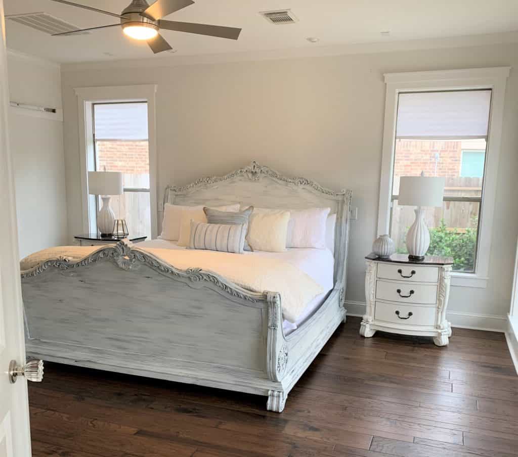
White is not for everyone! Well, this phrase is true only if you are not aware of the Sherwin Williams Origami WSherwin-Williamsis for everyone and everywhere(given it is used wisely).
If white is such a delicate color, what makes the SW 7636 such an interesting color to dedicate a whole article to it? You’ll see it yourself! For starters, just take the fact that you will be flexing the creamy neutral white tone of your house in front of nosy relatives.
And by the way, the Sherwin Williams Origami White review might be a little biased because we love this color, and you will, too, by the end of this article.
Basics – Sherwin Williams Origami White
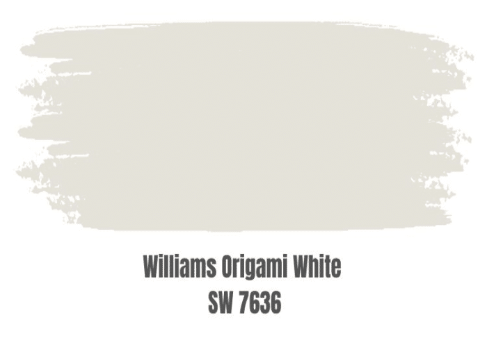
The Sherwin Williams Origami White belongs to the White and Pastel color family, including the other SW Whites. Unlike the other whites, it is not too creamy or crisp; rather is more toward the warm to cold ends of the color palette. This color gets along well with various other colors, making it easier to pair it up with other colors while designing.
1. Undertones of Sherwin Williams Origami White

The SW Origami White has a violet undertone. Yes, it’s unlike the usual pink or grey undertone colors. The cool violet undertone is pretty well read on the wall, but that does not mean the overall color reads violet or purple. In that case, it means you will have the cool essence of the purple undertone, making it stand out from the crispier whites.
Be careful with the lighting, though! The purple undertone might reflect varying light reflections on the painted area. The base might come out more prominently than intended if the lighting feature is not adjusted.
2. How Does Light Affect Color?

The Sherwin Williams Origami White is affected by both natural and artificial light. In the bright natural light, the undertone will be washed away, but, at the same time, the overall paint will come out to be lively and fabulous. But, be careful with the compass direction since it can affect the color of the paint in major ways.
The north-facing places will bring out a neutral and grayish look of the color, whereas the south and west-facing rooms will uphold a creamier warm look.
Use the swatches in various light conditions to test the true color of the paint. To achieve your desired effect from the color, you can make use of artificial lighting and fix them in calculated positions and directions to divert the effect of the color as you want. Use pendant lights and wall sconces for a welcoming appeal at the entrance of your home.
3. Tone – Warm or Cold?
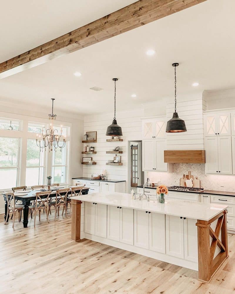
Sherwin Williams Origami White is the perfect color if you are more of a moderate person. Neither extremely warm nor too cozy, it is an extremely lively and happy color. It bends more towards the warmer tone and is versatile to be blended with other semi-cool palettes.
#SW Origami White creates an illusion of a larger space and thus is perfect for a city apartment. Hopefully, you have a basic idea of the Sherwin Williams Origami White. Because it’s now time to move toward the technical part, don’t worry, we will make it a cakewalk for you!
4. Technical Aspects of Sherwin Williams Origami White
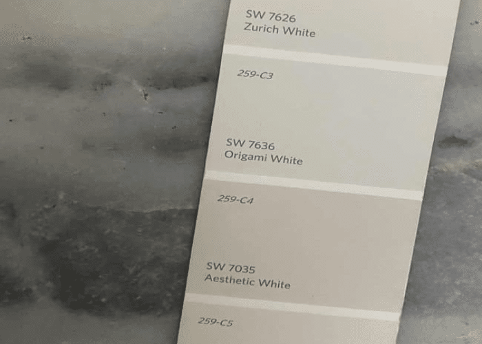
- LRV- Light Reflectance Value: As we mentioned in the beginning, the LRV of Sherwin Williams Origami White is 76. LRV is the measure of the amount of color that can reflect from the painted surface. On a scale of 0-100, the higher the LRV of color, the lighter it will be, and vice versa. Having said that, 0 is for the darkest color, black, and 100 is for the purest white. And SW 7636 stands at 76, so you can now do the maths. The lighter shade on the scale makes the color a great suitability for neutral or base colors. But keep the lighting in mind as well.
- RGB Color Code: RGB stands for Red, Green, and Blue, each being a parameter for measuring the density of the color. Each color ranges between 0 and 255, with 0, with 255 being the highest. These are the primary colors, the combination of which makes the desired color. The RGB of Sherwin Williams Origami White is 229, 226, 218, which means the content of Red is the highest in color, and the content of Blue is the least. However, all three are somewhat close.
- HEX Code: HEX stands for Hexadecimal. Hex codes are hexadecimal codes for identifying the exact color. It is made with Red, Green, and Blue in a particular shade of color. For every specific color, a digital code is generated, which the designers and paint specialists use for accurate color recognition. Well, the HEX code for SW Origami White is #e5e2da which helps the designers align with the painters and other hardware installers while designing your place.
Without getting much into the technical specification, let’s get into the practical application now. It’s important to know where and with which color will SW Origami White fit.
Application of Sherwin Williams Origami White
1. Bedroom
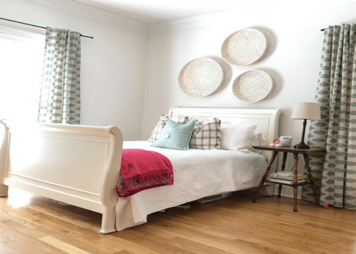
Your bedroom will love you for painting it with SW Origami White. It will reflect its love by making your bedroom look lively and fresh, which will be a sight for sore eyes after an eventful day. Matte black furniture and frames or wooden textured furniture will align well with the paint in your bedroom. Hardwood floors glam up the look of Origami white in a bedroom.
2. Bathroom
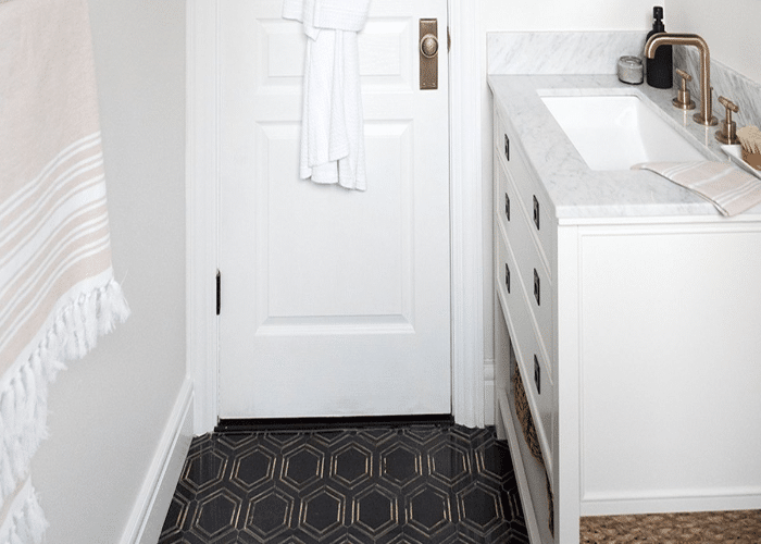
You will be refreshed in a bathroom painted with SW 7636 since it will create a cozy atmosphere for you to have a perfect bath. Wooden finish mirror frames and shelves do well with the paint in the bathroom while bringing a rustic yet modern feeling. You can paint a layer of plastic paint to the walls to keep the shine after being withered by water every day. It will help retain the shine.
3. Kitchen
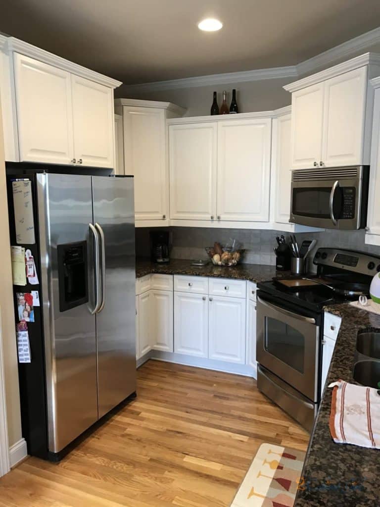
Paint the kitchen cabinet, island, and other storage spaces with SW Origami White; it will never be a dull experience to cook. It will be one of your best decisions if you install satin brass handles and other hardware along with the paint. The granite countertop goes well with origami paint and will even out the color balance.
4. Living Room
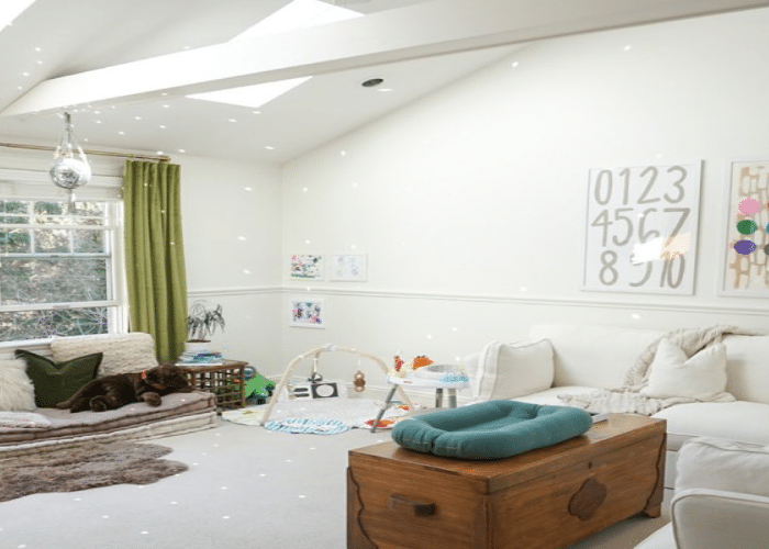
Living rooms are a place to chill, relax with family and friends, and they need a rich yet easy look. What’s better than creating a monochromatic look? Paint the walls with SW Origami White and add brown leather sofas, wooden shelves, and TV cabinets and pair them with black lamps and art pieces.
5. Exteriors

SW Origami White works great on the exteriors of a place. It creates a timeless classic look. Be it a craftsman-style home or a modern extravagant bungalow, this paint color is sure to attract the eyes of the viewer and neighbors. Take care of the trims and molding and pair the colors so the exterior look is in harmony.
Coordinating Colors of Sherwin Williams Origami White
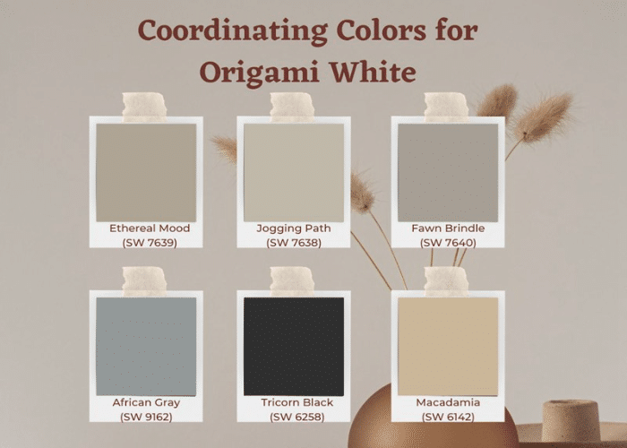
The trick to coordinating different colors with this tricky white color is understanding your needs and trying the different color palettes for the best result. Relax; you don’t need to go around understanding the various color palettes; we have done the hard work already, and here are the answers for you.
If you wish to create a perfect balance, you must go for either of the two- SW Anew Gray(SW 7030) or SW Spalding Gray(SW 6074). Or, if you want to have a contrasting palette, you can choose from a wide range of options from SW Macadamia(SW 6142), SW Tricorn Black(SW 6258), and SW African Gray(SW 9162).
Now that you know a lot about this beautiful color Sherwin Williams Origami White, it’s alright to go through a little comparison. This will help you make better decisions. We will help you differentiate between the various white shades of the SW White Family so you know which White is your go-to color.
1. SW Heron Plume

SW Heron Plume is a soft, warm neutral with whisper-like undertones. It is more like taupe or beige-gray and has sneaky undertones, which differentiates it from SW Origami White. Heron Plume is a warmer tone than Origami White and thus must be applied carefully, measuring the compass direction. Heron Plume does not look washed out in bright light and is thus suitable for spaces receiving natural bright light.
2. SW Aesthetic White
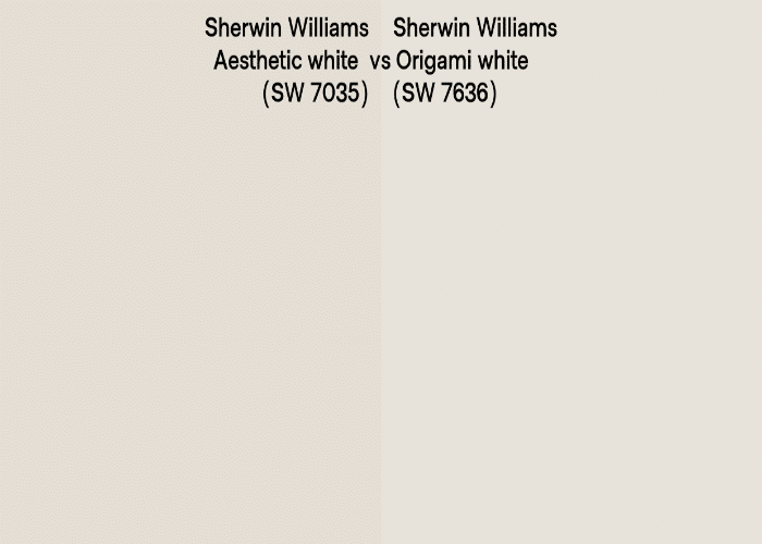
As aesthetic as it sounds, it falls perfectly in between the combination of Gray and Beige, which can transform the look of a place. It brings an aesthetic feel to the space. Aesthetic White has an LRV of 73, meaning it is quite similar and reflective to its counterpart. But keen observation will help you bring out the difference so that you can make a wise decision.
3. SW Zurich White
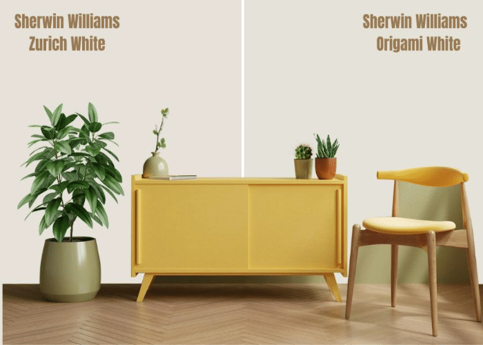
You must just say they both are the same, man! But, look closer; you will find it is warmer than Origami White. Zurich White is a versatile paint color that allows a range of elements. Pair the color with navy blue and deep grays for an elite look. It is a color apt for both cool as well as warm accents and lighting.
4. SW White Heron
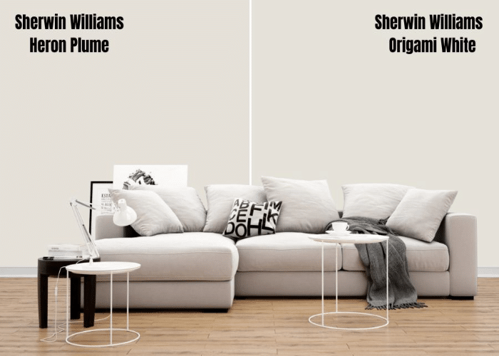
White Heron varies from Origami White in terms of the undertone. White Heron, along with a purple undertone, also has a pink undertone, and the color requires bright light to be recognized as paint. It isn’t completely white and perfect for someone who wants a splash of white in their space.
5. SW Windfresh White

Like Origami White, Windfresh White goes well with cream and greige. But, unlike in Origami White, you need not cater much to the lightning effects with this color. If you are unsure about the lighting in your space and forgot to use it as a sample first, don’t worry, just paint the walls with Windfresh White, and your space will have a fresh look.
6. SW City Loft

The SW City Loft is a chameleon color due to its various undertones. Its undertones include beige, brown, gray, and red-pink, which can take the form of peace, gray, taupe, purple, or pink under varying lighting circumstances. So, be very careful with this color. It has a warm tone with a sense of crispness. The soft white color brings a soft feel to homes. It is a perfect color for office or contemplative spaces.
Final Thoughts
The Sherwin Williams Origami White is a beautiful and trick white color that can change its appearance with the availability of light. You can use artificial light to your advantage to get the look you want.
White is a great choice of color for your house, and thus we have made a comparison of various whites from the SW family. Sherwin Williams is one of the leading brands in terms of paint colors, and thus we have helped you narrow down the selections for your ease.
Choose the color suitable for your place, and let us know which one you love the most and why.

