Finding the perfect deep blue for your home can feel overwhelming with so many options available. The countless paint swatches all start to look the same, making it hard to choose a shade that brings both style and warmth to your space.
Sherwin-Williams Inky Blue (SW 9149) offers a solution to this common dilemma. This deep, rich tone provides the ideal balance of style and comfort that works in many rooms and settings while making a bold statement without overpowering your space.
This guide will cover everything you need to know about Inky Blue, from its color properties and perfect pairings to practical tips for using it throughout your home.
You’ll find why designers and homeowners alike are drawn to this versatile shade for creating spaces with depth and character.
What Is Sherwin-Williams Inky Blue?
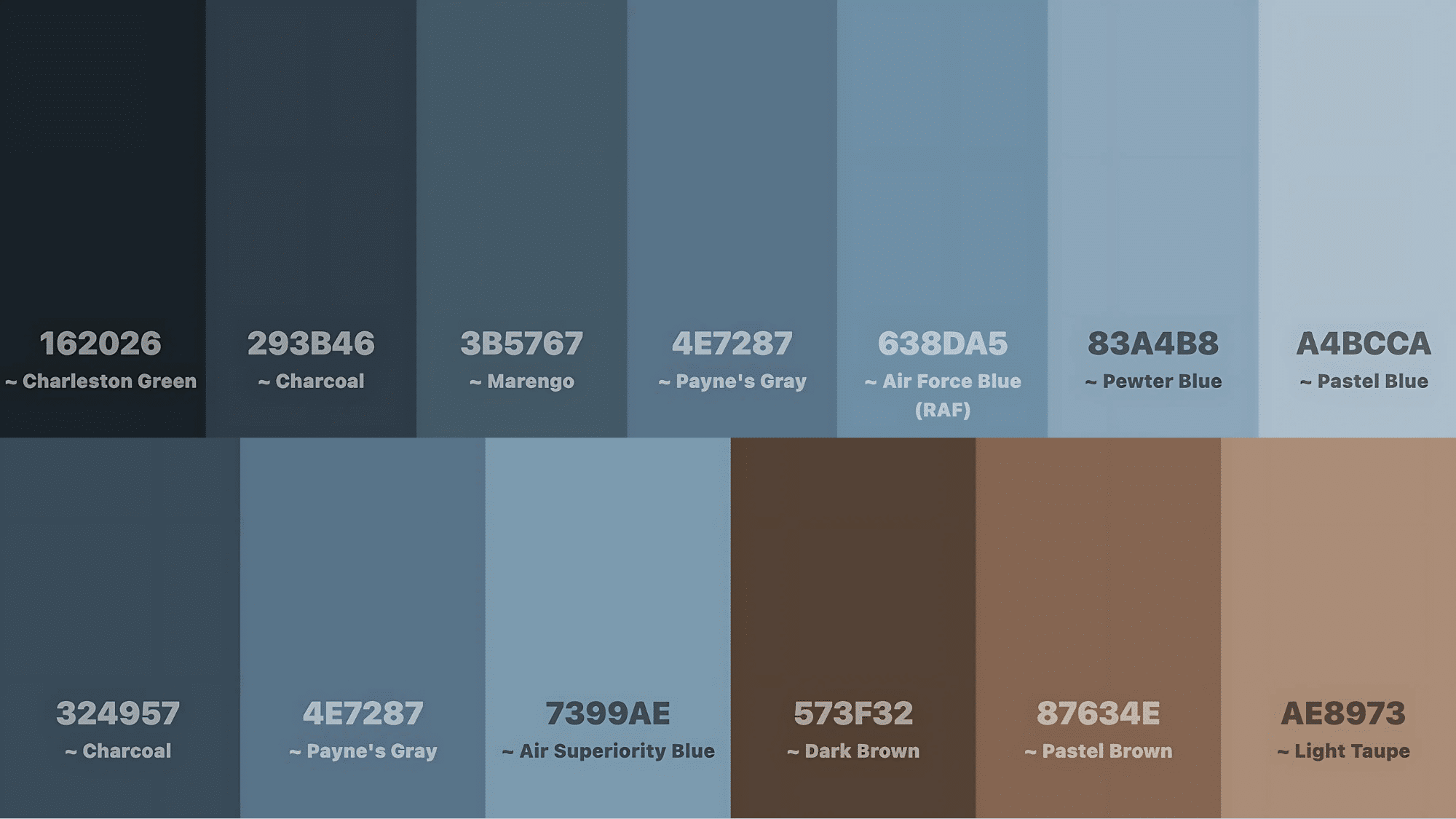
Sherwin-Williams Inky Blue (SW 9149) is a blue-black color with a rich depth that makes it both striking and versatile.
| Property | Details |
|---|---|
| Color Family | Blue |
| Light Reflectance Value | 15 |
| RGB Values | (78, 114, 135) |
| HEX Code | #4E7287 |
On the color spectrum, Inky Blue sits between true navy and charcoal, giving it more complexity than a standard dark blue.
This placement makes it less severe than black but more grounded than brighter blues.
When compared to other dark blues, Inky Blue stands out with its balance.
- Unlike Naval (SW 6244), which leans toward a traditional navy.
- Salty Dog (SW 9177) has stronger green undertones, while Inky Blue offers a more neutral option that works with many design styles, from modern to traditional.
What Makes Inky Blue Stand Out?
A Color That Speaks to Your Emotions: Inky Blue instantly transforms spaces into havens of calm and security. When you walk into a room painted in this shade, you’ll notice how it wraps the space in a feeling of protection without being overwhelming.
Creating Natural Focal Points: This color doesn’t need to shout to get attention. Whether on:
- An accent wall behind your bed
- Kitchen cabinets that pop against white counters
- A front door that makes neighbors take notice
Inky Blue naturally draws the eye and adds state-of-the-art to any surface it covers.
The Perfect Temperature Balance: Most dark colors fall into one extreme:
- Too cool (making rooms feel uninviting)
- Too warm (creating a heavy atmosphere)
Inky Blue strikes the rare middle ground with its balanced undertones. This makes it uniquely versatile for:
- North-facing rooms that need warmth
- South-facing spaces that benefit from cooling tones
- East or west exposures where light changes dramatically throughout the day
Where to Use Sherwin-Williams Inky Blue
This rich, deep blue tone offers versatility across various spaces in your home, creating different moods depending on where and how you use it.
Living Room
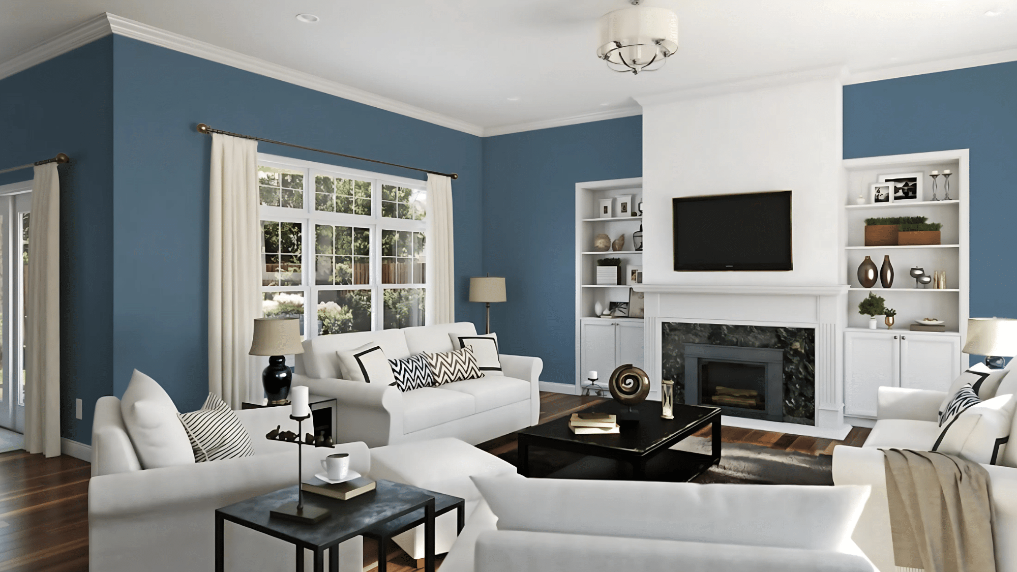
Inky Blue transforms living spaces into intricate gathering areas. Use it on a main wall behind your sofa or as an accent on built-in shelving to make decorative items stand out while hiding media components.
Key Considerations
- Ensure adequate natural or artificial lighting
- Balance with lighter furniture pieces
- Consider room size before using on all walls
Bedroom

This rich color promotes restful sleep and creates a cocoon-like feeling. An Inky Blue accent wall behind your headboard adds drama, or go bold by painting all walls for a hotel-luxury feel.
Key Considerations
- Balance with crisp white bedding and light rugs
- Add warm lighting to maintain coziness
- Use blackout curtains to enhance the sleep-friendly environment
Kitchen
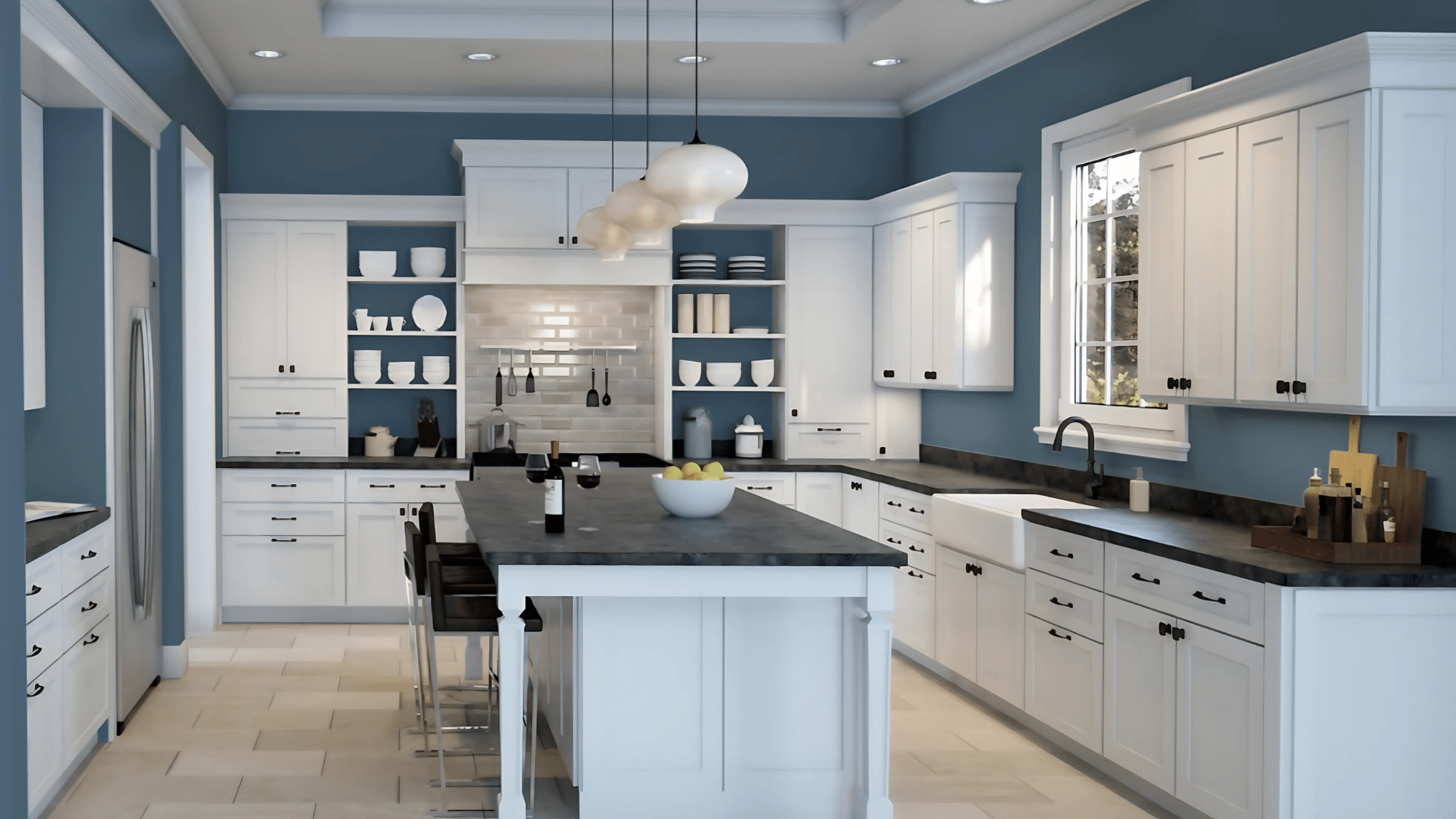
Inky Blue kitchen cabinets offer a fresh alternative to white or wood. Lower cabinets in this color paired with light uppers create balance, while an Inky Blue island becomes a striking centerpiece.
Key Considerations
- Contrast with light countertops and backsplashes
- Ensure adequate task lighting
- Consider smaller applications (pantry door, island) if uncertain
Bathroom
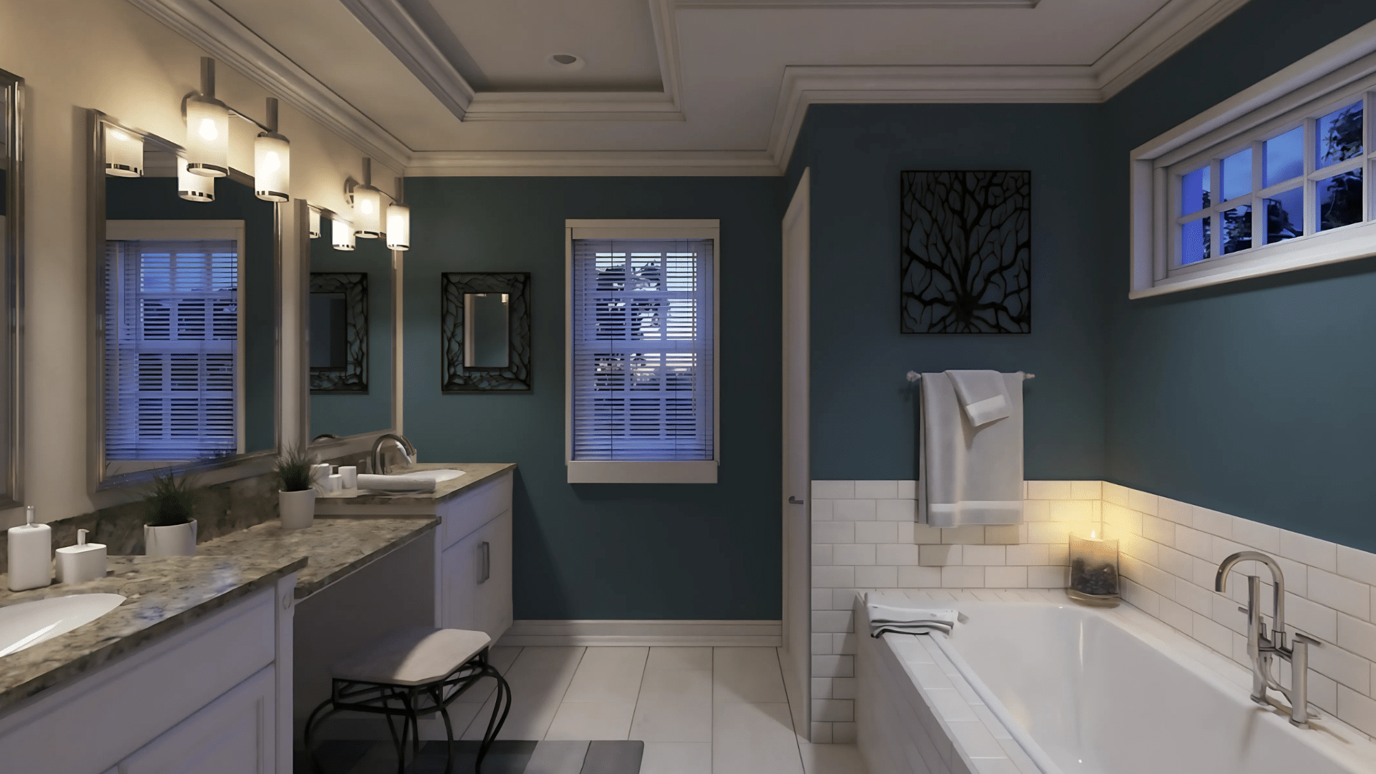
Bathroom vanities painted in Inky Blue create an instant high-end update. In powder rooms, this color works exceptionally well on all walls without feeling closed in.
Key Considerations
- Use a moisture-resistant paint formulation
- Pair with brass or chrome fixtures for contrast
- Include adequate lighting around mirrors
Exterior

On home exteriors, Inky Blue makes a confident statement as a front door color or on shutters and trim for traditional homes. Modern homes can use it as the main exterior color with white trim.
Key Considerations
- Test samples in different lighting conditions
- Consider your home’s constructural style
- Evaluate neighborhood appearance before full exterior application
Best Color Pairings with Inky Blue
Neutrals
Crisp whites create a clean, dramatic contrast against Inky Blue, making structural details stand out.
Off-whites offer subtle, without harsh, transitions, perfect for traditional or transitional spaces.
Light to medium grays work as complementary base colors that let Inky Blue shine while providing visual stability.
Warm beiges help balance the cool tones of Inky Blue, creating more inviting spaces.
Black accents add depth and definition to Inky Blue spaces, anchoring the color scheme.
Metallics
Brass and gold fixtures bring warmth and luxury to Inky Blue rooms, creating rich, inviting environments.
Chrome and nickel hardware provide contemporary appeal when paired with this deep blue tone.
Copper elements highlight the blue undertones for rich combinations that feel both timeless and fresh.
Bronze accents create a classic, aged appeal when paired with Inky Blue, perfect for spaces with traditional character.
Complementary Shades
Rust and terracotta tones create visually balanced combinations with Inky Blue for spaces that feel grounded yet sophisticated.
Mustard yellow adds energy and visual interest to Inky Blue spaces without overwhelming the senses.
Blush pink softens the overall look of Inky Blue for a more gentle feel in bedrooms or sitting areas.
Sage green pairs naturally with Inky Blue for harmonious environments that evoke a connection to nature.
Coordinating Colors
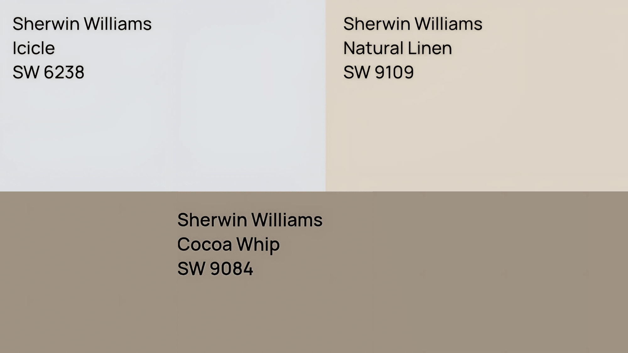
- Icicle (SW 6238) offers a soft, barely-there blue that complements Inky Blue when a lighter touch is needed
- Natural Linen (SW 9109) provides a warm, versatile neutral base that works across various lighting conditions
- Cocoa Whip (SW 9084) brings light taupe tones for added sophistication that enhances the depth of Inky Blue
Tips for Decorating with Inky Blue
When working with a deep shade like Sherwin-Williams Inky Blue (SW 9149), thoughtful planning helps create spaces that feel both intimate and open. Here are some practical tips for using this rich color effectively in your home:
Lighting Considerations
Good lighting is essential when using Inky Blue. This deep shade absorbs more light than lighter colors, so plan accordingly.
- Install multiple light sources in rooms painted with Inky Blue to prevent shadows and dark corners
- Position lamps strategically to highlight the depth and richness of the color
- Consider how natural light enters the room throughout the day – north-facing rooms need extra lighting support
- Use warm-toned light bulbs (2700K-3000K) to bring out the warmth in Inky Blue rather than its cooler tones
How to Avoid Making the Space Feel Too Dark
While the depth of Inky Blue creates a cozy feeling, you want to maintain balance:
- Limit Inky Blue to one or two walls in smaller spaces
- Pair with light-colored trim, moldings, and ceilings to create contrast
- Add mirrors to reflect light throughout the room
- Include light-colored furniture and textiles to break up large areas of dark color
- Use white or cream curtains that allow natural light to filter through
Choosing the Right Finish
The finish you select can dramatically change how Inky Blue looks and functions in your space:
- Matte finish: Creates a soft, velvety look that hides wall imperfections but may be harder to clean. Best for low-traffic areas like formal dining rooms or adult bedrooms.
- Eggshell/satin finish: Offers a subtle sheen that’s easier to clean than matte. This middle-ground option works well in most living spaces.
- Semi-gloss/gloss finish: Reflects more light and is highly washable, making it ideal for trim, doors, and high-moisture areas. A glossy Inky Blue creates a more dramatic, formal feel.
Practical Application Tips
- Test sample patches in different areas of your room to see how the color looks throughout the day
- Use a high-quality primer, especially when painting over lighter colors
- Apply two coats for the richest, most even color results
- Consider using Inky Blue on built-ins or kitchen islands as a statement without committing to full walls
Conclusion
Sherwin-Williams Inky Blue brings depth and polish to any space when used thoughtfully. This rich hue works across many settings, from bold accent walls to statement cabinetry.
We’ve seen how Inky Blue pairs effectively with neutrals, metallics, and complementary colors to create diverse looks that suit various styles. The color’s versatility makes it suitable for both traditional and modern homes.
Before you commit, remember to:
- Test a sample in your specific lighting conditions
- Consider the room’s purpose and use
- Think about how existing furniture will look against this deep backdrop
If you’re unsure about using such a bold color, start with a small project like an accent wall or a furniture piece.
For personalized advice, consider speaking with a Sherwin-Williams color expert who can help create a complete color plan for your home.