Are you looking for that perfect white that won’t blind you or turn your home into an igloo? You’re not alone. Thousands of homeowners struggle to find a white that feels “just right”—not too stark, not too creamy.
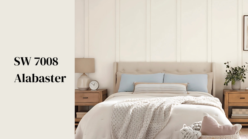
Enter Sherwin Williams Alabaster (SW 7008). This popular white has earned its spot as a top choice for walls, trim, and cabinets in homes across the country. But is it the right white for your space?
This soft, slightly warm white offers a clean look without the harsh glare of brighter whites. It can make a room feel bigger and brighter while still keeping that cozy feel everyone wants.
Let’s take a closer look at what makes Alabaster tick and why it might be the white you’ve been searching for all along.
What Is Alabaster and Why is it so Popular?
Alabaster (SW 7008) is a warm, creamy white that works in nearly every room.
Its LRV (Light Reflectance Value) is 82, which means it bounces back plenty of light yet never feels harsh or cold. It comes in many finishes, from flat to glossy. This shade is suitable for both walls and trim.
Sherwin-Williams named it the Color of the Year in 2016. Since then, it’s won over designers and homeowners. Its soft glow makes spaces feel cozy.
It fits both modern and old-school styles. Where stark whites can feel chilly, Alabaster adds warmth, making rooms feel lived-in and comfy.
People pick Alabaster for its friendliness with other colors. It rarely lets you down. Even as trends shift, this white stands the test of time.
What are the Undertones of SW Alabaster?
Alabaster has subtle warm undertones, but they’re never too yellow, making it very livable. It sits in a sweet spot between colors—not too cool, not too beige.
Morning light brings out its warmth. Midday sun shows its true white side. Evening light can make it appear softer. North-facing rooms might reveal its creamy side. South-facing spaces show off their brightness.
These shifts help rooms feel different throughout the day.
Think of Alabaster as a color chameleon. Next to gray? It looks crisp and clean. Beside brown? Its warmth comes forward. Near blues? It stays neutral and balanced.
This flexibility makes it perfect for open floor plans. It flows from room to room without fighting with other colors, so your eyes won’t get tired of it.
Some whites can turn yellow in certain lights, while others look too blue or stark. Alabaster rarely makes these mistakes.
Unlike pure whites, Alabaster won’t feel stark, and unlike cream colors, it won’t look yellow. It walks the middle path perfectly.
Where Does Alabaster Work Best?
Alabaster isn’t just a one-trick paint. It works in almost any room. Its balanced tone makes it a go-to choice for many spots in your home. Let’s look at the most popular places to use this versatile white.
Living Rooms
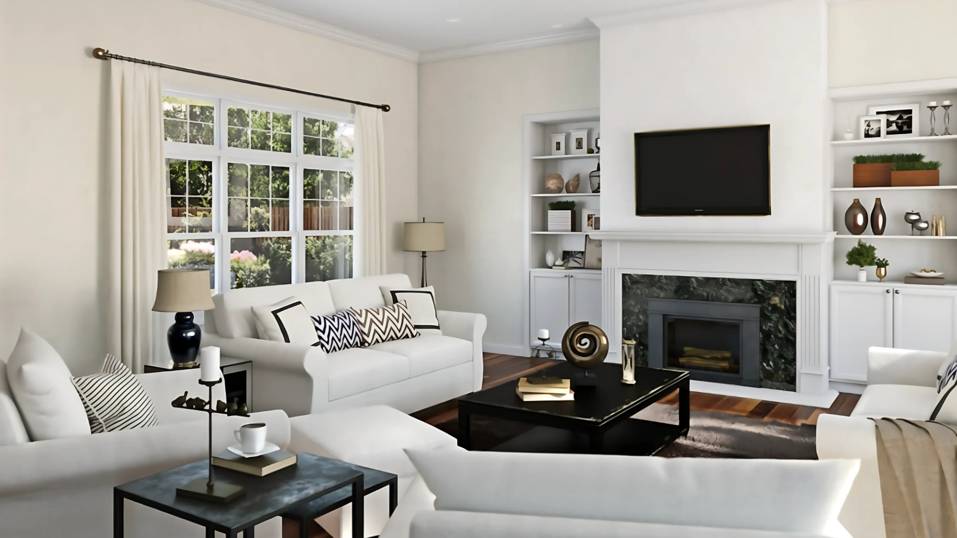
Living rooms come alive with Alabaster walls. The soft white makes the space feel open. Furniture stands out better, and art pops more. The room feels cozy but not closed in.
Your guests will notice how bright yet comfortable the space feels. Evening light makes it glow warmly, while daytime keeps it looking crisp. It works with any style, from modern to classic.
Kitchens
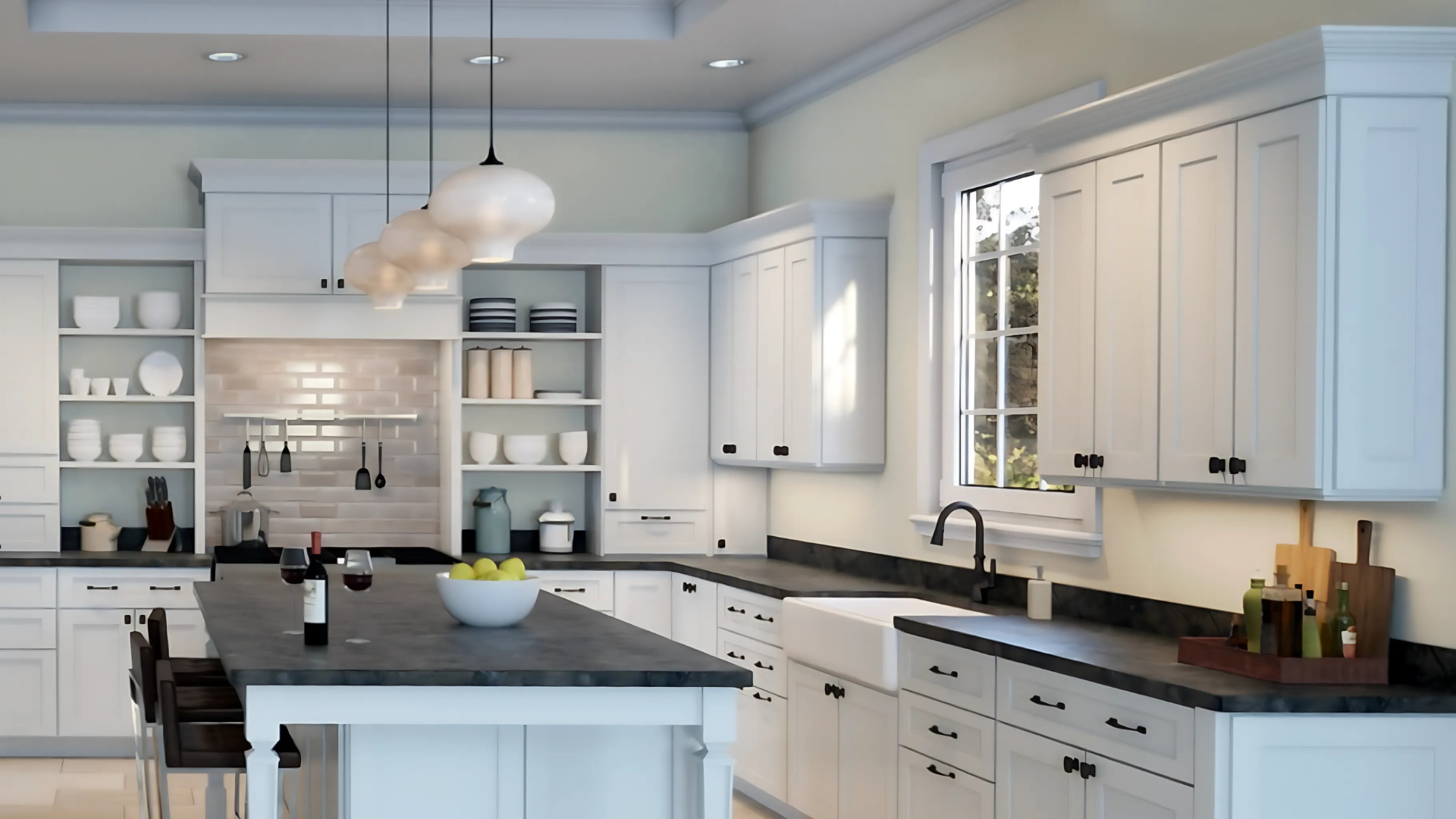
Kitchens need to feel clean. But stark whites can feel too cold. Alabaster strikes the perfect balance. Cabinets look fresh without the harsh hospital feel.
Food looks more appetizing against this backdrop. It hides minor smudges better than pure whites. The color stays true even under kitchen lighting. It pairs well with any countertop color.
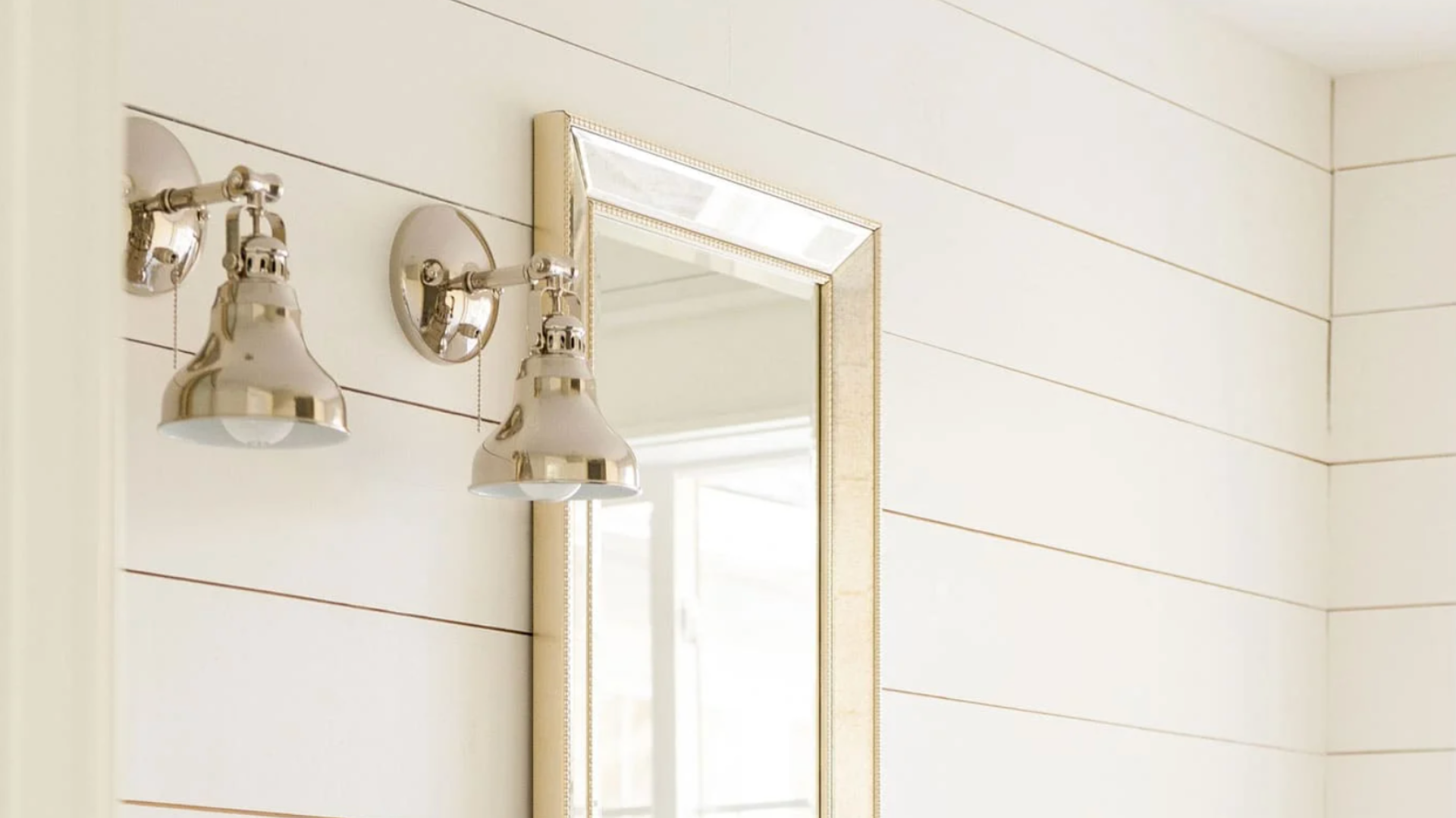
Bathrooms
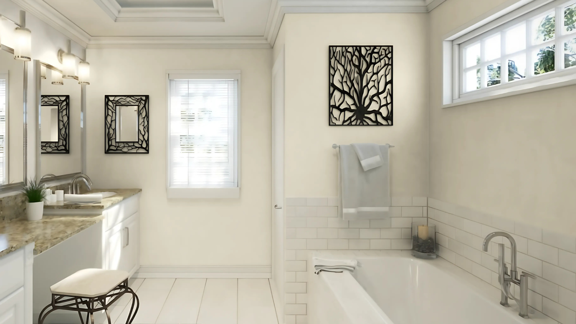
Bathrooms shine with Alabaster’s clean look. The color bounces light around small spaces, making tiny bathrooms feel bigger and larger ones feel spa-like.
Water spots show less than on stark whites. It complements most tile colors. The warm undertones prevent that cold, clinical feeling. Morning routines feel more pleasant in this gentle light.
Exterior
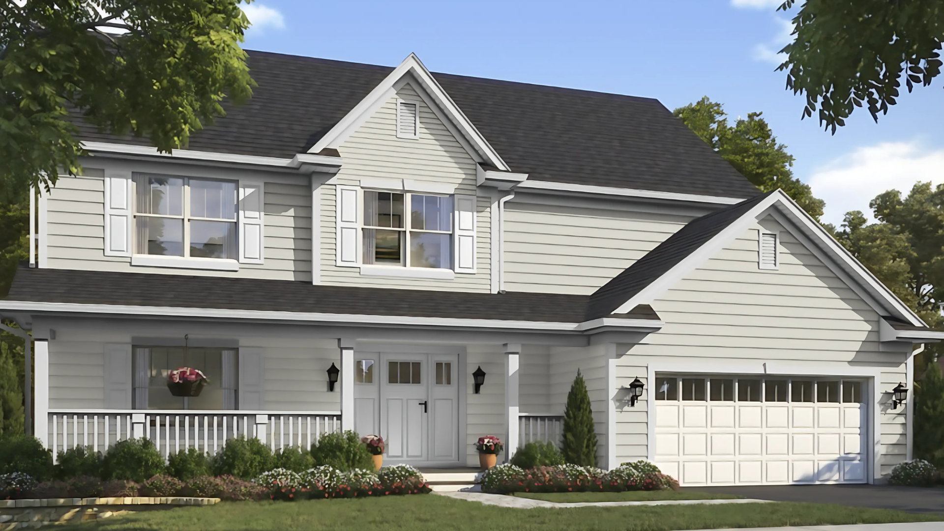
Alabaster paint enhances exteriors’ curb appeal. The soft white looks fresh without blinding neighbors, and it doesn’t glare in bright sunlight.
Trim pops against the darker siding. Whole houses look clean and well-kept. Porch ceilings gain a gentle glow. Front doors welcome guests with subtle style. The color ages gracefully through all seasons.
Comparing Alabaster to Similar Colors
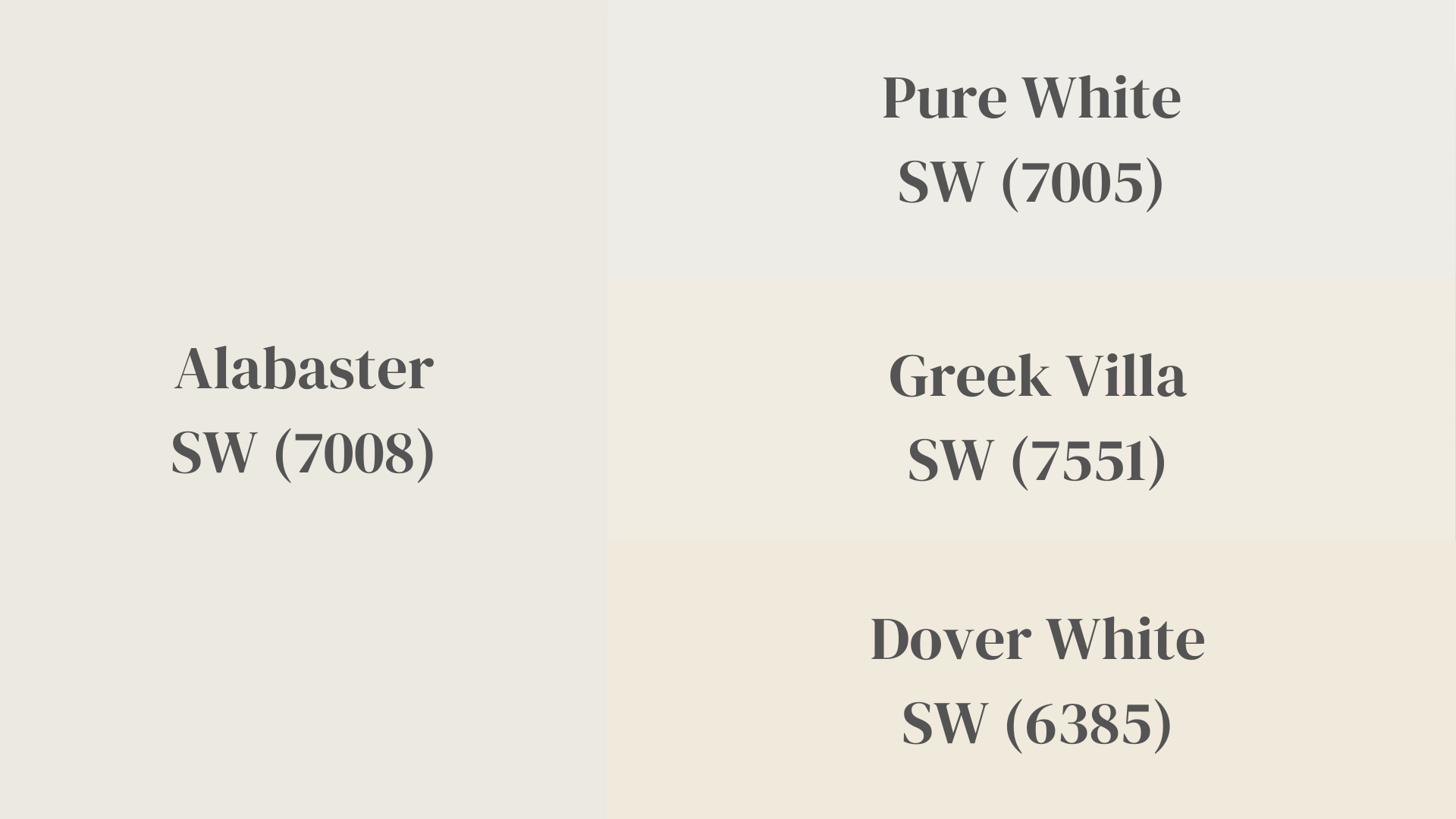
Not all whites are created equal. Subtle differences matter when picking the perfect shade.
When looking at whites side by side, you can spot the small shifts in tone and warmth that make a big impact on your walls.
| Feature | Alabaster (SW 7008) | Pure White (SW 7005) | Greek Villa (SW 7551) | Dover White (SW 6385) |
|---|---|---|---|---|
| LRV | 82 | 84 | 84 | 83 |
| Undertone | Soft, warm | Neutral to slightly cool | Creamy with beige hints | Creamy with yellow undertones |
| Best For | Versatile use throughout home | Clean, modern spaces | Traditional spaces | Traditional, antique-look spaces |
| North-Facing Rooms | Maintains warmth | Can look slightly gray | Can look more beige | Can look very creamy |
| South-Facing Rooms | Bright without glare | Bright, clean look | Very warm, can look yellow | Can appear more yellow |
| Pairs Well With | Most color schemes | Blues, grays, cool colors | Terracotta, wood tones | Earthy tones, traditional colors |
These small differences become more obvious once the paint is on your walls. Light changes how each white looks at different times of day.
Your room’s natural light, artificial lighting, and even nearby wall colors can shift how these whites appear in your space.
The Alabaster Color Palette: What Goes With It?

The real magic of Alabaster is how well it plays with other colors. Its balanced warmth makes it a team player in any color scheme. Here are some Sherwin-Williams colors that make perfect partners.
Accessible Beige (SW 7036): This light beige creates a smooth flow with Alabaster. The colors share warm undertones. They work as a soft backdrop for any style. Use Alabaster on trim with Accessible Beige walls for a classic look.
Sea Salt (SW 6204): This soft blue-green-gray adds gentle color while staying calm. Sea Salt and Alabaster create a spa-like feel in any room. The coastal vibe feels fresh but not overly beachy.
Meditative (SW 6227): This soft blue-gray creates a calming contrast with Alabaster. The cool tones of Meditative balance perfectly with Alabaster’s gentle warmth. Together they create a peaceful, balanced feeling.
Vintage Leather (SW 9912): This rich brown creates a stunning contrast with Alabaster’s soft white. The warm tones in both colors create a natural harmony. The pair feels grounded and timeless.
Final Thoughts on Sherwin-Williams Alabaster
Alabaster stands out as a truly special white in the paint world. It strikes that hard-to-find balance between warmth and crispness, making it work in almost any room and with any style.
The color shifts gently throughout the day, always staying pleasant. It won’t shock with stark brightness or disappoint with unwanted yellow tones. This reliability makes it perfect for both small projects and whole-house makeovers.
Always test before you commit. Colors look different in every home’s unique lighting, so what works in a showroom might not work in your living room.
Alabaster is tough to beat for a white that plays well with others, adapts to changing light, and creates a welcoming feel. It’s a timeless choice that won’t go out of style.