Do you ever notice how some colors make a room feel special without trying too hard?
Pink Shadow by Sherwin Williams offers something different from typical pink tones – a soft, muted shade that works in many styles of homes.
This color can transform plain walls into pleasant spaces, giving them a warm feel without being loud. It complements both modern and classic designs, making it a top pick for people who want lasting appeal.
Read on to learn why Pink Shadow might be the perfect choice for your next home project, how to pair it with other colors, and tips from paint experts on getting the best results with this subtle but striking shade.
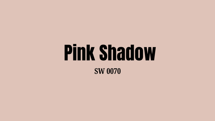
Pink Shadow by Sherwin-Williams: A Quick Overview
| Feature | Details |
|---|---|
| Color Name | Pink Shadow (SW 0070) |
| Color Description | Light, soft pink with subtle gray undertones |
| LRV (Light Reflectance Value) | 58 |
| Best for | Both small and large rooms |
| Room Size Impact | Small rooms: Won’t make the space feel closed in. Large rooms: Add enough color to avoid plainness. |
| Color Family | Warm neutral |
| Lighting Considerations | North-facing rooms: May show more gray tones. South-facing rooms: Will show warmer pink aspects. |
| Pairing Options | Pairs well with both cool and warm color schemes. |
Ideal Spaces for Pink Shadow
Pink Shadow works well in various rooms throughout your home. Its soft tone makes it useful in both main living areas and smaller spaces. Here’s how this versatile color can enhance different parts of your house.
1. Living Rooms
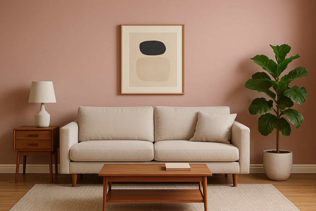
Pink Shadow turns living rooms into cozy spots for family and friends. The soft color creates a backdrop that makes guests feel welcome and at ease. It pairs well with neutral furniture while adding more interest than plain white walls. Wood accents and green plants stand out nicely against this gentle pink tone.
2. Bedrooms
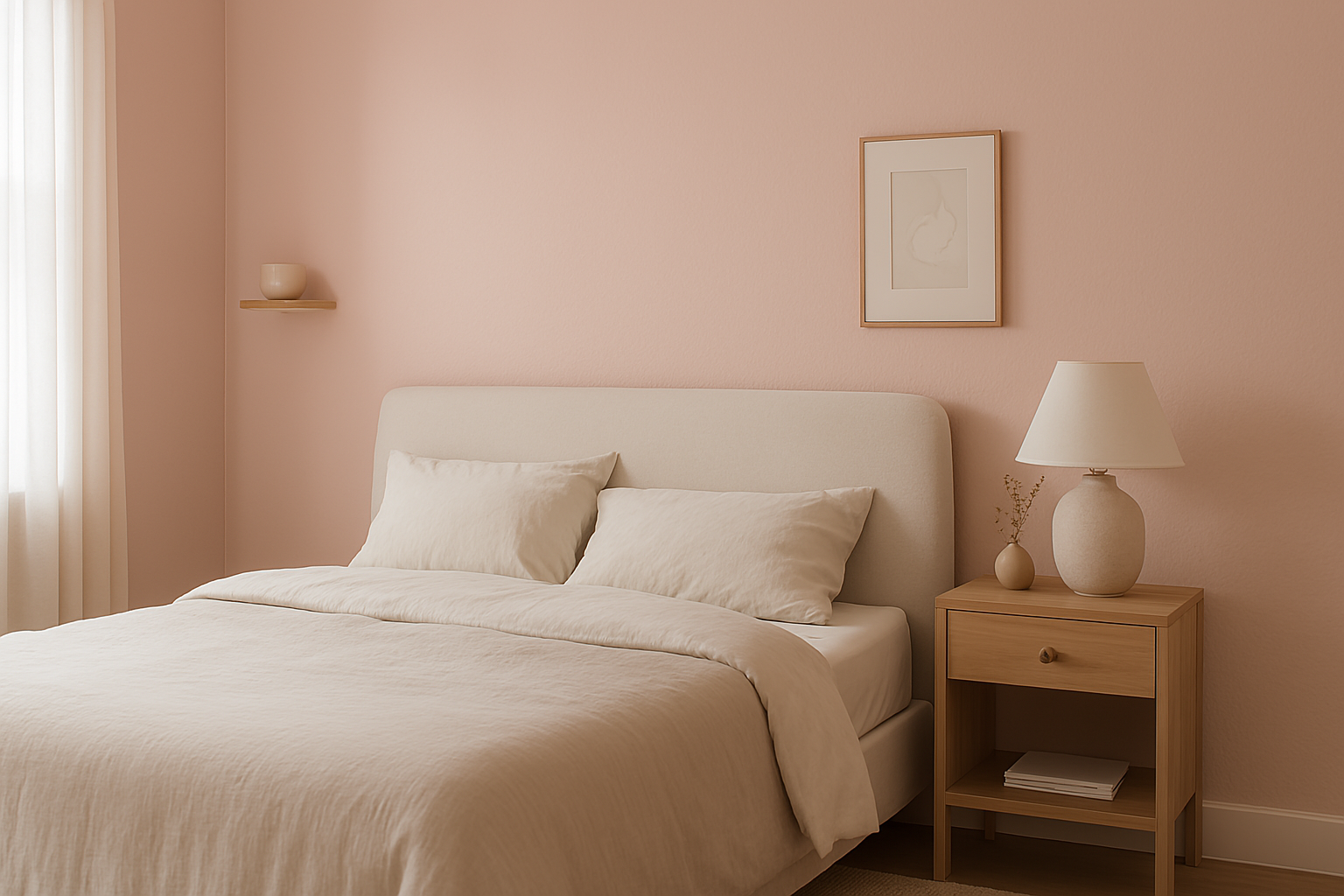
In bedrooms, Pink Shadow helps create a peaceful space for rest. The color isn’t too bright or stimulating before bedtime. Morning light brings out its warm tones, making waking up more pleasant. It works for main bedrooms, guest rooms, and children’s spaces that won’t feel too young as kids grow older.
3. Bathrooms
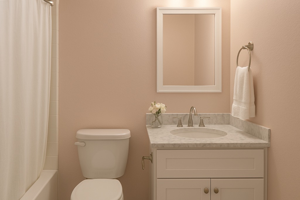
Small bathrooms gain a touch of style with Pink Shadow walls. The color adds warmth without making tight spaces feel smaller. It complements white fixtures and marble countertops nicely. In powder rooms, this subtle pink offers a hint of color that guests will notice without feeling it’s too bold.
4. Kitchens & Dining Areas
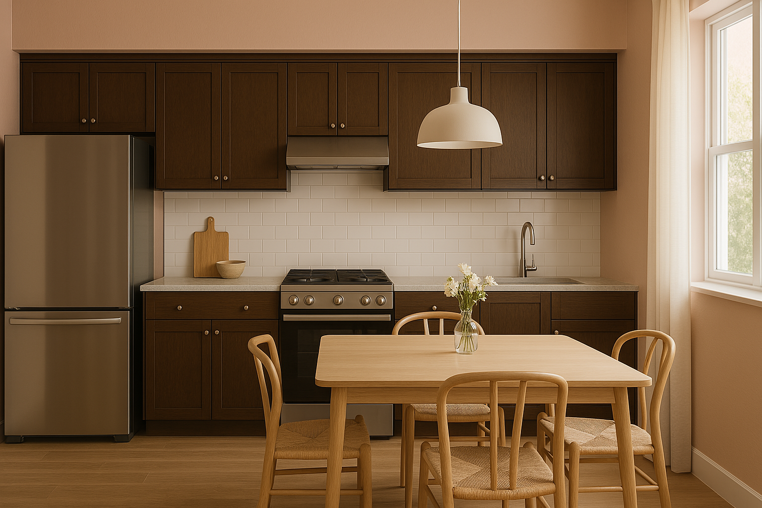
Pink Shadow softens modern kitchen designs with its gentle warmth. It works well with both dark and light cabinets, creating balance in the space. During meals, this color creates a pleasant mood for dining. The shade especially enhances wood tables and brings out the beauty of food presentation.
Perfect Pairings: Colors That Complement Pink Shadow’s Charm
The colors you pair with Pink Shadow can change how the whole room feels. Good matches bring out its best qualities and create different moods.
From calm and natural to bold and striking, these color combinations help Pink Shadow work in any style home.
1. Panda White (SW 6174)

Panda White offers a clean, bright companion to Pink Shadow without looking stark or cold. This soft white has warm undertones that connect well with Pink Shadow’s gentle warmth. When used together, these colors create light, airy spaces that feel fresh yet cozy.
Try Panda White on ceilings and trim with Pink Shadow walls for a classic look. For a more modern approach, use Pink Shadow as an accent wall with Panda White surrounding it. This pairing works well in sunlit rooms where both colors can show their true tones.
2. Quiver Tan (SW 6151)
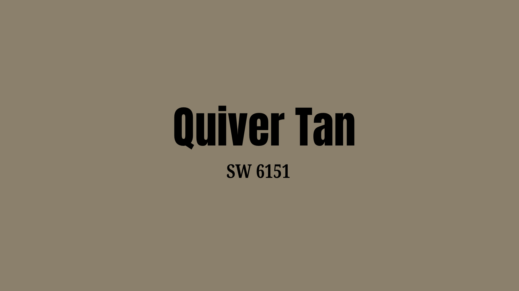
Quiver Tan brings a grounded, earthy quality that balances Pink Shadow’s softness. This warm tan has subtle pink undertones that create a natural bridge between the colors. Together, they form a warm, cohesive palette that feels both fresh and timeless.
Use Quiver Tan for larger furniture pieces in Pink Shadow rooms to create depth. These colors work well in dining rooms, where the tan adds warmth while Pink Shadow keeps the space feeling light. The pairing also suits spaces where you want a subtle, low-contrast look throughout.
Practical Tips for Incorporating Pink Shadow
Using Pink Shadow in your home requires some planning. These tips will help you get the most out of this soft pink shade in various settings.
Room Size & Lighting
Small rooms can benefit from Pink Shadow’s light to medium tone. With an LRV of 58, it reflects enough light to make tight spaces feel more open. In large rooms, it adds warmth without feeling empty or cold.
Morning light brings out Pink Shadow’s warmer pink tones. Evening light may show more of its gray undertones. Test a sample on different walls before painting the whole room.
North-facing rooms get less direct sunlight, which may make Pink Shadow appear cooler. South-facing rooms with lots of sunlight will highlight its warm, cozy qualities.
East-facing rooms look best with Pink Shadow in the morning when the light is brightest. West-facing rooms show off its warm side in afternoon and evening light.
Balancing with Other Elements
Consider your flooring when using Pink Shadow. It pairs well with medium wood tones and neutral carpets. Very dark floors create a strong contrast, while light floors blend for a soft look.
Furniture colors matter too. White, cream, and light gray pieces look clean against Pink Shadow walls. Dark brown or black furniture creates more visual interest.
Window treatments in white, cream, or matching Pink Shadow help create a smooth flow. For more contrast, try soft green or navy blue curtains.
Art stands out nicely against Pink Shadow without being too stark. Photos in white frames look clean and fresh against this soft background.
Finish Choices
Flat or matte finish works well in low-traffic areas like bedrooms. This finish hides wall flaws but can be harder to clean.
Eggshell finish offers a slight sheen that’s still soft-looking. It’s more washable than flat paint, making it good for living rooms and dining areas.
Satin finish has more shine and stands up to cleaning, ideal for kitchens and bathrooms. The extra sheen will make Pink Shadow look slightly brighter.
Semi-gloss is very washable and good for trim when you want Pink Shadow on both walls and woodwork. The contrast in sheen adds subtle interest.
Conclusion
Pink Shadow brings a gentle touch to any room without shouting for attention. Throughout this blog, we’ve seen how this soft color works in various spaces and with different color partners.
We’ve learned that Pink Shadow changes with light, pairs well with both bold and soft colors, and fits many home styles. Its lasting quality means your walls won’t feel dated next year.
The appeal of Pink Shadow lies in its balance – not too pink, not too beige, but just right. This makes it useful for people who want color without risk.
As you consider colors for your next project, remember that the right shade can make a space feel both fresh and timeless. Pink Shadow might just be that perfect middle ground.
Frequently Asked Questions (FAQs)
1. Why Pink Shadow is in Trend
Pink Shadow is in trend for its versatile and flattering tones, adding a soft yet vibrant touch to makeup looks. It’s a bold yet delicate choice that enhances natural beauty effortlessly.
2. Which is the Most Beautiful Shade of Pink?
The most beautiful shade of pink is subjective, but many consider rose gold pink for its warm, elegant tone that blends soft pink with a hint of gold, creating a timeless allure.
3. What will the Color of the Kitchen be in 2025?
In 2025, kitchens are trending towards warm, earthy tones like terracotta, olive green, and soft beige, complemented by natural wood accents, creating a cozy yet modern atmosphere with sustainable materials.