
Finding the right green for any season is like finding a needle in a haystack. After testing dozens of shades with my clients, most greens looked too bright or dark or fell flat against their walls. That’s until I discovered Benjamin Moore’s October Mist.
Here’s the good news: This gentle sage green brings nature’s softness indoors while maintaining a refined presence that works year-round.
Its subtle gray undertones create a sophisticated base that pairs beautifully with any color scheme or interior style.
In this post, I’ll explain everything you need to know about October Mist, from the best lighting conditions to foolproof color combinations.
I’ll also provide real examples from my design projects that showcase its versatility in every room.
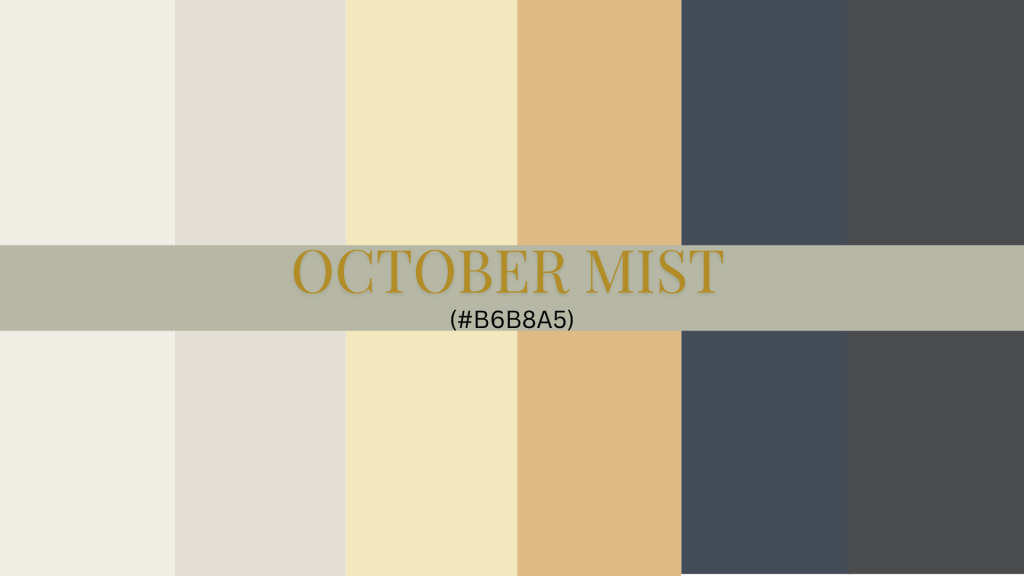
October Mist (BM 1495) – Color Profile & Characteristics
After testing hundreds of greens in different homes, I can tell you October Mist stands out for its remarkable balance. This shade reminds me of early morning fog lifting from soft, natural, and incredibly refined garden herbs.
Let me break down what makes this color special. The gray undertones keep it from feeling too bright or garden-like, while the warm green base prevents it from appearing cold.
In my clients’ homes, I’ve noticed how these undertones help the color stay true without shifting to blue or yellow.
With an LRV of 46, this paint hits the sweet spot regarding light reflection. I love its brightening darker corners while maintaining enough depth to create interest. In my living room, it reads differently throughout the day:
- Morning: Appears fresh and crisp
- Afternoon: Shows its warmer side
- Evening: Takes on a cozy, muted quality
How to Use October Mist in Interior Design
1. Living Rooms
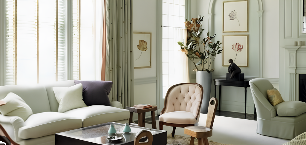
In my own living room, October Mist creates an atmosphere that makes people want to linger longer. I’ve noticed how this color feels like bringing the outside in – but in a subtle way that doesn’t scream “nature-inspired.”
The magic happens when you layer the space:
- Natural oak furniture looks richer against these walls
- Bronze floor lamps add depth
- Cream linen curtains soften the overall look
2. Kitchens
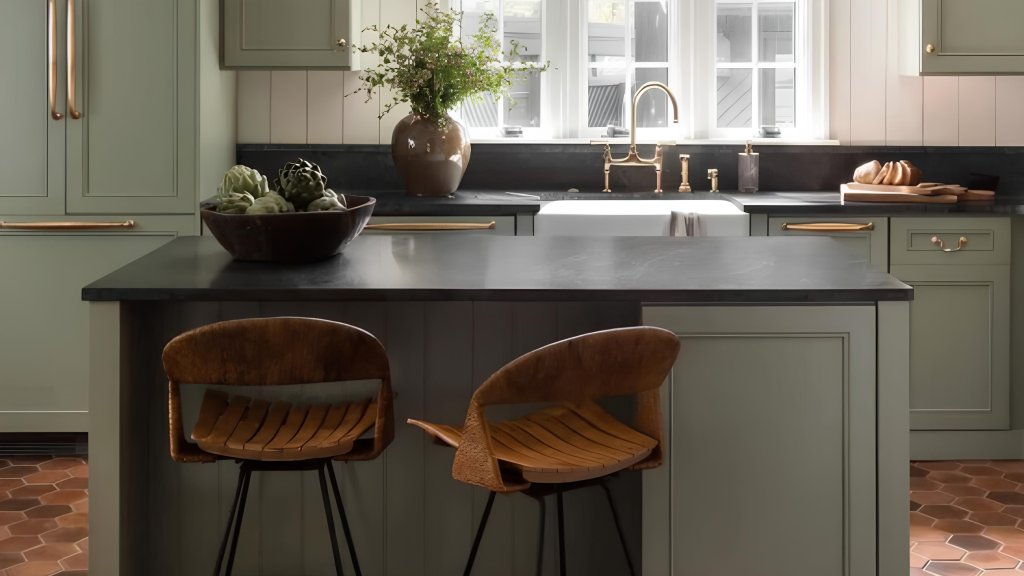
After painting several client kitchens, I’ve found October Mist shines particularly bright here. On cabinets, it creates a fresh feel without overwhelming the space. My favorite combination includes:
- Black stone countertops
- Light oak open shelving
- Matte black pulls
- Cream backsplash tiles
3. Bedrooms
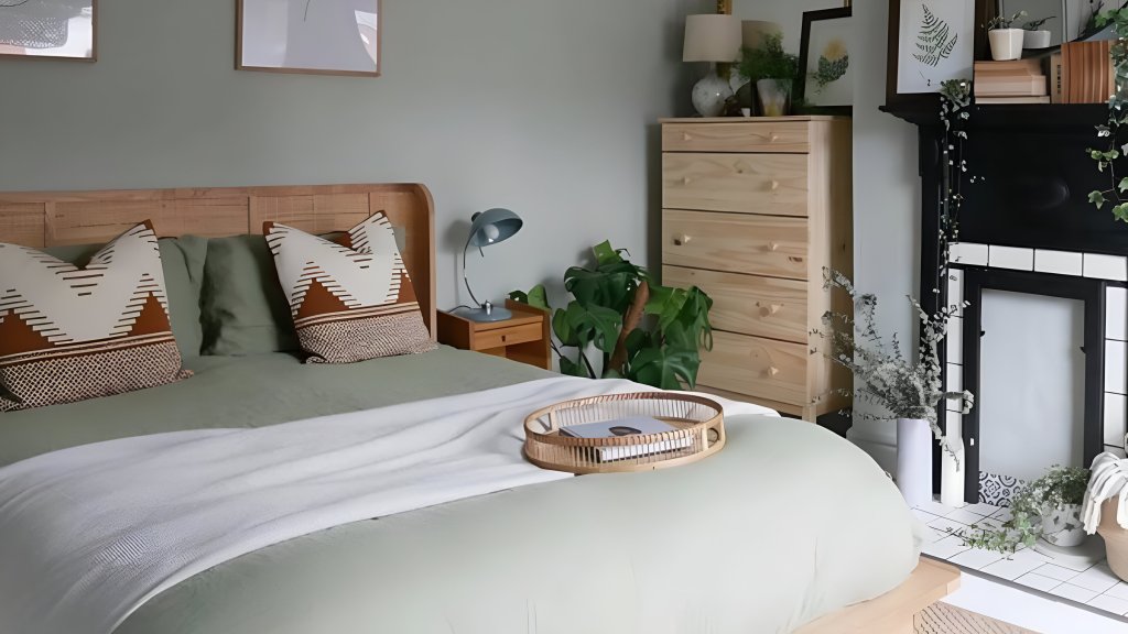
The most restful bedroom I designed used October Mist as its foundation. Here’s how I layered it:
- Soft white bedding
- Natural jute rug
- Wooden side tables
- White linen drapes
- Brass reading sconces
4. Bathrooms
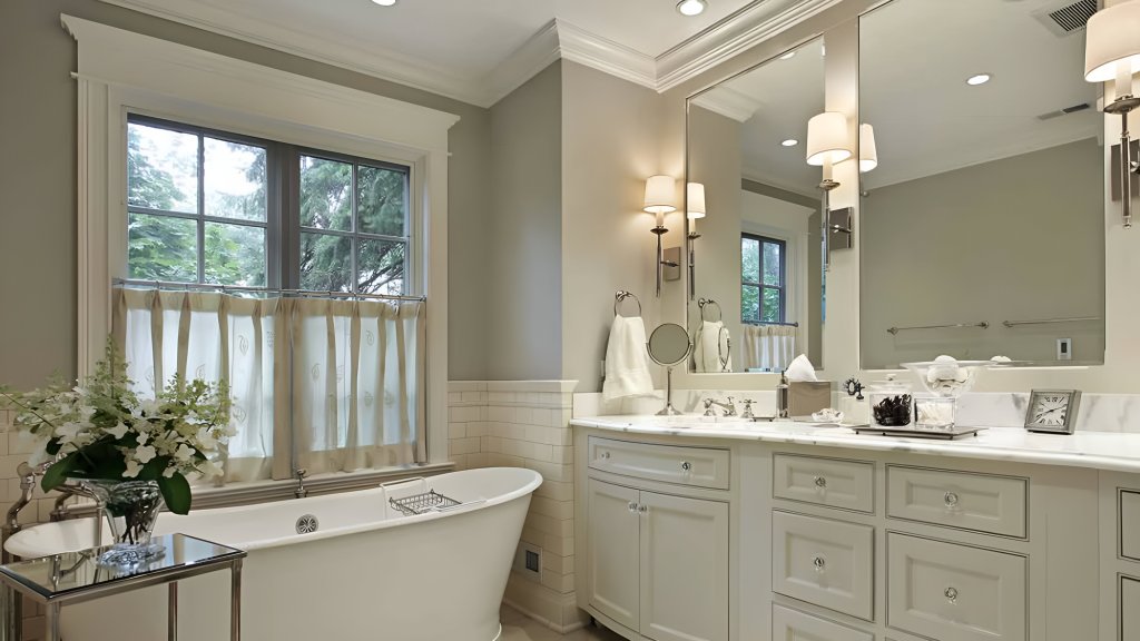
I love how October Mist creates a clean, fresh feel in bathroom spaces without the starkness of white. My tried-and-true combinations include:
- White porcelain fixtures
- Light marble counters
- Natural wood vanity
- Simple white tiles
- Bronze or nickel fixtures
5. Exteriors

On home exteriors, this color makes a subtle statement. From my experience with client homes:
- It pairs beautifully with limestone
- Creates harmony with natural cedar
- Looks fresh with white window frames
- It makes copper gutters stand out
- Adds character to front doors
Best Color Combinations with October Mist
1. Neutral Pairings
After testing countless combinations in client homes, I’ve found the perfect neutral partners for October Mist. White Dove (OC-17) is my top choice for trim and ceilings – it adds brightness without harsh contrast. I used this combination in my office; the transition feels natural and flowing.
Classic Gray (OC-23) creates a “whisper palette” with October Mist. In a recent project, I used Classic Gray on adjoining walls, and the effect felt like a gentle conversation between colors rather than a stark transition.
2. Bold & Dark Contrasts
Here’s a design secret: Hale Navy (HC-154) with October Mist creates pure magic. I recently paired these colors in a client’s library – the navy built-ins against October Mist walls struck the perfect balance between cozy and sophisticated.
Wrought Iron (2124-10) adds drama without heaviness. In my dining room, I used it on window frames against October Mist walls, creating definition while maintaining its peaceful feel.
3. Earthy & Warm Accents
Pale Moon (OC-108) brings subtle warmth without competing. I often suggest this to clients who want to add sunshine without brightness. The combination reminds me of early morning light filtering through leaves.
Chestertown Buff (HC-9) creates a beautiful partnership for those seeking more warmth. In a recent sunroom project, these colors worked together to create a naturally lit space, even on cloudy days.
Comparing October Mist with Other Green Paint Colors
| Color | Undertone | LRV | Best Use |
|---|---|---|---|
| October Mist (BM 1495) | Soft sage with gray undertones | 46 | Versatile in interiors and exteriors |
| Saybrook Sage (HC-114) | Warmer, beige-green | 44 | Cozy and traditional settings |
| Night Owl (2137-30) | Deeper olive green | 15 | Accent walls and cabinetry |
| Soft Fern (2144-40) | Lighter, yellow-green | 60 | Airy and bright spaces |
How October Mist Fits Different Design Styles
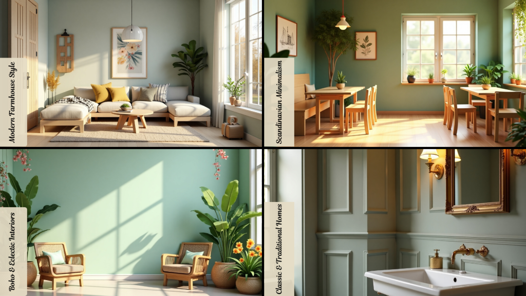
1. Modern Farmhouse Style
October Mist creates a perfect backdrop in farmhouse settings. The soft green tone brings life to white shiplap walls and adds depth to every room. When paired with worn wood beams, it creates a sense of history and comfort.
Brown furniture pieces stand out beautifully against October Mist walls, making each item feel special. Black metal lamps cast interesting shadows on the green surface, adding visual interest.
Old-style chairs look fresh and inviting when placed in a room with this color. The green shade helps tie together all the natural materials common in farmhouse decor.
2. Scandinavian Minimalism
In simple Scandinavian spaces, October Mist adds the right amount of color without breaking the rules of minimalism.
The green shade maintains its quiet presence next to clean white surfaces, creating gentle contrast. Light oak tables and chairs gain warmth when surrounded by this green shade.
Basic decorations find their perfect spot against October Mist backgrounds. Small plants look like they belong naturally in these spaces.
The color helps create peaceful rooms while staying true to minimalist principles. It works especially well in spaces with lots of natural light, shifting subtly throughout the day.
3. Boho & Eclectic Interiors
October Mist is an excellent foundation for mixed-style rooms—the green works in harmony with earth tones, creating layers of visual interest.
Hand-made wall hangings find their perfect background against this green shade, letting patterns and textures shine through.
With October Mist nearby, natural chairs and woven baskets feel right at home. The color creates a calm background that lets creative decorations take center stage.
It supports bold pattern mixing without adding competing elements. Plants of all types look extra lush against this green backdrop.
4. Classic & Traditional Homes
October Mist brings rooms into the present in older homes while honoring their past. Dark wooden furniture gains new life next to this green, creating rich visual contrasts.
Gold-colored metal fittings catch light beautifully against October Mist walls, adding sparkle to traditional spaces.
The color makes architectural details stand out in fresh ways. Wall trim and decorative moldings look crisp and defined.
It adds subtle sophistication to formal dining rooms and studies. October Mist creates a modern feel while respecting traditional elements in spaces with lots of woodwork.
Each room painted in this shade feels both timeless and current. The green works equally well in sunny morning rooms and cozy evening spaces. It creates different moods throughout the day as natural light changes, making spaces feel alive and responsive.
Conclusion
Finding the right green paint can change how you feel in your home. October Mist offers a balanced approach to color. It works well across many design styles while staying true to its calming nature.
From modern farmhouses to classic spaces, this shade fits in perfectly. Its mid-tone depth means it can be a main color or a supporting player in your rooms.
Compared to other greens, it holds its own with its perfect mix of sage and gray tones.
Ready to try October Mist in your home? Start with a small space like a reading corner or bathroom. Watch how the color changes throughout the day.
You might want to add more of this gentle green to other areas of your home.
Have questions about using October Mist? Leave a comment below.