Most homeowners feel lost choosing between Dover White and Alabaster for their walls. Both shades look similar at first glance, making the decision hard.
Many don’t know that these popular white shades have distinct traits that can make or break a room’s appearance. Their subtle differences matter more than you might think.
The right white can create the perfect mood in your space, improve lighting, and work well with your existing furniture. Making the wrong choice could leave your room feeling off-balance.
Read on to learn the key differences between Dover White and Alabaster so you can make the best choice for your home.
Dover White vs Alabaster: A Quick Overview
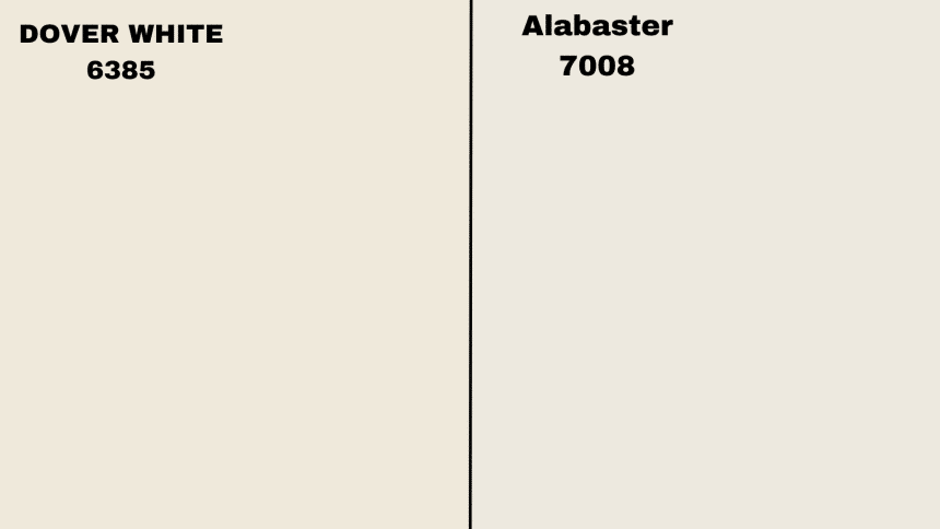
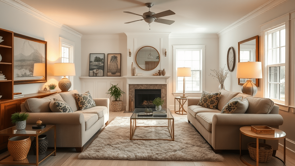
Dover White (SW 6385)
Dover White has a warm, creamy look with yellow hints that show through. With a Light Reflectance Value of 83, this color sends back lots of light.
The shade makes rooms brighter and fits well in homes with warm color schemes. Regular lamps and lights bring out its yellow side more, giving spaces a soft, buttery feeling. This color suits homes that want a warmer, more lived-in feel.
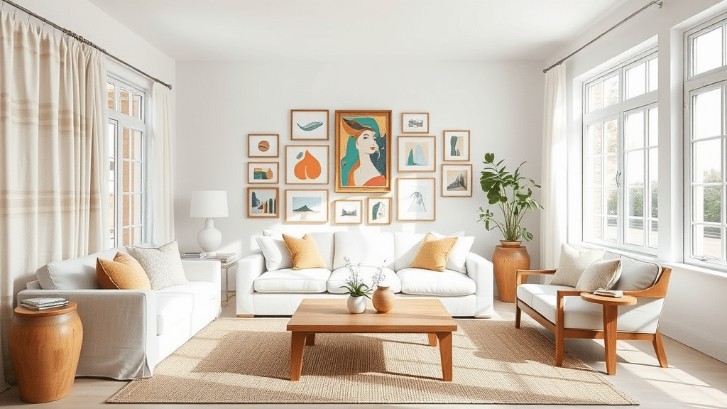
Alabaster (SW 7008)
Alabaster offers a gentle white color with light beige hints mixed in. Its Light Reflectance Value of 82 helps make small spaces feel bigger.
The color stays true and steady under both sun and lamp light. It works nicely in many home styles, from simple modern homes to country-style houses.
This shade keeps its neutral look without becoming too bright white or too yellow. Many people pick this color because it blends well with other shades and doesn’t stand out too much.
Dover White vs Alabaster: Key Differences
Small details make a big impact when selecting between Dover White and Alabaster. Let’s look at their main features side by side:
| Detail | Dover White (SW 6385) | Alabaster (SW 7008) |
|---|---|---|
| Color Family | White | White |
| Light Reflectance Value (LRV) | 83 | 82 |
| Undertones | Warm yellow undertones | Soft beige undertones |
| Best for | Cozy, warm interiors and exteriors, nurseries, and kitchens | Versatile backdrop for modern and traditional spaces, including living rooms and kitchens |
| Overall Look | Creamy, warm, slightly golden | Soft, neutral, and adaptable to different decor styles |
Where Dover White Looks Best in Your Home
1. Nurseries and Kids’ Rooms
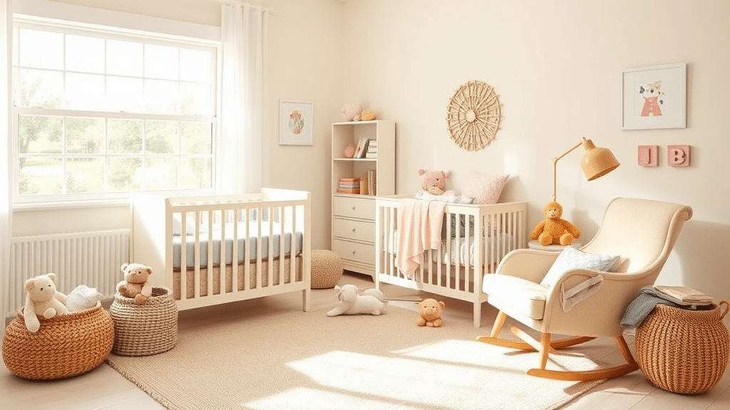
The soft, warm feel of Dover White makes it perfect for children’s spaces. Its creamy tone helps create a gentle, caring mood that helps little ones feel safe and comfortable.
Parents often choose this shade because it looks clean and fresh, giving off a cozy feeling. The light-reflecting quality helps keep the room bright during daytime naps.
The color works well with both pastel and bright decorations, making it easy to update the room’s style as children grow. It also photographs well, helping preserve those special moments without casting odd tints on skin tones.
2. Kitchens and Cabinets
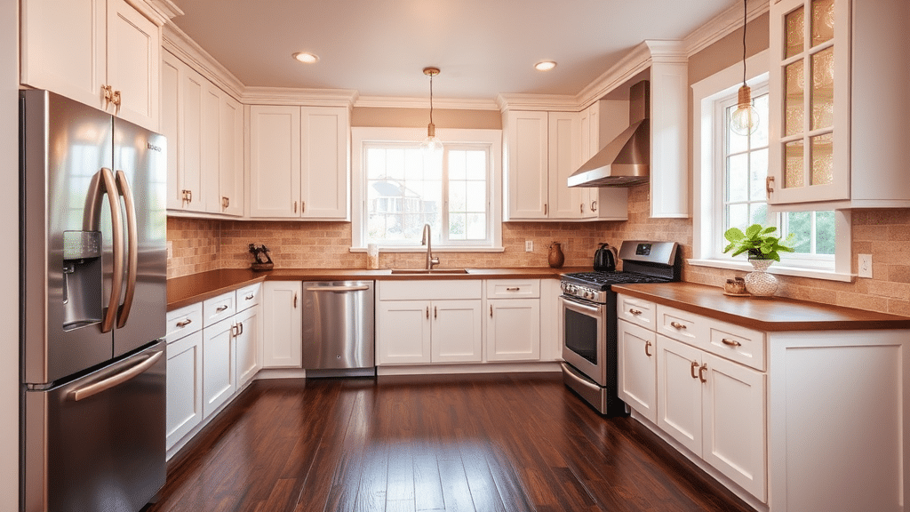
Dover White brings warmth to kitchen spaces while maintaining a fresh, clean appearance. It pairs beautifully with dark wood floors, brown or tan countertops, and metal fixtures in brass or copper tones.
The yellow hints in this shade help enhance the natural beauty of wooden elements throughout the space. When used on cabinets, it creates a soft contrast with stainless steel appliances and natural stone backsplashes.
The color holds up well under both natural and artificial lighting, maintaining its warmth without looking too yellow. It’s particularly effective in making smaller kitchens feel more open and welcoming.
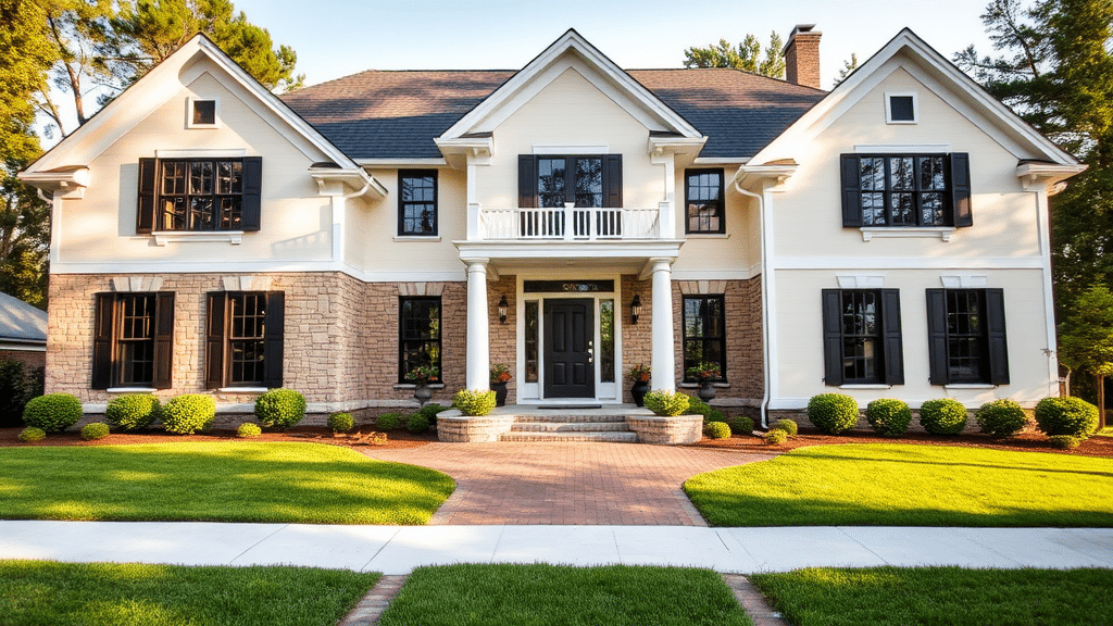
3. Mediterranean Style Homes
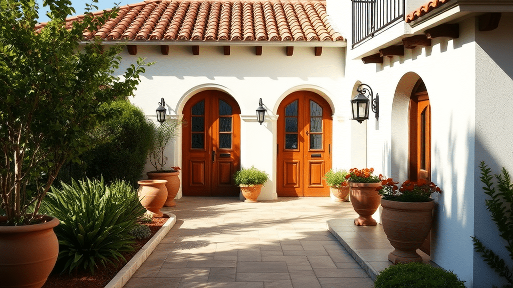
On outside walls, Dover White creates a sun-touched appearance that matches well with Mediterranean design elements. The color works perfectly alongside terra cotta roof tiles, stone pathways, and wrought iron details.
It catches and reflects sunlight throughout the day, helping maintain a bright, welcoming look from morning to evening. This shade stands up well to weather exposure while complementing outdoor greenery and clay planters.
The warm undertones work particularly well in sunny climates, where they help reduce glare while maintaining a bright, cheerful appearance.
4. North-Facing Rooms
North-facing rooms often face challenges with limited natural light and cooler-toned shadows throughout the day.
Dover White helps address these issues with its high Light Reflectance Value of 83, bouncing available light around the room effectively.
The warm undertones help balance the typically cooler light these rooms receive, creating a more inviting atmosphere. This shade works especially well when paired with warm-toned light fixtures and mirrors to maximize light distribution.
It helps create a consistently bright feel even in spaces that might otherwise seem dim or uninviting.
Where Alabaster Looks Best in Your Home
1. Living Rooms
Alabaster helps create open, bright spaces that still feel welcoming and comfortable. The gentle white tone makes rooms feel larger without the harsh glare of pure white walls.
It provides an ideal setting for colorful art pieces and furniture, letting them stand out naturally. The color stays true from morning to night, adapting well to changing light conditions.
When combined with natural textures like cotton, linen, or wool, Alabaster helps form a balanced, peaceful setting that makes guests feel at home.
2. Kitchens
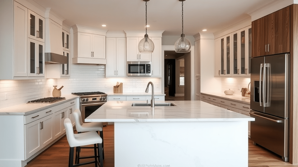
As a kitchen color, Alabaster offers a fresh look that fits many different styles. The shade works well with white marble countertops, making them appear crisp and clean.
It pairs nicely with both light and dark cabinets, stainless steel appliances, and various backsplash materials. The color maintains its neutral tone under kitchen lighting, helping food look natural and making the space feel bright.
Its subtle warmth adds comfort without competing with other design elements.
3. Modern Farmhouse
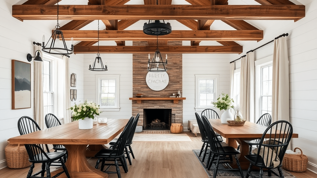
In farmhouse-style homes, Alabaster creates the perfect background for natural woods, black hardware, and textured fabrics. The color supports other design elements without taking over the space.
It matches well with shiplap walls, exposed beams, and raw wood furniture. The shade helps blend modern touches with rustic features, creating a well-balanced look.
Its gentle tone works particularly well with natural materials and simple decorative pieces.
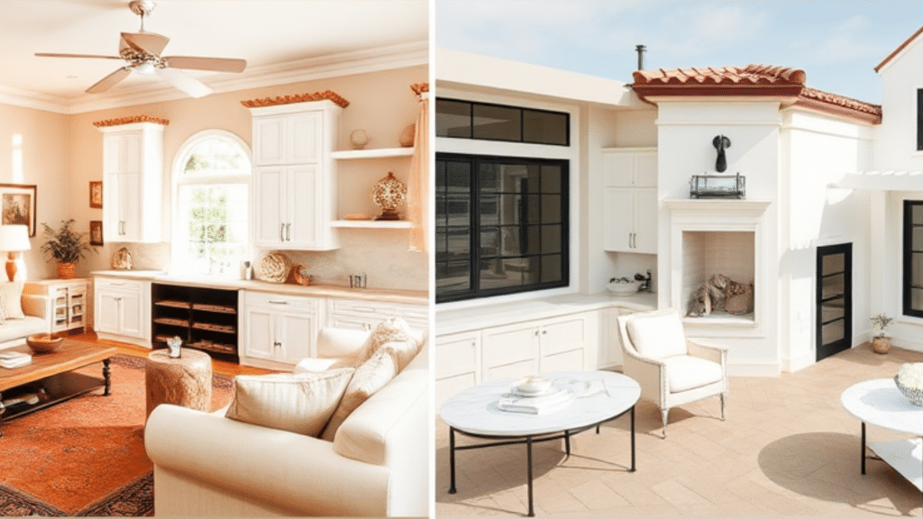
4. Exteriors
On outside walls, Alabaster shows its true flexibility. The color shifts subtly throughout the day, responding to natural light changes. Morning sun brings out its warmer side, while evening light reveals cooler notes.
It works well with various trim colors and helps highlight architectural features without looking too bright. The shade pairs nicely with natural stone, brick accents, and different roof colors, making it a good choice for many home styles.
NOTE: Both colors have their strengths, but Dover White adds richness, while Alabaster offers a more adaptable neutral white.
Which One Should You Choose?
The choice between Dover White and Alabaster depends on your space and what you want to create. Each shade brings its own strengths to your walls and can shape how your room feels.
Dover White – For Warm and Cozy Spaces
Dover White stands out best in rooms where you want to feel wrapped in warmth. The color shines in spaces with north-facing windows, where its creamy side helps fight cool light.
It makes a perfect match for homes filled with wood tones and natural textures. The shade glows softly under lamp light, making evening hours feel extra cozy.
This white works well in traditional homes that focus on comfort. It helps create spots where people want to gather and stay. The color makes spaces feel lived-in right away, perfect for family rooms and bedrooms that need a welcoming touch.
Alabaster – For Flexible Design Options
Alabaster shows its worth through its ability to work with any style choice. This shade stays balanced between warm and cool, making it easy to pair with changing decor.
It keeps rooms feeling fresh and clean without the harsh look of pure white. The color fits perfectly in modern homes but works just as well in farmhouse settings.
This white gives you room to grow and change your style. It won’t limit your color choices or fight with new decor items you bring in. The shade creates a clean base that lets other elements in your room shine while keeping spaces bright and open.
Making Your Choice
Think about what matters most in your space. Dover White makes the better choice if you want rooms that feel instantly cozy and warm.
For spaces that might change style over time, Alabaster offers more freedom. Both whites can create beautiful rooms – your choice comes down to matching your home’s needs.
Conclusion
Picking between Dover White and Alabaster matters more than most people think. Both shades shine differently – Dover White brings warmth and coziness to your rooms, while Alabaster offers clean simplicity that works with any style.
Dover White fits best in spaces where you want that extra touch of warmth, like family rooms or cozy bedrooms. Its creamy side shows up most in the evening light, making spaces feel lived-in and comfortable.
With its true neutral tone, Alabaster gives you more room to play with different styles and colors. It stays consistent in various lights and keeps spaces fresh without being too stark.
Your choice comes down to this: Do you want lasting warmth or lasting flexibility?