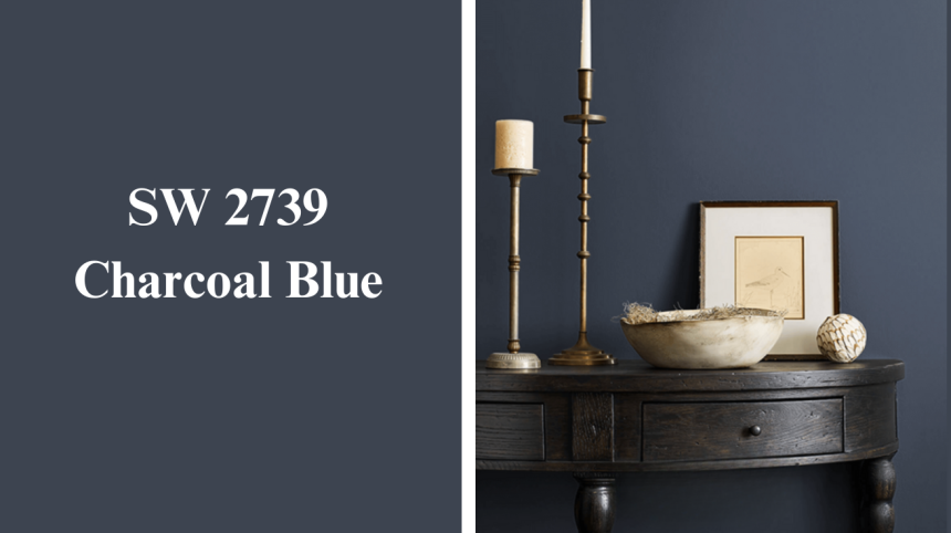
Looking for a cool color that makes your room pop without going overboard? Meet Charcoal Blue from Sherwin Williams! This nifty shade sits right between blue and gray – like that friend who can’t decide if they’re serious or silly.
Want to know what makes this color special? It can change its mood depending on the light – sometimes looking more blue, sometimes more gray. It’s like a mood ring for your walls!
Charcoal Blue works great in bedrooms, living rooms, or even as an accent wall in your study space. Pair it with crisp white trim for a clean look, or add yellow accessories for some extra zing!
Stick around as we get into everything about this fan-favorite color – from where it works best to what colors make it shine!
What is Charcoal Blue SW 2739 Color?

Charcoal Blue SW 2739 is a bold and sleek shade from Sherwin Williams that brings a deep, modern touch to any room. It’s a mix of rich blue and soft gray, creating a calming yet dramatic vibe.
This color creates a cozy, inviting atmosphere while maintaining a modern, stylish feel. If used on an accent wall or throughout the whole space, Charcoal Blue instantly adds character and depth.
It’s perfect for anyone looking to transform a room with a strong yet calming color that complements both contemporary and traditional décor styles. If you want a room that feels both cozy and chic, this shade could be your new best friend!
Understanding Charcoal Blue Paint Color Basics
Sherwin-Williams Charcoal Blue is a deep blue-gray paint color that offers dramatic depth and urban elegance. It combines the richness of navy with subtle gray undertones for a modern yet timeless appeal.
| Aspect | Details |
|---|---|
| LRV (Light Reflectance Value) | 9 (Very dark) |
| Color Category | Blue-Gray |
| Comparison | Similar to navy blue but with gray undertones |
| RGB Value | R: 58, G: 67, B: 72 |
| Hex Code | #3A4348 |
- The low LRV means Charcoal Blue absorbs more light, making it perfect for cozy spaces.
- It has a more muted, modern look compared to bright blues.
- The mix of blue and gray makes it a usable color for both modern and traditional styles.
Why Choose Charcoal Blue SW2739?
Charcoal Blue SW 2739 is an excellent choice for anyone looking to add a bold yet calming touch to their space.
-
Modern and Versatile:
Charcoal Blue combines deep blue and gray, making it a great fit for both modern and classic interiors. If you have contemporary furniture or vintage pieces, this color works well with different styles. -
Perfect for Creating Atmosphere:
Its rich, dark tone gives any room a cozy, intimate feel. It’s ideal for spaces like bedrooms, living rooms, or even dining areas where you want to create a relaxing and welcoming vibe. -
Pairs Well with Multiple Colors:
Charcoal Blue looks beautiful when paired with light neutrals, metallics, or even natural wood. It’s a great color for accent walls, trims, or even as a whole-room color, adding depth and dimension to your home.
This color not only makes a room look more stylish but also sets the perfect mood for relaxation and comfort.
How Charcoal Blue Will Look In Interior Design
Charcoal Blue SW 2739 is a striking color that brings a sense of depth to any space. Its rich, cool tones create a balanced atmosphere, making it perfect for transforming your home into a stylish, cozy retreat.
Living Room
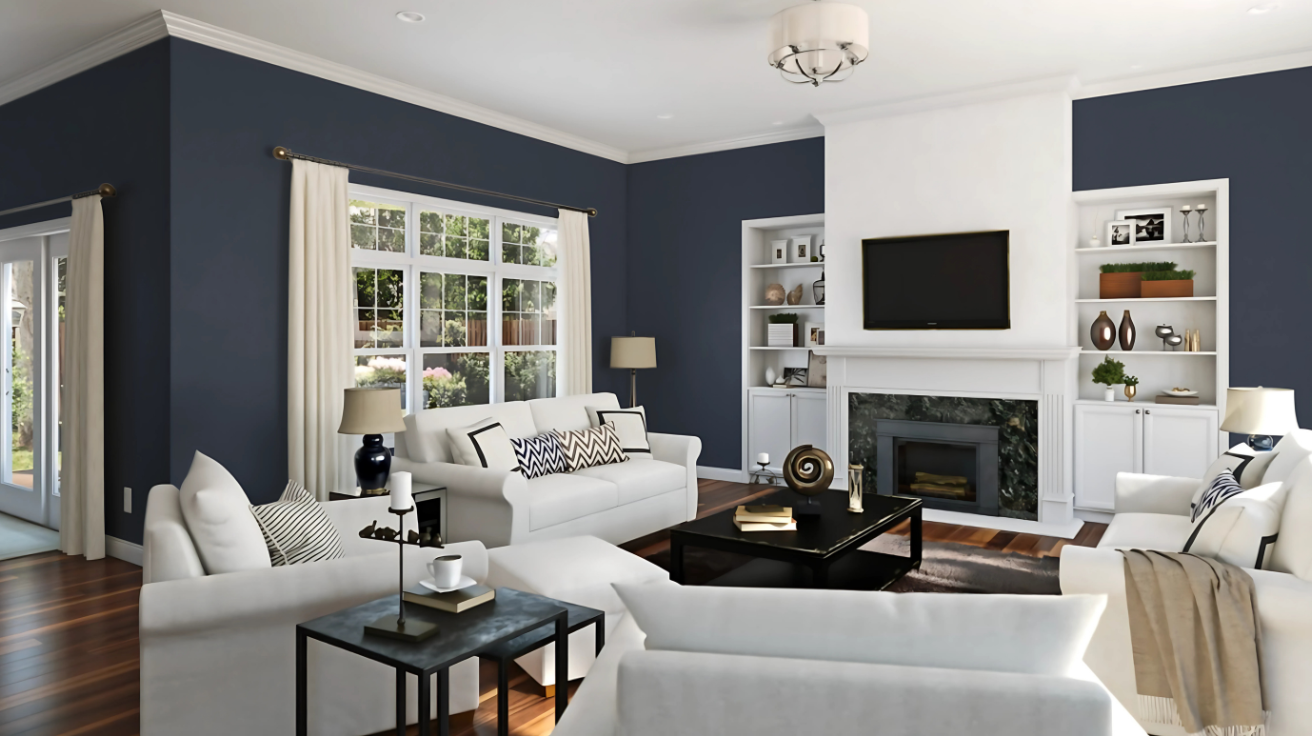
- It adds a calm and cozy feel to living rooms.
- Pairs well with light-colored furniture and metallic accents for a modern touch.
- Ideal for accent walls or creating a focal point in the room.
Bedroom
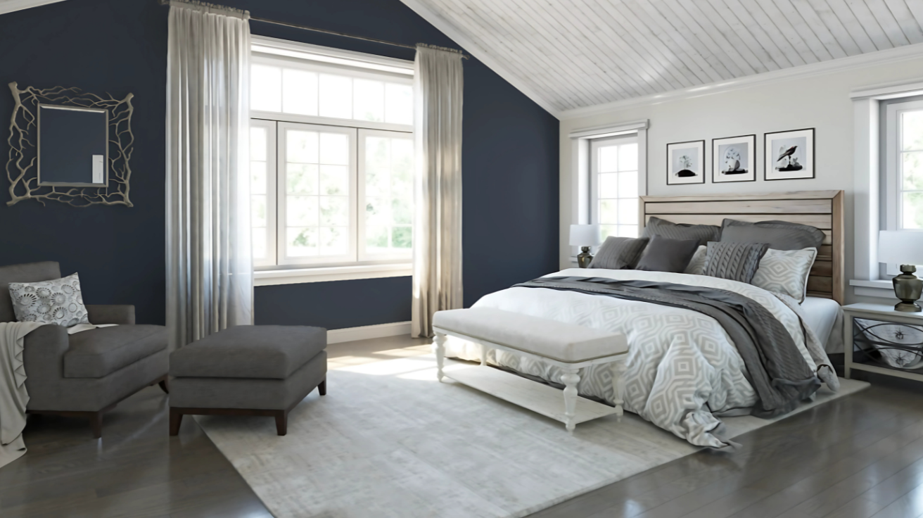
- Creates a calm, serene environment perfect for restful sleep.
- Works beautifully with soft neutrals, textiles, and warm lighting.
- Excellent for accent walls behind the bed or for a full room makeover.
Bathroom
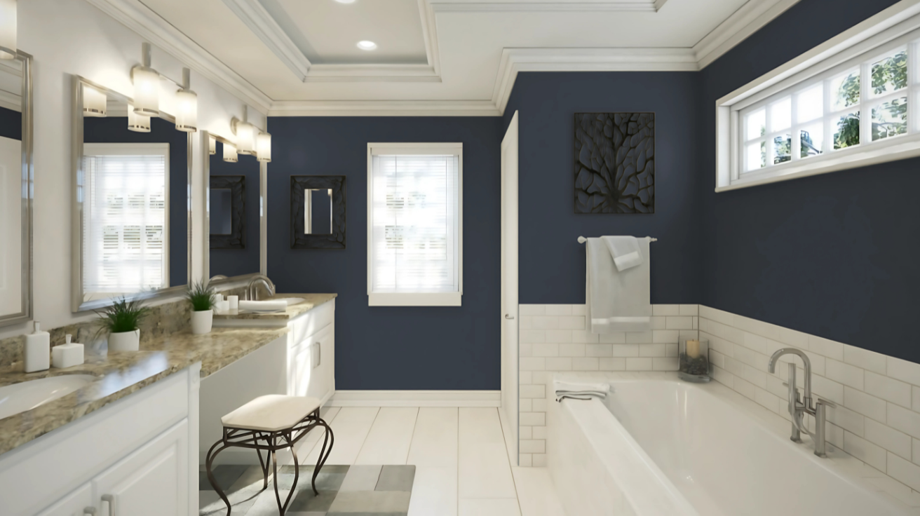
- Charcoal Blue adds a spa-like, calming vibe to bathrooms.
- Pairs well with white fixtures and natural wood accents for balance.
- Great for creating a modern, stylish feel in smaller bathrooms.
Tips for Using Charcoal Blue
Charcoal Blue is a versatile and bold color that can turn any space with its depth and style. When used correctly, it creates a striking yet balanced atmosphere that complements various lighting, trim, and finishes.
1. How Lighting Affects Charcoal Blue:
- Warm vs. Cool Lighting: Charcoal Blue can look significantly different depending on the type of lighting. Warm lighting brings out the richness and depth of the color, making it feel cozier and more inviting. Cool lighting, on the other hand, can make Charcoal Blue appear more dramatic.
- Layer Lighting: Use layered lighting with a mix of ambient, task, and accent lights. Consider placing spotlights or table lamps to highlight the richness of Charcoal Blue walls or furniture.
- Natural Light: Charcoal blue can appear more vibrant and lively in spaces with lots of natural light. It’s ideal for living rooms or open spaces with abundant sunlight.
2. How to Use the Right Trim:
- Contrast for Impact: When paired with white or light-colored trim, Charcoal Blue stands out and adds drama. This contrast creates a clean, sharp look that enhances the color’s depth.
- Soft Trim for a Subtle Look: For a more muted and subtle look, choose trim in a softer color, like light gray or a soft wood finish. This helps keep the focus on Charcoal Blue without overwhelming the space.
- Glossy vs. Matte Finish: High-gloss trim can create a more modern, polished effect against Charcoal Blue. A matte trim will keep the look understated andmodern.
3. Surface and Finishes:
- Matte and Velvet Finishes: Matte finishes work well with Charcoal Blue, as they give the color a soft feel. Velvet or satin finishes can add a touch of luxury, making Charcoal Blue perfect for accent walls or statement pieces.
- Textured Surfaces: Charcoal Blue looks good on textured surfaces, such as a rough brick wall or a fabric-covered headboard. The texture adds visual interest and highlights the depth of the color.
- Complementary Materials: Pair Charcoal Blue with materials like brass, gold, or marble to bring out its richness. Charcoal Blue works well with both light and dark woods, creating a balance between warmth and cool tones.
These tips will help you make the most out of Charcoal Blue, whether in a cozy living room, a dramatic accent wall, or a trim and finishes.
Color Pairings and Combinations for Charcoal Blue

Pure White (SW 7005): This classic combination offers a sharp contrast, with Charcoal Blue making a bold statement against the crisp and clean Pure White.
Golden Fleece (SW 6388): The warm, rich tone of Golden Fleece adds a cozy feel, balancing the cool depth of Charcoal Blue for a dynamic yet inviting space.
Rainwashed (SW 6211): Rainwashed pairs beautifully with Charcoal Blue, creating a serene and harmonious look that evokes a sense of calm and nature.
Paint Colors: Perfect Alternative to Charcoal Blue

Naval(SW6244): This deep navy blue brings elegance and depth to any room.
Rainstorm(SW6230): It is a calming, muted grayish-blue, ideal for creating a serene and peaceful atmosphere.
Azure Tide(SW9684): It is a refreshing, bright blue with a touch of turquoise, evoking a tropical, tranquil feel.
Smoky Blue(SW7604): This soft, muted blue-gray creates a calm atmosphere in any space.
Wrapping It Up
Looking at everything, Charcoal Blue from Sherwin Williams is a total winner for anyone wanting a cool, calm room. This blue-gray mix changes with different lights, making it super flexible.
Remember these key points: It has a low LRV of 9, works in bedrooms and living rooms, and looks cool with white trim or yellow stuff. The color makes spaces feel cozy without being boring!
Want something different? Try Naval, Rainstorm, Azure Tide, or Smoky Blue as other options.
When picking colors for your room, Charcoal Blue SW 2739 is worth considering. It’s not too bright, not too dark—just right for making your space look put-together without trying too hard.
So grab a paint brush and see how this color can change your room to totally cool!