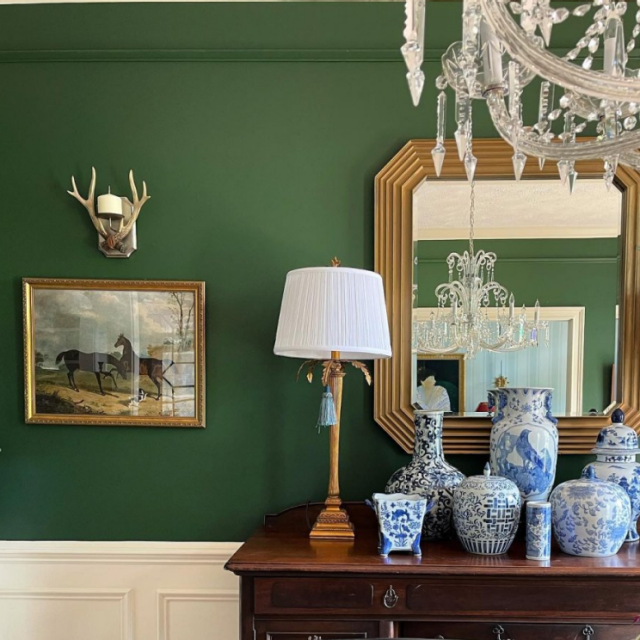
The enthralling world of paint colors is huge, and the selection of them is much more difficult! But here we are, making your job a bit easier. If you’re seeking some of the most exquisite and greatest green-blue paint colors, you’ve come to the perfect place.
Paint colors are an element that can breathe life and energy into your favorite spaces. Sherwin Williams, a superb paint manufacturing company, brings the world a fascinating palette of green-blue paint colors that turns walls into a ‘work of art.’
Whether you imagine your space to reflect a calm coastal feeling or give you bold energy, we’ve picked a palette of colors that will let you instantly pick up the paintbrush and showcase your creativity on the walls.
So, without further ado, let us plunge into the vibrant world of Sherwin Williams’ greatest green-blue paint colors that will evoke a sense of serenity and redefine the way you perceive your home.
Top Picks from Sherwin Williams’s Vivid Palette of Green Blue Paint Colors
Let’s look at the top picks of Sherwin Williams’s colorful palette of green-blue paint colors that are definitely going to leave you in awe one by one:
Green Paint Colors
1. Evergreen Fog SW 9130
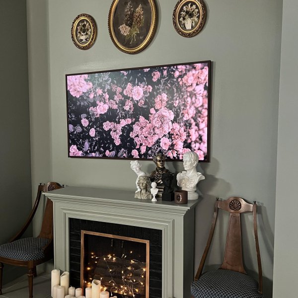
This shade of green paint color, also ‘Color of the year 2022’, is a captivating color that infuses the sense of tranquillity and serenity in the space used. Whether you use it in the living space, bedroom, or kitchen, this color spreads freshness and positivity wherever painted on walls.
Everygreen fog is a muted, medium-toned green with greyish undertones. It catches the vibe of a forest in the calm morning and birds chirping, developing the surrounding quietness. The versatility of this color helps it go with the diverse interior design styles and in all the blends of traditional and modern furniture. Warm neutrals, such as soft beiges or creamy off-whites, can help to achieve a harmonious balance and provide warmth to the room.
2. Halcyon Green SW 6213
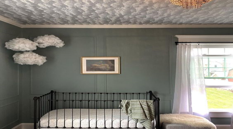
Taiga, an eminent shade of green, is all about its rustic and refined look. This green paint color is the perfect tone for giving any room a sense of traditionalism and old vintage charm. The neutral tone of this color creates a peaceful aura around it. Perfect to be used in any space, this color is sure to turn that space into your favorite sanctuary.
The blend of this color is best suited with neutral tones like white, off-white, and creamish and Metallic tones like golden or silver. This mood-refreshing tone is sure to turn your walls into your joyful surrounding with a pinch of calmness.
3. Leapfrog SW 6431
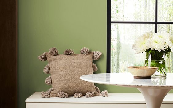
This tacky green paint color is a treat to your home as it spreads the space with happy and joyful vibes. The modern touch of this color balances out the warmth of the room with the loudness of the tone. This green color can be used in all the rooms and even in your kitchen to make you happy while you cook!
The ingenuity of Leapfrog allows it to pair up with all the tones of furniture, be it dark, light, or metallic, as per any individual’s choice. Any dull day can be turned into a happy day with the magic of this paint color on the walls.
4. Secret Garden SW 6181
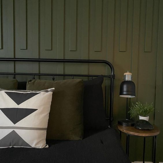
The ‘expert pick’ green paint color, Secret Garden, just goes with its name- the calmness of the garden and secretive with its serenity. The magical bloom of this tone spreads like the greenery of trees in the room used, balancing the essence of sophistication and peace at the very same time.
This understated paint color can absolutely pump up the overall appearance of your favorite space when combined with white furniture. For a more contemporary appearance of your room, try to add home decor like vases and showpieces of metallic colors such as bronze or gold that can elevate the charm of this green paint color.
5. Celery SW 6421
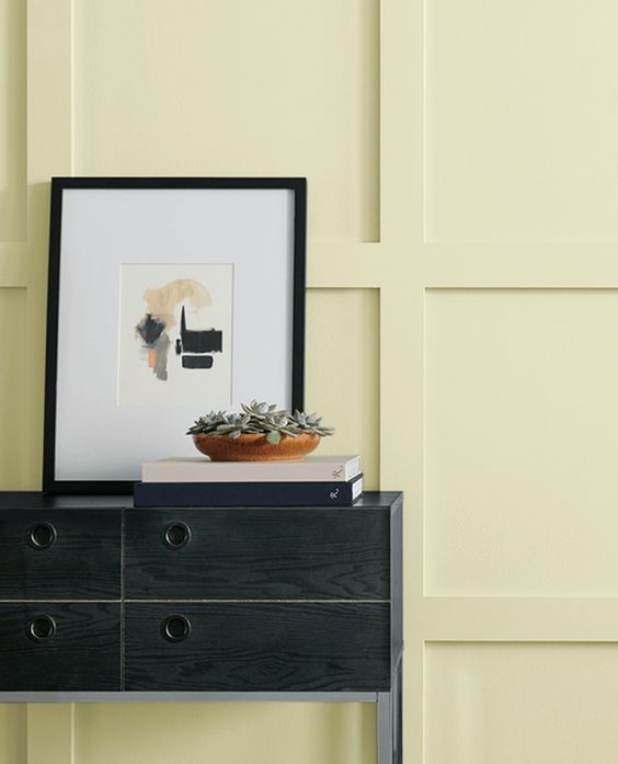
With the yellow undertone in the light green tone, this green paint color is all about dropping a sense of refreshing and soothing essence in the air of the room used. This visually appealing color tone can enticingly win the heart of people and make the start of their day with real joy and happiness.
The appearance of this color in the light, be it natural light or artificial light, elevates the look of the room perfectly and beautifully adapts to all because of its versatility. Pairing up Celery with particularly whiter tones can leave your visitors speechless and you with tonnes of compliments.
6. Soft Sage SW 9647
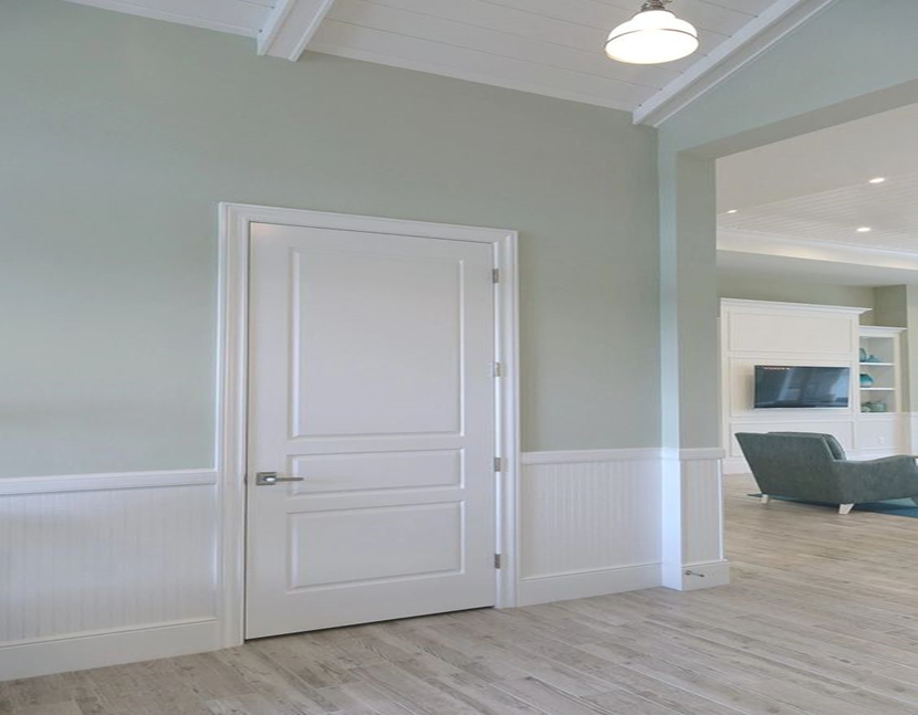
Treat to the eyes, the Soft Sage, green paint color is perfect for people to use in their rooms who prefer neutrals. The essence of positiveness that this color drops to the space used is mind-blowing and extremely attractive.
This captivating tone of green can be blended up with all the other combinations of the room very easily and beautifully. The soothing touch of this paint color glows in the natural light and adds a touch of class and sophistication to the overall appearance of the room used, be it your kitchen, bedroom, or your living room. This paint color is a great choice for people who love nature.
7. Retreat SW 6207
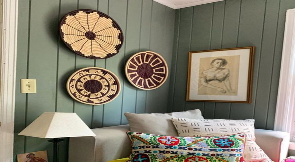
Frosted form, the combination of olive green and light green, is a perfect pick for the modern interiors these days. The contemporary look that this color displays in the space used turns that entire space into a beautiful perfect sanctuary that keeps you attached to this tone.
Furniture of metallic tones perfectly combines with the aura of this green color that not only keeps attracting you but also makes your guests stay in for a longer time! This green paint color also has a tendency to make your room appear expansive and add depth to all the corners. With this eye-soothing paint, you’re surely going to fall in love with the room all over again.
Blue Paint Colours
Let’s delve into the magic that these blue paint colors carry with them:
8. Azure Tide SW 9684
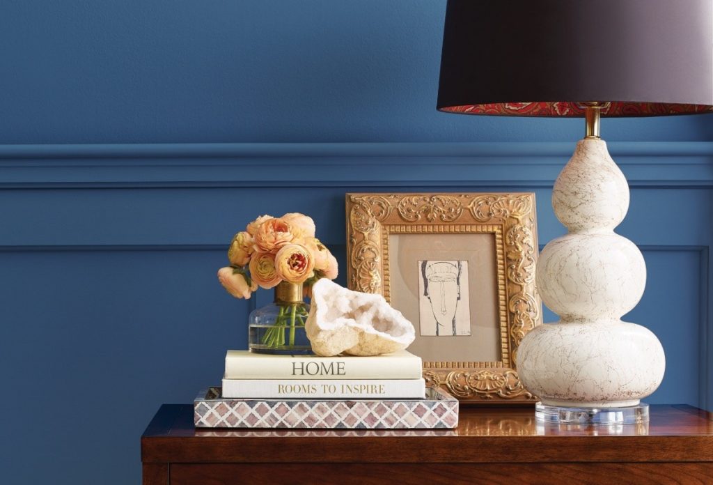
The easy breezy tone of blues is always fascinating, and this Azure Tide blue paint color, offers the entire space a sense of coolness with its usage on walls. The darker tone of this color creates a stunning atmosphere around itself with the essence of sophistication and classiness.
With an ultimate advantage to the versatility of blue tones, any tone of furniture of lighter tones can be easily set up with the overall theme of the room. Blue has a very natural tendency to be a mood lifter tone, and the same is with this paint color. Even on your bad day, this paint color can be a joy extractor.
9. Dew Drop SW 9641
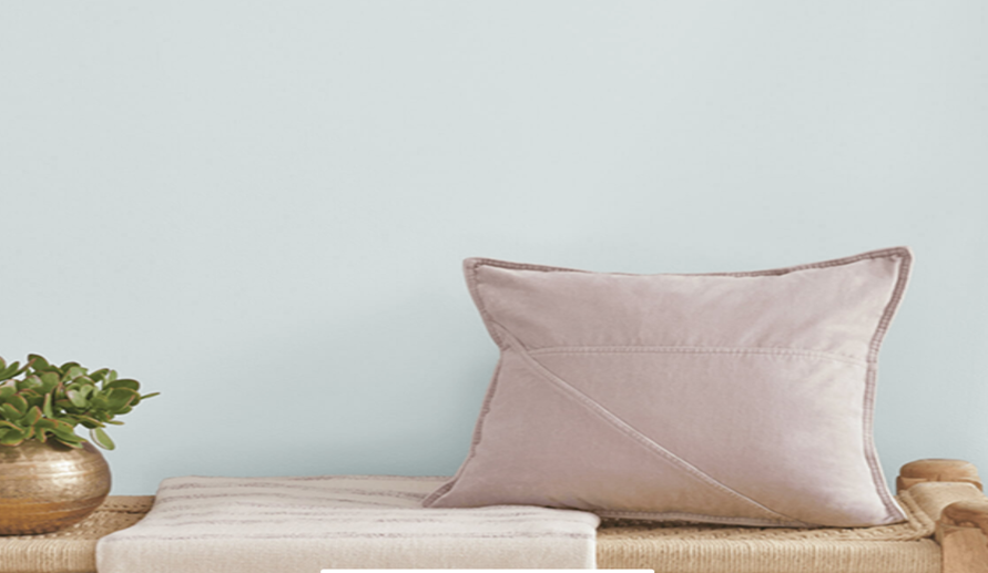
Be it any season; lighter tones are always eye soothing. The dew drop, light blue paint color, with the tone of blue and undertone of grey, is no exception to the magic that it creates on the walls when applied. The natural and appealing aesthetics of this blue paint color can create airy surroundings.
Azure Tide works well with natural materials and textures in furniture and design. Light-colored woods, such as driftwood or faded oak, can contribute to the tranquil atmosphere of the room. Incorporating features such as jute rugs could be helpful in improving the overall aesthetic of the room.
10. Aleutian SW 6241
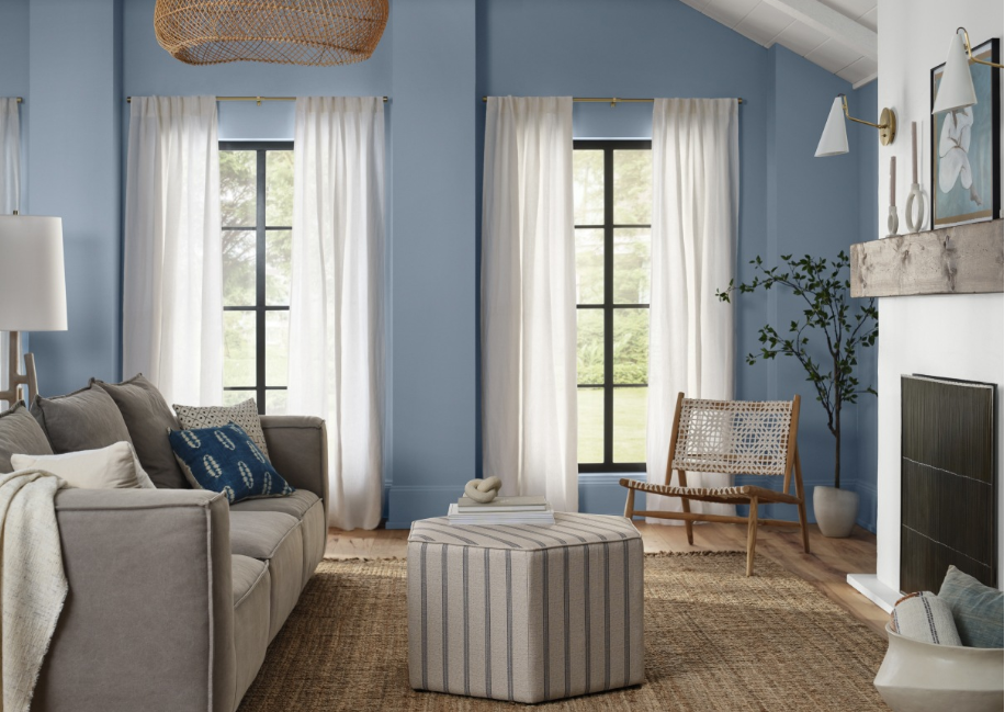
The Aleutian, blue paint color, is all about the magic of the shade of a clear blue sky with crystal-clear clouds on the walls. The comforting and relaxing vibe that this color carries along with itself is one of the stunning effects of this tone.
Aleutian exceptionally looks great with tones such as cream, white, and grey, portraying a class and clean appearance. Additionally, Aleutian can be used in conjunction with deeper blues or greens to create a more dramatic and dynamic environment, allowing Aleutian to take center stage while maintaining a balanced overall effect. Having this color on your walls is like waking up with the aesthetics of clear and quiet mornings.
11. Moscow Midnight SW 9142
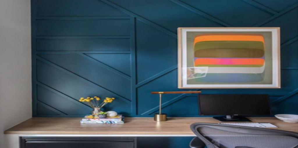
The deep and rich tone of Moscow Midnight reminds us of the dark night sky, exuding a vibe of elegance and mystery at the same time. This color is a perfect choice for those who prefer sophistication and making a statement in their home interiors.
This color is best for your living room as it creates a dramatic scene with a classic vibe. Pairing up this blue color with lighter shades of furniture so as to create a striking contrast between the overall combinations of the room. This blue paint color in natural light or artificial light adds depth to the room and even elevates the richness that its color carries around itself.
12. Slate Tile SW 7624
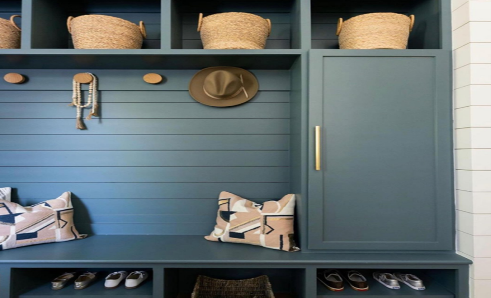
From the family of neutral paint colors, the blue & grey tone of Slate Tile is all about the timeless beauty that this color displays with itself. The flexibility that this color carries along with itself is highly preferred in modern interiors.
Slate Tile offers the perfect blend of warmth and coolness, making it an immensely versatile choice for a wide range of interior design styles. Also, due to the neutral nature of this blue paint color, it can be paired up with any tone of pieces of furniture and mixed up easily with the room’s overall color combination. Giving you an essence of peace and serenity, this color is surely going to attract you.
13. Lakeside SW 9683
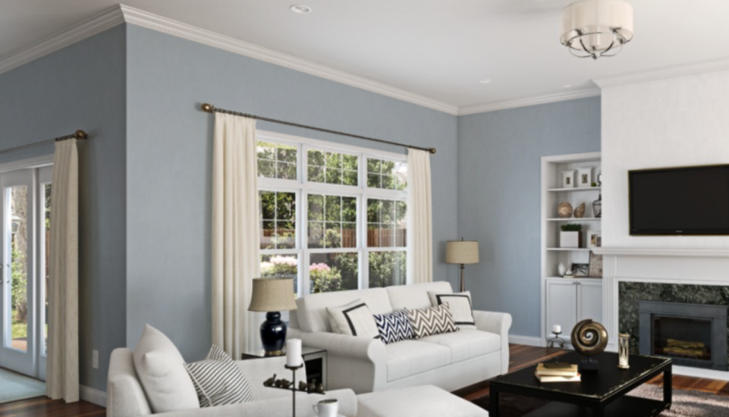
The ‘expert pick’ color, Lakeside, is an effortless blue paint color that oozes beauty with its subtle tone. With a clean appearance, this color is definitely going to make your room look more organized and sophisticated.
The natural tone of this color can make you feel calm and quiet and also add a touch of peace wherever applied. Lakeside color can be best combined with the natural tones or white tones of furniture, giving a very elegant aesthetic in the overall appearance of the space. With such a serene atmosphere around you created by this color, you’ll always be energized and happy.
14. Favorite Jeans SW 9147
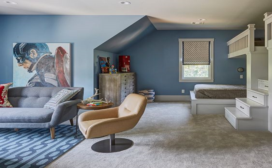
Favorite jeans, a perfect blue paint color, help you transport to the good old times and cherish good old memories with their classic and timeless appeal. This blue color is extremely versatile and can be used in any space that you like, whether it is your living room, bedroom or your, kitchen, or outdoors. This color has got you covered completely.
Because of the flexibility that this color carries along with itself, any warm or lighter tones of furniture would pair up really well with the overall aesthetic of the room. With the quietness that this color reflects, you’ll want to paint every wall in your house with this color!
To Summarize
Green-blue paint colors from Sherwin Williams let you portray your creativity on the walls of your favorite space where you can relax and have an absolutely loving “me time” and that you’ll keep cherishing and looking at them all day and every day.
Beautiful and aesthetically appealing, these green-blue paint colors are soothing yet trendy to give your complete house a sense of modern and classic touch, both at the very same time.
Also, the adaptability that these paint colors carry among themselves is perfect for all interior designs to choose from through the variety of options and different undertones. So, go ahead and tell us how you feel about these green-blue paint colors from sherwin williams by leaving a comment below!

