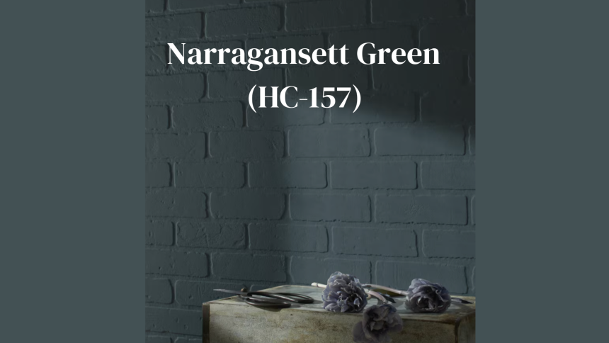
Ever walked into a room and felt instantly calm, like you’ve stepped into a peaceful forest? That’s the magic Benjamin Moore Narragansett Green (HC-157) can bring to your home.
This rich, deep green has become a favorite choice for homeowners who want to bring nature indoors. With its perfect balance of blue and yellow undertones, it creates spaces that feel both cozy and sophisticated.
What makes Narragansett Green special? Unlike some greens that can feel too bright or too dark, this shade hits the sweet spot. It works beautifully in living rooms, kitchens, and even as an eye-catching front door color.
Many people report feeling more relaxed and at home after painting with this shade. It pairs wonderfully with natural wood tones, crisp whites, or warm brass fixtures.
Ready to see if Narragansett Green is right for your home?
What Is Narragansett Green?
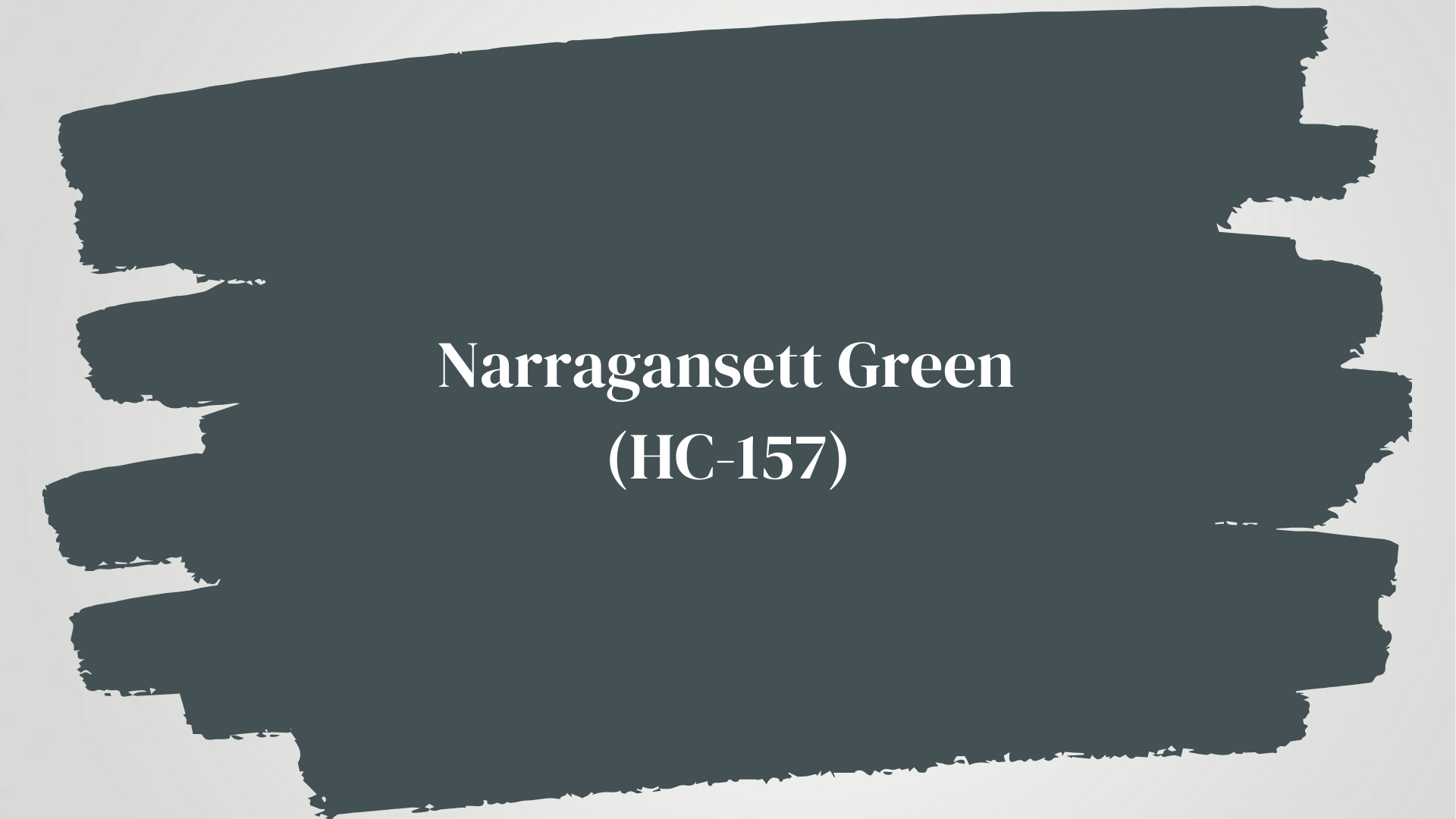
Narragansett Green (HC-157) is a deep, moody green paint color with subtle blue-gray undertones from Benjamin Moore’s Historical Collection.
This versatile shade stands out for its balance—not too bright yet not too dark—making it perfect for creating spaces that feel timeless and fresh.
The color brings the soothing quality of nature indoors while adding depth and character to any room.
Here’s a quick breakdown of everything you need to know about this popular paint color:
| Feature | Details |
|---|---|
| Color Code | HC-157 (Historical Collection) |
| Color Family | Green |
| Undertones | Blue-gray |
| Light Reflectance Value (LRV) | 9.14 |
| Pairs Well With | Crisp whites, warm woods, brass fixtures, cream, taupe |
| Finish Options | Matte, eggshell, satin, semigloss, high-gloss |
Where to Use Narragansett Green in Your Home
This versatile green works in more places than you might think. Its depth makes it perfect for creating focal points, while its natural vibe helps spaces feel grounded and connected.
Here are the top spots where Narragansett Green truly shines:
Bathroom Walls
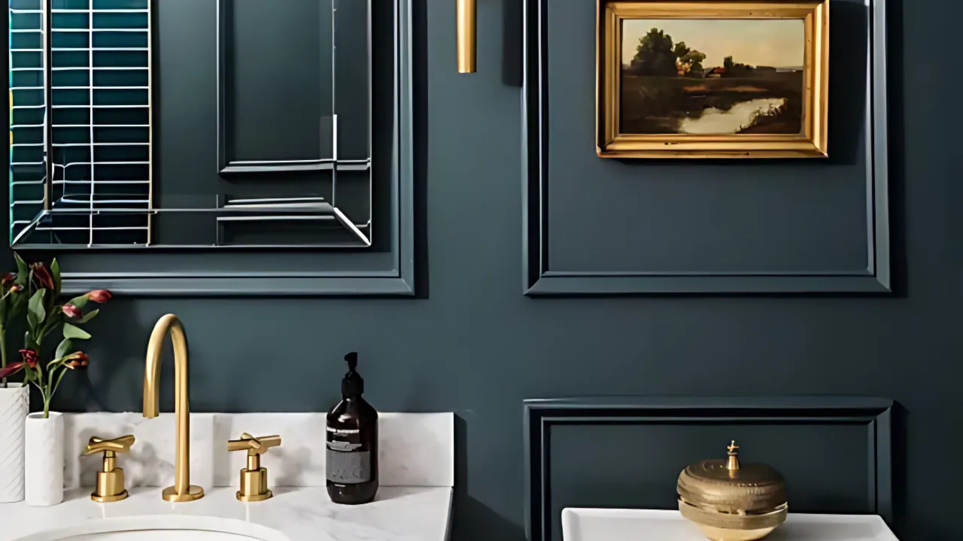
Narragansett Green changes ordinary bathrooms into spa-like retreats. The deep tone creates a sense of luxury and calm that’s perfect for a space dedicated to relaxation.
For larger bathrooms, this green creates a cocoon-like atmosphere that invites long soaks in the tub. White fixtures stand out beautifully against this backdrop, and natural stone elements like marble or travertine complement its earthy quality.
Kitchen Cabinets
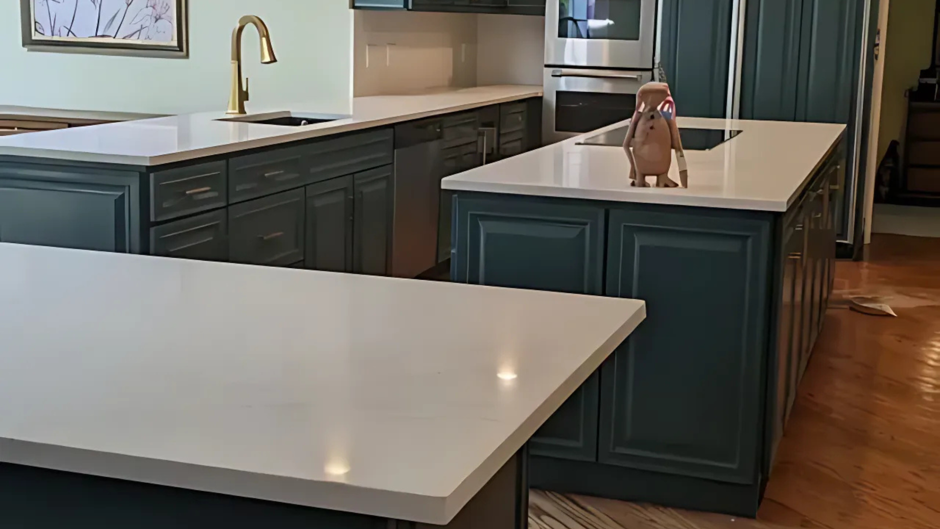
Are you looking for a cabinet color that stands out from the usual white or wood? Narragansett Green kitchen cabinets make a statement while still feeling timeless.
They look especially striking with marble countertops, brass hardware, and under-cabinet lighting that highlights their rich color.
Living Rooms
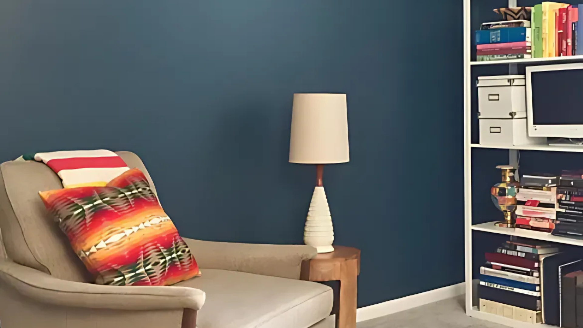
For a cozy, wrapped-in-comfort feeling, Narragansett Green works beautifully in living rooms and dens. The color creates a perfect backdrop for bookshelves, artwork, and natural materials.
It also looks great in rooms with lots of natural light, which brings out its complex undertones.
Exterior Siding or Front Doors
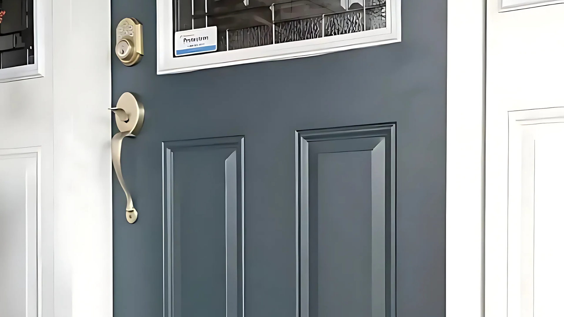
Make a statement from the curb with Narragansett Green on your home’s exterior. As a front door color, it offers a welcoming yet distinctive entrance.
For the brave, full exterior siding in this shade creates a home that stands out while still connecting beautifully with landscape elements.
Color Pairings That Make Narragansett Green Shine

The right color companions can transform Narragansett Green from beautiful to breathtaking. When paired thoughtfully, this deep green creates balanced and visually appealing spaces.
Here are the combinations that designers consistently recommend:
Swiss Coffee (OC-45)
This soft off-white gently contrasts with Narragansett Green. Its creamy undertones create a warm feel, perfect for trim, ceilings, and adjacent walls in kitchens and living areas.
White Ice (2139-70)
A crisp, nearly-white color with subtle blue undertones complements the blue-gray notes in Narragansett Green, creating a fresh, modern look suitable for bathrooms and bedrooms that seek a clean yet grounded aesthetic.
Manchester Tan (HC-81)
This warm beige pairs well with Narragansett Green. Manchester Tan enhances the green’s richness and maintains cohesion, making it ideal for connecting open spaces.
Tranquil Blue (2051-50)
This soft blue with Narragansett Green creates a palette inspired by forests and water. The combination is harmonious yet offers contrast to define spaces. Use Tranquil Blue for accessories or adjoining rooms for a cohesive look.
Similar Shades: Narragansett Green vs. Amazon Green
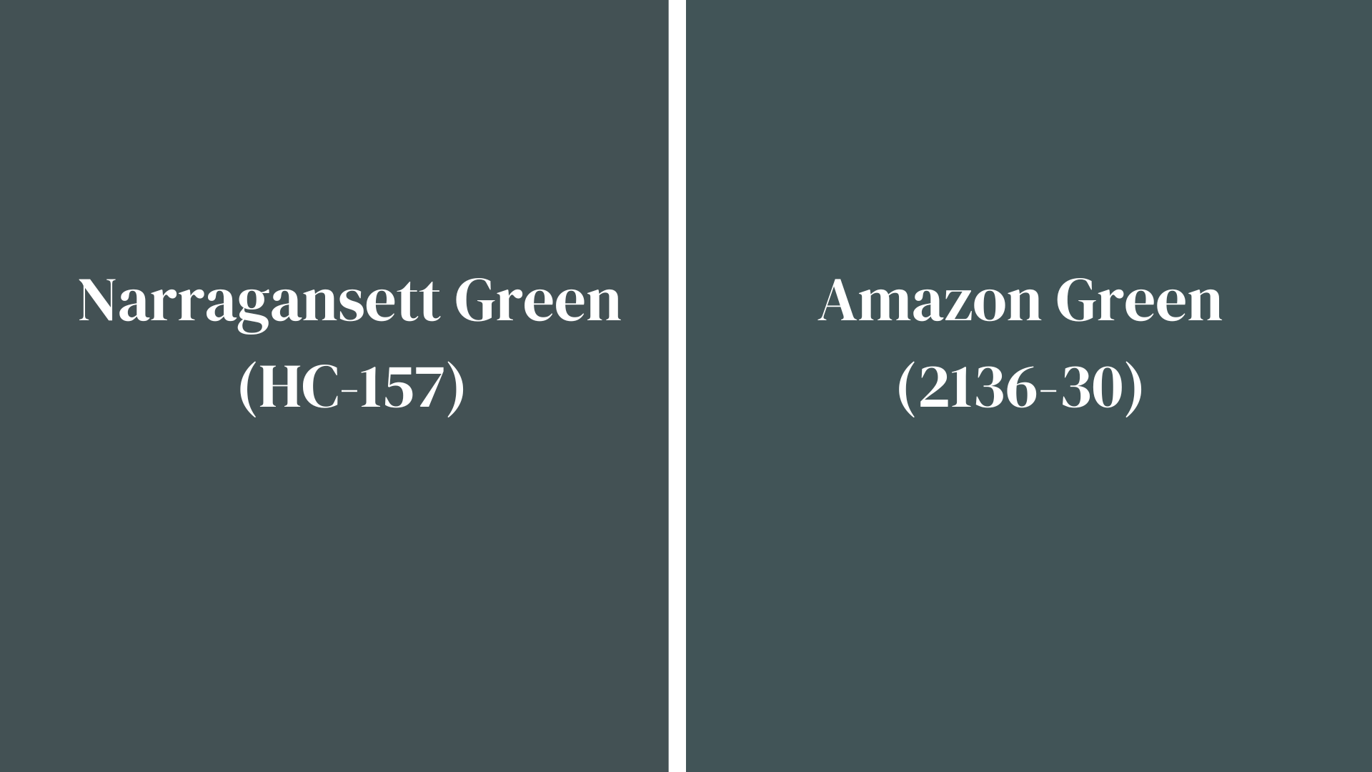
Confused between these two popular Benjamin Moore dark greens? Both create stunning spaces but have distinct personalities. Here’s a straightforward comparison to help you choose the right green for your project:
| Feature | Narragansett Green (HC-157) | Amazon Green (2136-10) |
|---|---|---|
| Undertones | Blue-gray | Yellow-olive |
| Depth | Medium-deep | Darker, more intense |
| LRV | 8-10 | 5-7 |
| Feel | Classic, balanced | Rich, dramatic |
| Best Pairings | Swiss Coffee, White Ice | Cloud White, Muslin |
| Best For | Versatile use, traditional spaces | Bold statements, accent walls |
While both colors create sophisticated spaces, Narragansett Green offers more versatility with its balanced blue-gray undertones.
Amazon Green delivers more drama and warmth with its deeper intensity. Your choice depends on whether you want a timeless, adaptable green or a bolder statement color that commands attention.
Arragansett Green: How Light Changes Everything
Narragansett Green Changes dramatically throughout the day and under different lighting conditions, making it a dynamic choice for your walls:
Morning Light
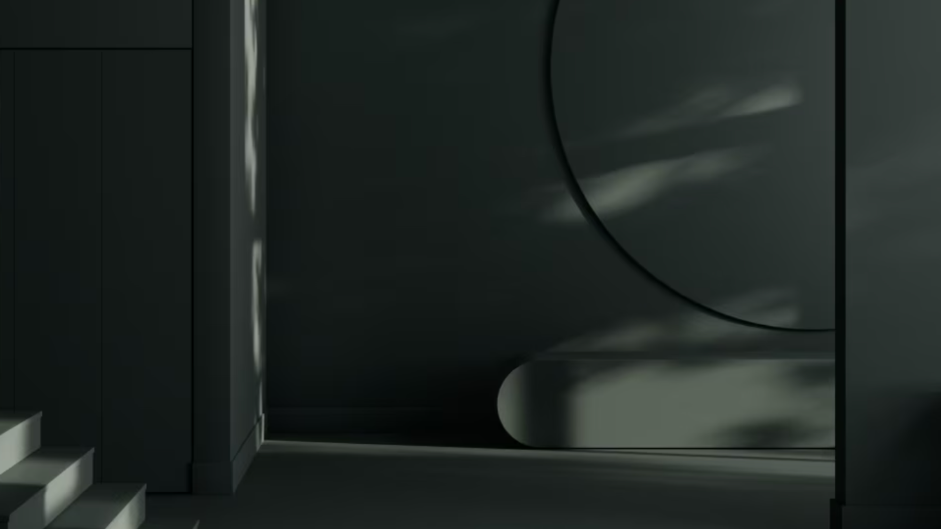
In early morning light, Narragansett Green reveals its softer side. The gentle eastern light brings out the color’s gray undertones, creating a muted, calming effect.
The color appears more subdued and creates a peaceful backdrop for starting your day. This morning character works particularly well in kitchens and breakfast areas where people gather.
Afternoon Light
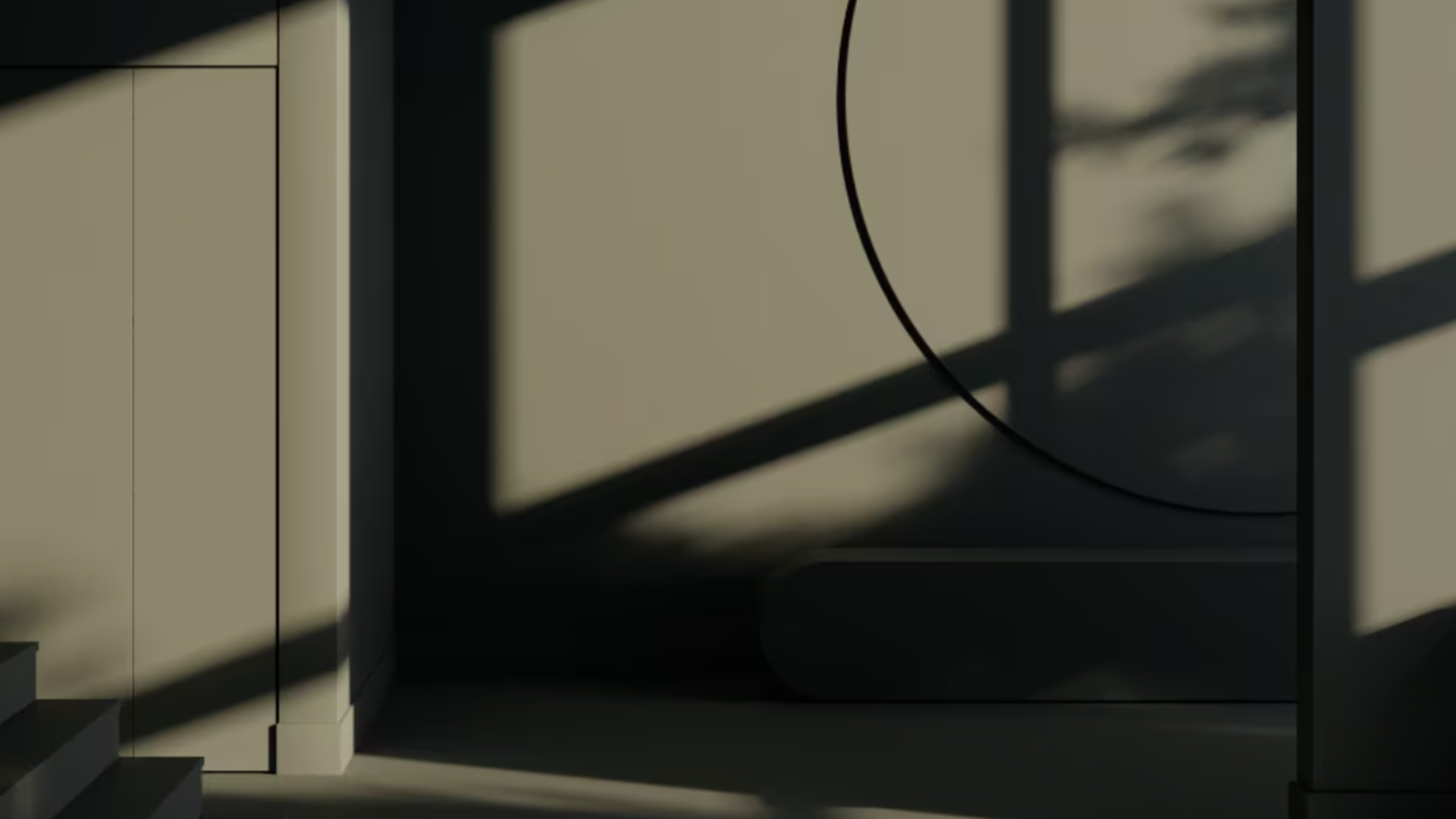
As the sun reaches its peak, Narragansett Green shows its true depth. The stronger midday light illuminates the rich forest green quality of the paint.
In south-facing rooms, the color maintains its intensity while in west-facing spaces, it gains warmth as the afternoon progresses. This is when the color looks most balanced and true to how it appears on color cards.
Ambient Lighting

Under artificial lighting, Narragansett Green responds differently depending on your bulb choice. Warm white bulbs (2700-3000K) enhance the color’s richness and depth, making spaces feel cozy.
Cool white bulbs (3500-4100K) bring out the blue undertones, creating a crisper look. LED lighting generally shows the truest version of the color, while incandescent lights add warmth to the green.
Night Lighting

After sunset, Narragansett Green deepens significantly. Under typical evening lighting, the color appears almost black in corners and shadows while maintaining its green identity in well-lit areas.
This creates an interesting dimension in the room. The contrast between light and dark areas becomes more pronounced, making the space feel layered and sophisticated during evening hours.
Tips for Testing It First with Paint Samples
Before committing to Narragansett Green, test it properly:
- Paint large sample boards (at least 12″ x 12″) rather than small swatches
- Move the sample around different walls in your room at different times of day
- View the color next to your flooring, furniture, and trim to ensure compatibility
- Check how it looks under both natural daylight and your evening lighting
- Test in the actual room where you’ll use it, as adjacent rooms’ colors can reflect on the walls
Final Thoughts!
Narragansett Green (HC-157) stands out as a bold color choice that brings depth and character to any space. This rich shade offers something different from the typical neutrals many homeowners default to when uncertain about color.
For those willing to step beyond beige and gray, this green delivers a sophisticated look that connects interiors with nature.
Its chameleon-like quality—shifting from blue-tinted forest green in daylight to a deep, cozy hue at night—means you get multiple looks in one color.
Before committing, take time to sample this paint in your actual space. Watch how it changes throughout the day and under different lighting conditions.
While not for the color-shy, Narragansett Green rewards the brave with spaces that feel both timeless and fresh—a rare combination in the world of interior design.

