Ever walked into a room and felt instantly calm? That’s the magic of the right blue.
Hamilton Blue from Benjamin Moore isn’t just another color on a paint strip. It’s that friend who never goes out of style, ready to make your home feel both fresh and timeless.
This rich, deep blue brings warmth to any space without trying too hard. Perfect for kitchens that need a touch of character or bedrooms calling for peace.
What makes Hamilton Blue special is that it plays well with others. Pair it with warm woods for a cozy feel or crisp whites for something more open and breezy.
Ready to bring this tried-and-true color home? Let’s look at why Hamilton Blue might be the answer to your painting questions. Your walls are waiting – and they might just look best in blue.
Hamilton Blue: A Classic and Versatile Blue
Hamilton Blue is a deep, muted blue from Benjamin Moore’s Historical Collection. Inspired by rich heritage tones, this shade strikes a balance between style and warmth.
With its subtle gray undertones, it adapts beautifully to various lighting conditions, making it a versatile choice for interiors and exteriors alike.
Ideal for creating depth and character, Hamilton Blue works well in both modern and traditional spaces. Its medium-dark depth ensures it adds richness without feeling overwhelming, while its cool undertones provide a calming effect.
Below is a detailed overview of the key features and specifications of Hamilton Blue:
| Property | Value |
|---|---|
| LRV (Light Reflectance Value) | 18.25 |
| Color Category | Blue |
| Comparison | A dark, stony shade of blue steeped in history |
| RGB Value | 95, 118, 127 |
| Hex Code | #5F767F |
Where to Use Hamilton Blue in Your Home?
Hamilton Blue is a versatile shade that can elevate any space, adding depth and character. Whether used on walls, cabinetry, or exterior accents, it creates a timeless and inviting atmosphere.
Here’s how it works in different areas of your home.
Living Room
-
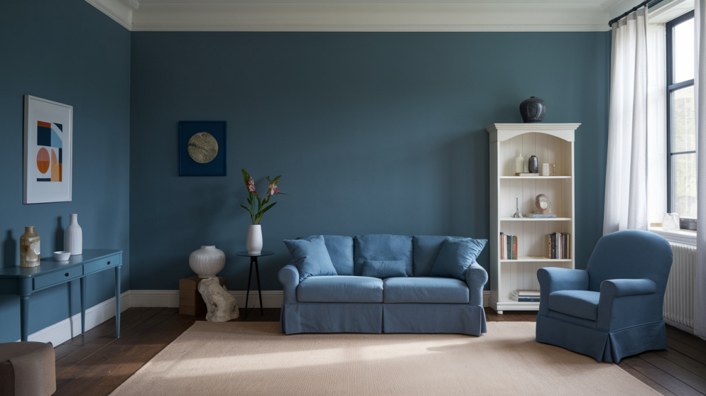
Hamilton Blue creates a warm yet refined atmosphere, adding depth without making the space feel too dark or overwhelming, making it perfect for cozy yet stylish interiors.
-
This shade pairs beautifully with neutral and earthy tones like beige, taupe, and off-white, helping to create a well-balanced space that feels both inviting and grounded.
-
It enhances natural light in bright rooms while providing a moody and intimate ambiance in spaces with lower lighting, making it highly adaptable to different environments.
Bedroom
-
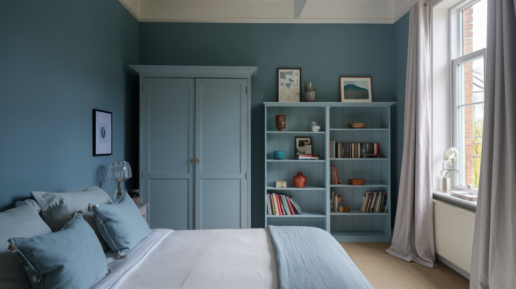
Hamilton Blue promotes a calm and restful ambiance, making it an excellent choice for bedrooms where relaxation and tranquility are the top priorities.
-
It pairs beautifully with soft linens, neutral bedding, and plush textures, helping to create a cozy and inviting environment that enhances comfort and warmth.
-
Works well in both modern and traditional bedroom designs, blending effortlessly with different furniture styles, from vintage wooden pieces to sleek contemporary decor.
Kitchen
-
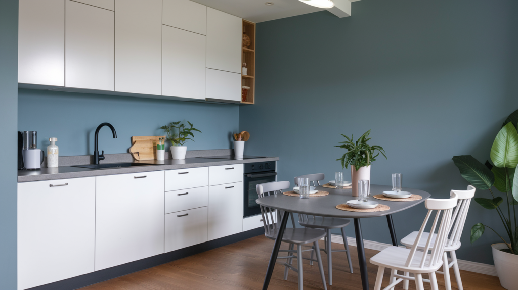
Hamilton Blue provides a timeless yet modern look for kitchen cabinetry, making it an excellent choice for homeowners who want a unique yet classic color.
-
It pairs exceptionally well with marble, quartz, or butcher block countertops, offering a beautiful contrast that elevates the overall look of the kitchen.
-
Looks striking when combined with brass, matte black, or silver hardware, allowing for a variety of finishes that suit different kitchen styles.
Bathroom
-
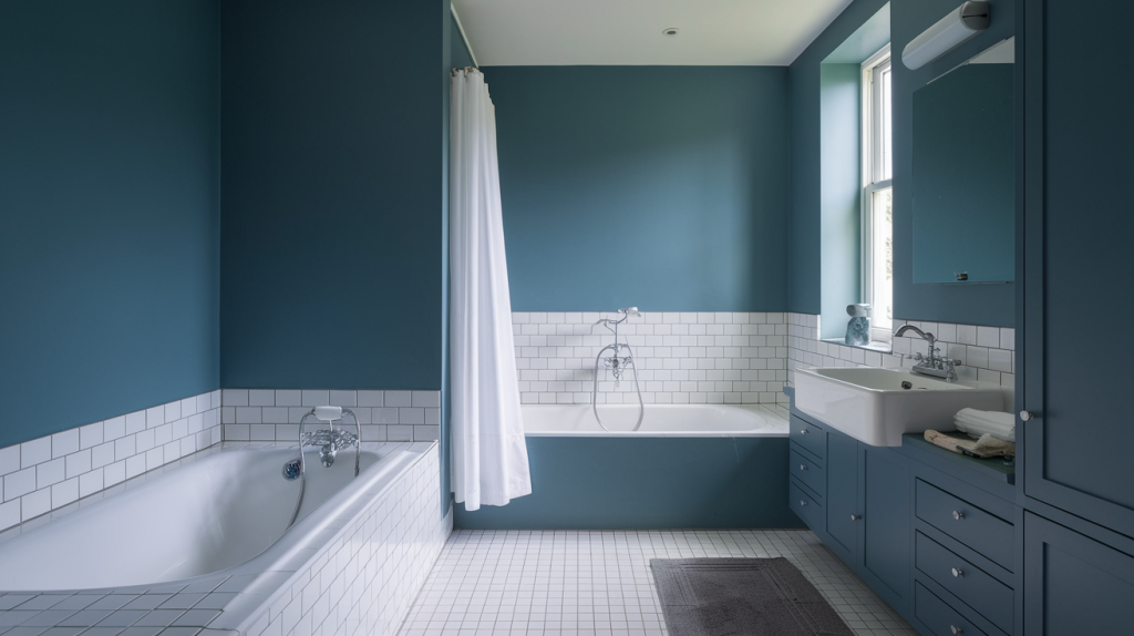
Hamilton Blue adds a rich and luxurious feel to bathrooms, making small spaces look more stylish and thoughtfully designed without feeling overwhelming.
-
It pairs well with white subway tiles, marble countertops, and gold or silver fixtures, creating an inviting color palette for any bathroom.
-
Can be used on vanities for a striking contrast against lighter-colored walls, adding depth and visual interest while keeping the design cohesive.
Best Color Combinations with Hamilton Blue

Hamilton Blue is a versatile shade that pairs beautifully with a variety of colors, from soft neutrals to bold, contrasting hues. Whether you want a classic, modern, or dramatic look, the right color pairing can enhance its depth and character.
Hamilton Blue + Muslin (OC-12)
Muslin(OC-12) is a soft beige that adds warmth to the space while keeping it neutral and inviting. It complements Hamilton Blue’s cool tones, bringing a balanced, cozy feel.
Use: Ideal for creating a soothing, serene atmosphere in bedrooms or living rooms, where Hamilton Blue can be used on feature walls, paired with Muslin for furniture to add warmth.
Hamilton Blue + Spanish Red (1301)
Spanish Red(1301) is a warm terracotta shade that enhances the depth of Hamilton Blue while creating an earthy contrast. It adds a rich, rustic charm, creating a harmonious balance with Hamilton Blue’s cool tones.
Use: Great for making a statement in spaces like dining rooms or entryways, where Hamilton Blue can be used on walls with Spanish Red as an accent in decor or accessories for a bold look.
Hamilton Blue + Blue Heather (1620)
Blue Heather(1620) is a soft powder blue that adds a lighter, more subtle touch to the deep tones of Hamilton Blue, creating a cohesive, calming atmosphere.
Use: Perfect for layering different shades of blue in bedrooms or bathrooms, where it can be used on accent walls, paired with Blue Heather for bedding or curtains, to create a serene look.
Alternatives to Hamilton Blue
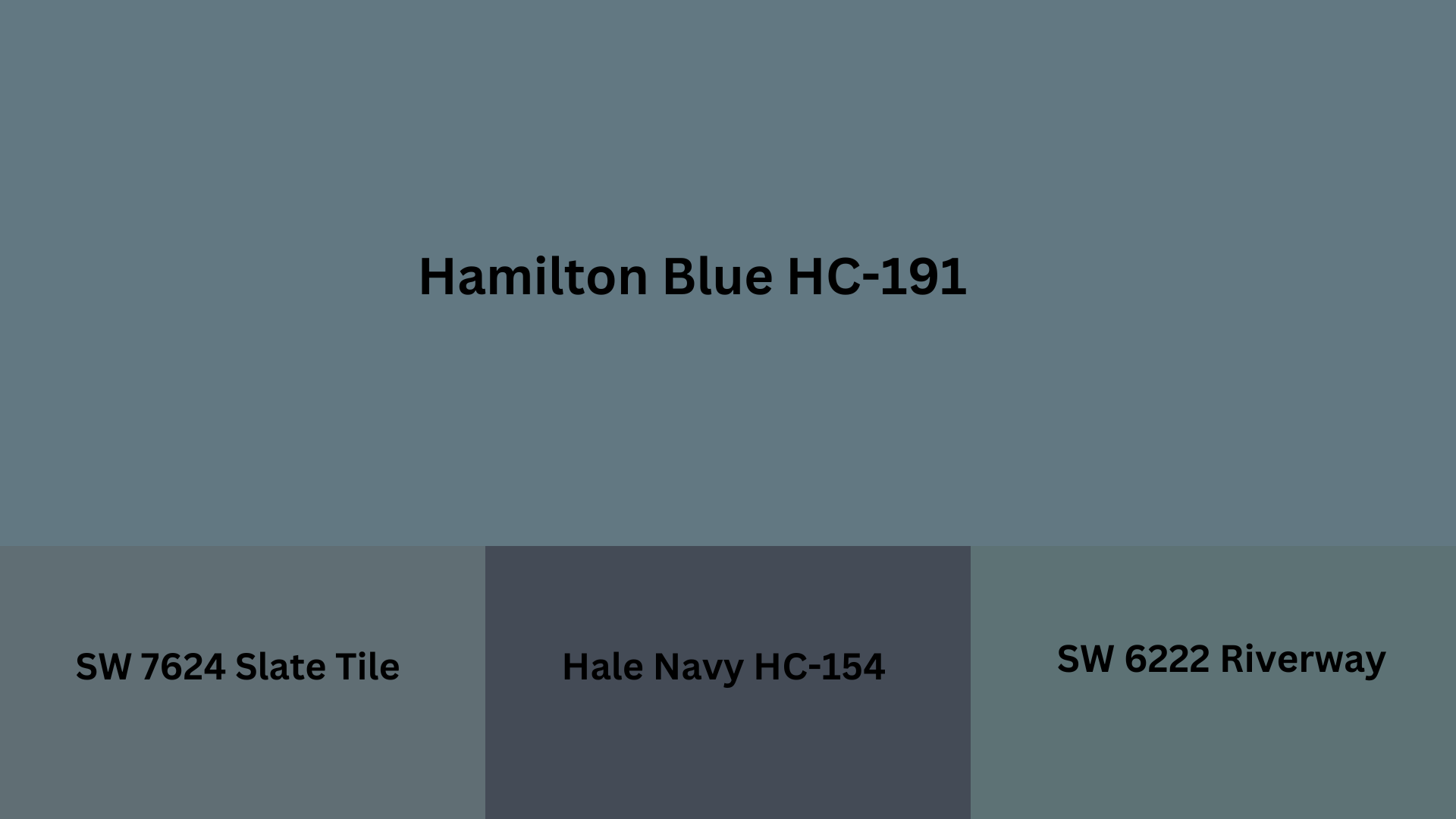
SW 6222 Riverway: Riverway is a serene, muted blue with a soft green undertone, offering a calming, coastal vibe. It provides a peaceful alternative to Hamilton Blue.
Hale Navy (HC-154): Hale Navy is a deep, rich navy blue that brings a sense of serene look. It’s darker and more dramatic than Hamilton Blue, making it ideal for creating a bold statement.
Slate Tile SW 7624: Slate Tile is a muted blue-gray that brings a modern, refined edge to any space. It has a slightly cooler tone than Hamilton Blue, making it perfect for spaces that require a more contemporary feel.
Styling Tips for Hamilton Blue
Hamilton Blue is a timeless shade that can transform any space with its rich and inviting presence. The right finishes, textures, and placement can enhance its appeal, making it suitable for a variety of interiors.
Choosing the Right Finishes
The finish you choose impacts how Hamilton Blue appears in different lighting conditions and how well it holds up over time.
Matte – A flat, non-reflective finish that gives a soft, modern look, perfect for bedrooms and living rooms.
Satin – A slight sheen that adds durability and depth, making it ideal for hallways and kitchens.
Semi-Gloss – A reflective finish that highlights architectural details, great for trim, cabinetry, and doors.
Pairing with Different Textures and Materials
Hamilton Blue pairs beautifully with a variety of textures and materials, enhancing its depth and style.
Light Oak or Walnut – Warmer wood tones bring balance and contrast to Hamilton Blue, creating a cozy look.
Brushed Brass or Matte Black – These metal finishes add modernity, perfect for lighting fixtures and hardware.
Velvet, Linen, or Leather – Soft textiles like velvet and linen add comfort, while leather brings a refined, classic touch.
Small Vs Large Spaces
Hamilton Blue can work in spaces of all sizes, as long as it’s balanced correctly with lighting and complementary elements.
Small Spaces – Use Hamilton Blue as an accent wall or cabinetry color, paired with light neutrals to keep the room open and airy.
Large Spaces – Embrace full walls in Hamilton Blue, layering in lighter furniture, mirrors, and warm lighting to create a welcoming atmosphere.
The Lasting Appeal of BM Hamilton Blue
Some colors come and go. Hamilton Blue isn’t one of them. People love this shade because it just works. In kitchens, bedrooms, even on front doors – this blue feels right at home.
What makes it stick around while other colors fade away?
Maybe it’s how it changes through the day – deeper in evening light, brighter when the sun hits. Or perhaps it’s how it pairs with just about everything from crisp whites to warm woods.
The best part about Hamilton Blue isn’t in design magazines or social media. It’s in how rooms feel when people actually live in them – comfortable, pulled-together, and somehow both classic and fresh at once.
When a color works this well in real homes, it’s no wonder it keeps showing up, year after year.

