Are you tired of repainting your walls every few years when color trends change? Most homeowners waste time and money on shades that quickly feel dated or clash with their décor.
Accessible Beige offers a solution to this common problem. This soft, warm neutral creates a lasting foundation for any home style while adding a sense of comfort that pure white walls can’t match.
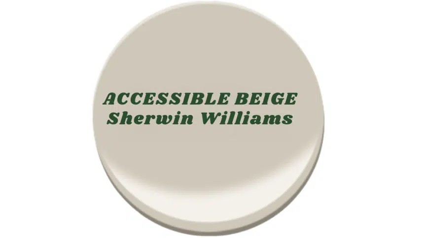
In this article, you’ll learn why Accessible Beige has become a top choice for both homeowners and color experts. We’ll cover which rooms benefit most from this shade, similar color options worth considering, and practical tips for using this versatile neutral effectively in your space.
By the end, you’ll understand how one thoughtful color choice can transform your entire home experience.
Why Choose Accessible Beige for Your Home?
Accessible Beige stays fresh year after year. This color isn’t tied to fads. It offers a calm base that works well today and will still look good in five years.
The warmth in this shade makes rooms feel cozy. When you walk into a space with these walls, you feel at ease right away. It creates a sense of comfort that makes guests want to stay longer.
This shade complements a wide range of home styles. It suits modern homes with clean lines. It also suits homes with classic touches. The color blends with both new and old features.
Using this color in multiple rooms creates a smooth, cohesive look. As you move from your living room to your hallway to your bedroom, the same soft tone ties all spaces together, making your home feel well-planned and complete.
Accessible Beige Room Ideas: Where This Color Shines
Explore the versatile beauty of Accessible Beige with room ideas that showcase its warm, inviting tones and seamless adaptability in any setting.
1. Living Rooms

Accessible Beige creates a calm base in living rooms. It gives you a clean slate for adding your own style. The soft tone helps make your space feel both put-together and laid-back. This color lets your furniture and art stand out without fighting for notice.
Best Features: The shade works well with both natural light and evening lamps, keeping the room feeling warm any time of day.
2. Bedrooms

In bedrooms, Accessible Beige helps build a quiet retreat. The soft color sends signals to your brain that it’s time to relax. It fades into the background so your mind can slow down. Pair it with soft bedding for a space that feels like a gentle hug.
Sleep-Friendly Combo: Mix with pale blues or soft greens for an even more calming bedroom setting.
3. Kitchens & Dining Rooms

This shade fits kitchens and dining spaces perfectly. It shows off wood cabinets and makes them look rich. The beige works with steel items and white marble without clashing. Food also looks better against this neutral wall color.
Kitchen Perk: The warm tone makes eating spaces feel more friendly, which may help meals last longer.
4. Hallways & Entryways

Hallways painted in Accessible Beige feel open and inviting. The color gives guests a good first look at your home’s style. It makes small spaces seem bigger. The shade also hides marks better than white walls would.
Quick Tip: Use a semi-gloss finish in hallways for walls that are easier to clean.
5. Home Offices

For workspaces, this color helps you focus without being boring. It stays in the background while you think. The warm tone feels less cold than plain white walls. Your eyes won’t get tired looking at this gentle shade all day.
Work Enhancement: Add a few green plants against this beige for better focus and less stress.
Beautiful Colors Similar to Accessible Beige
1. Balboa Mist (OC-27)

Balboa Mist is a gentle gray with hints of beige. It creates rooms that feel calm and well-planned. The color has a soft touch that makes spaces look more grown-up. It brings a clean look without feeling cold or stark.
This shade works best in living rooms where you want to relax. It fits well in open floor plans. The color makes small rooms feel bigger. It creates a blank canvas that lets your other items shine.
Balboa Mist runs a bit cooler than Accessible Beige. It has more gray notes in its mix. The color still feels warm, but in a more subtle way. It’s like taking Accessible Beige and adding a thin layer of fog.
2. Revere Pewter (HC-172)

Revere Pewter blends warm gray and light beige for a balanced feel. It works in both new and old home styles. The color feels current yet lasting. Its depth makes rooms look finished and well-thought-out.
This color shines in kitchens where it makes all parts look good. It works well in bathrooms with white fixtures. In big, open spaces, it helps define areas without walls. The color stays true in many light settings.
Revere Pewter is a step deeper than Accessible Beige. It has a bit more gray in the mix. The color has a richer feel while still being light. Think of it as Accessible Beige’s slightly older, more serious cousin.
3. Edgecomb Gray (HC-173)

Edgecomb Gray gives a soft, clean look with warmth. It isn’t fully gray or beige but lives between the two. The color creates a fresh base for rooms. It feels light but not washed out.
This shade fits beach-style homes very well. It also works in farm-style spaces with wood items. The color helps blend old and new styles and makes a smooth base for changing styles over time.
Compared to Accessible Beige, Edgecomb Gray feels a tiny bit cooler. The two colors are very close friends. If you placed them side by side, you’d see Edgecomb Gray has just a touch more gray. But both share the same easy-to-live-with nature.
Should You Choose Accessible Beige? Weighing the Pros and Cons
| Pros | Cons |
|---|---|
| Warmth: Provides a welcoming, comfortable vibe in all spaces. | Risk of Blandness: May appear too dull or muted in some spaces if not paired with interesting décor. |
| Neutral Versatility: Works with a wide range of colors, making it easy to integrate into various design themes. | Undertone Sensitivity: In certain lighting, the gray or beige undertones can shift, affecting the overall look. |
| Timelessness: Not a trend-based color, ensuring it stays relevant for years. | Limited Contrast: May not be ideal for those looking for bold or high-contrast interiors. |
Painting Tips: How to Use Accessible Beige Like a Pro
- Choosing the Right Finish – A matte finish hides wall bumps and flaws best. Eggshell or satin adds slight shine and makes cleaning easier in busy rooms.
- Preparation – Always use primer first to prevent old wall colors from changing the new beige tone.
- Application Techniques – Good brushes and rollers cost more but give much smoother results. Two full coats will give you the best color and help the paint last longer.
Conclusion
Accessible Beige stands out as a smart choice for homeowners who want lasting color that won’t quickly date. Its warm neutral tone creates comfortable spaces that work with virtually any décor style.
Unlike trendy colors that can feel outdated within a year, this versatile shade provides a timeless foundation for your home. Its ability to complement both modern and traditional elements means your walls can stay the same even as your furniture and accessories change.
Try a sample in your own space first—watch how it changes throughout the day. Then make your move to this reliable neutral that designers consistently recommend for its perfect balance of warmth and sophistication.
With Accessible Beige, you’re choosing more than just a color—you’re choosing simplicity, flexibility, and enduring style for your home.
Frequently Asked Questions
What Finish Is Best for Accessible Beige in High-Traffic Areas?
For busy spots like hallways and kitchens, a satin or eggshell finish offers the right balance of looks and ease of cleaning.
How does Accessible Beige Look in North-Facing Rooms?
Although it may appear slightly cooler in north-facing rooms, it maintains its warm base tone throughout the day.
Can I Use Accessible Beige on the Ceiling and Trim Too?
Yes, but to create a soft contrast, try a lighter shade (50% formula) for ceilings and pure white for trim.
How do I Test Accessible Beige in My Home Before Buying Gallons?
Buy a small sample pot, paint a 2×2 foot square on multiple walls, and watch it during different times of day for at least 48 hours.