
Finding the perfect blue paint shade can be challenging for many homeowners. With countless options available, selecting one that offers both style and function requires careful consideration.
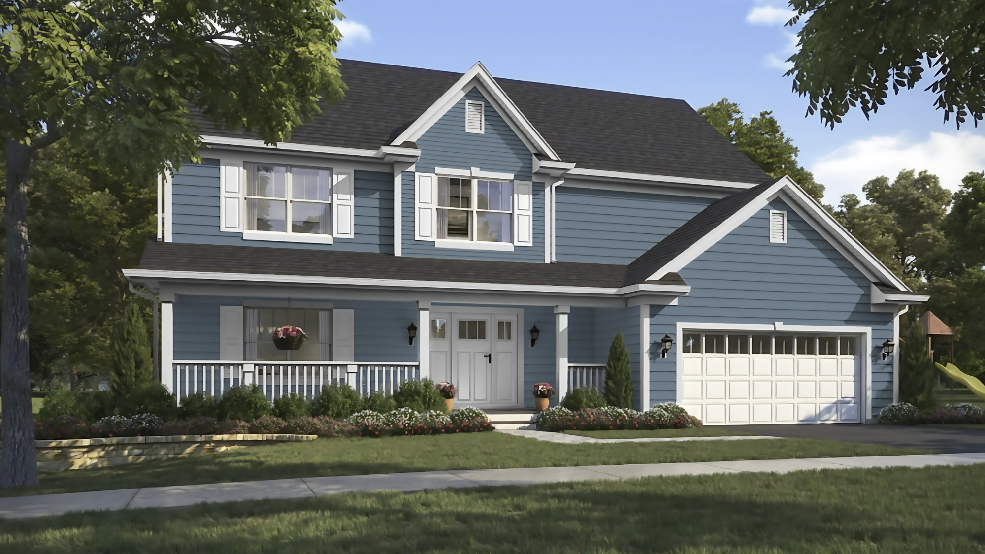
Sherwin Williams Bracing Blue (SW 6242) has become increasingly popular among homeowners and interior designers who want a rich blue tone that makes a statement without overwhelming a space.
This deep blue is in the cool portion of the color spectrum, offering a polished feel that works across many design styles.
In this guide, we’ll cover everything you need to know about Bracing Blue—from its technical details and suitable rooms to coordinating colors and practical application tips for your next painting project.
What Is Sherwin Williams Bracing Blue?
Sherwin Williams Bracing Blue (SW 6242) is a deep, saturated blue with a medium-dark tone.
| Property | Details |
|---|---|
| Color Family | Blue |
| Light Reflectance Value | 25 |
| RGB Values | 118/139/154 |
| HEX Code | #768BP9A |
The color has cool undertones that create a composed and refined mood.
Many describe it as having a bold presence that still feels classic rather than trendy. Its depth provides a sense of stability while offering enough visual interest to make a space feel designed.
On the color wheel:
- Bracing Blue sits between navy and royal blue, making it versatile for various design applications.
- It’s not as dark as navy but offers more depth than standard medium blues, making it distinctive in Sherwin Williams’ blue collection.
What Makes SW Bracing Blue Stand Out?
Bracing Blue offers remarkable flexibility that few paint colors can match. This shade works equally well in modern spaces, where it adds depth without feeling old-fashioned.
In classic settings, it brings a touch of contemporary style without appearing too trendy. This dual nature makes it a smart choice for homeowners who want a color with staying power.
Another distinguishing quality is how this blue interacts with natural light. In bright, sun-filled rooms, it reveals its full depth and richness.
In spaces with limited natural light, it creates a cozy, intimate feeling without making the room feel closed in. This adaptability to lighting conditions makes it suitable for various exposures and room orientations.
The emotional impact of this blue shade shouldn’t be overlooked. Blues generally promote feelings of calm and focus, and this particular shade strikes a perfect balance between stimulation and relaxation.
It’s known to foster productivity in workspaces while still creating a sense of tranquility that makes rooms feel like a retreat from daily stress.
Best Spaces to Use SW Bracing Blue
Bracing Blue brings a crisp, balanced tone that works well in spaces where you want both energy and calm.
Living Room
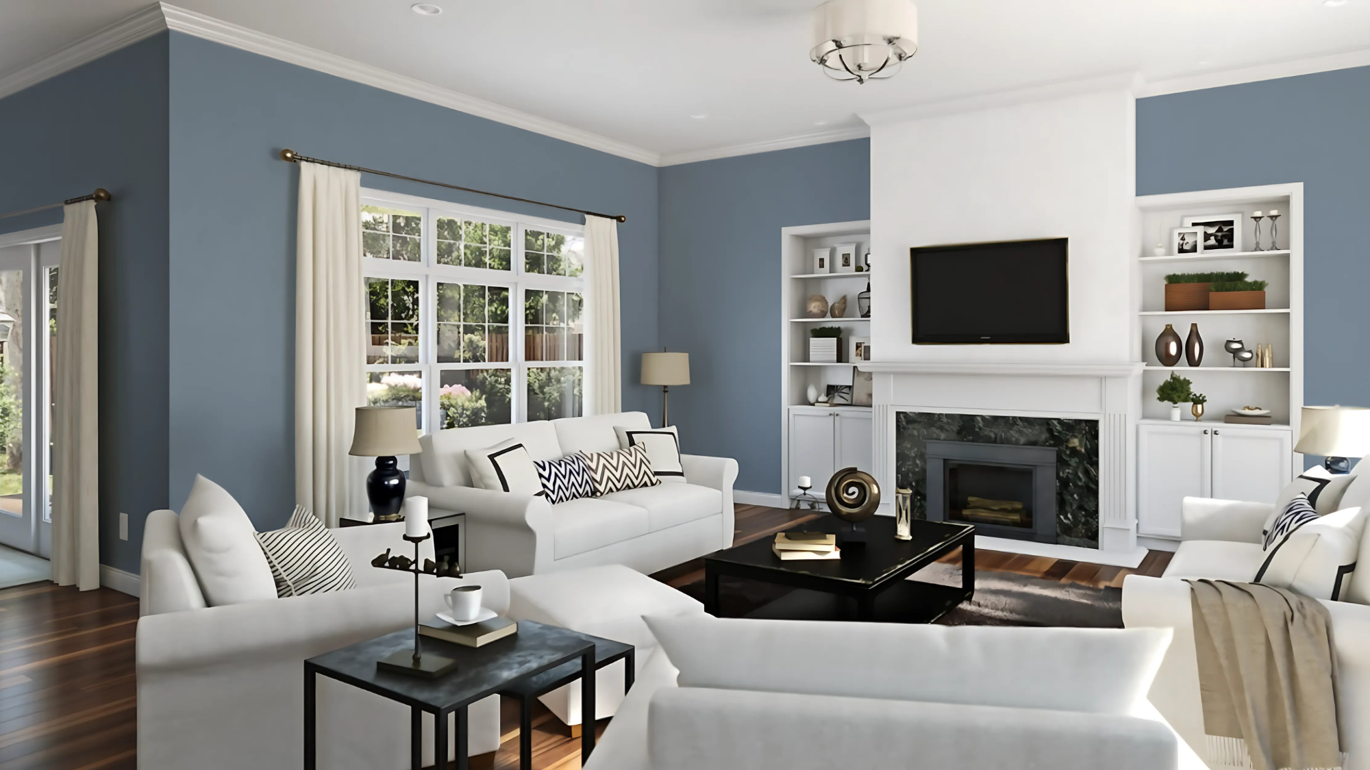
- It becomes a compelling central point that draws the eye and serves as the main visual interest in your living space.
- The strong color provides solid visual support for your furniture layout.
- The deep blue tone offers an excellent background that makes artwork pop and allows decorative items to stand out more vividly against its rich color.
- The color performs particularly well in more spacious living areas where the room’s overall dimensions can balance the intensity of the blue.
Key Consideration: Ensure adequate lighting to appreciate the color’s depth fully.
Bedroom
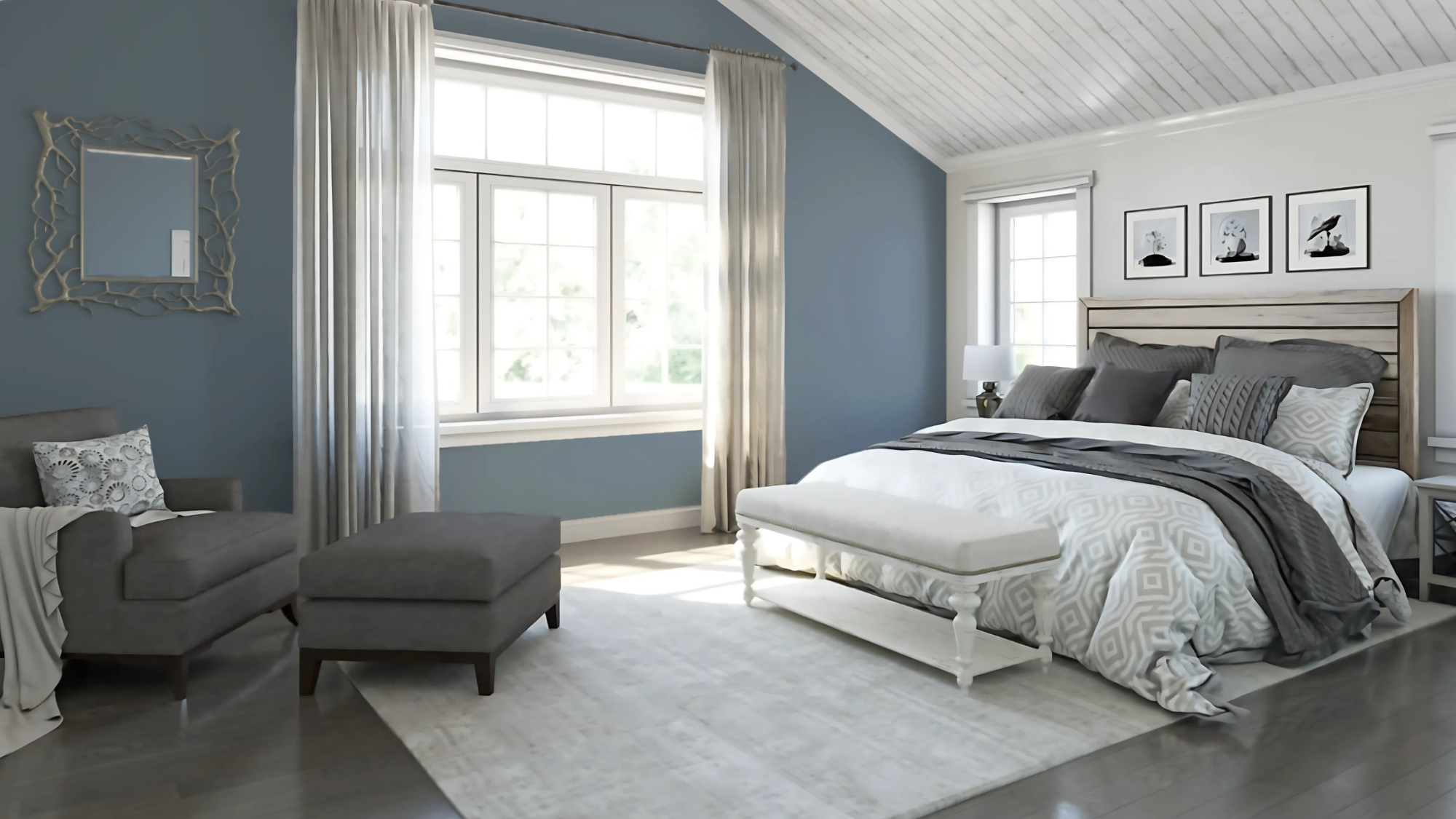
- Using Bracing Blue in bedrooms completely changes ordinary spaces into calm retreats where you can escape the stresses of daily life.
- The color naturally supports better sleep habits by creating an environment conducive to winding down and resting your mind at the end of a busy day.
- The deep blue creates a stunning contrast when used alongside pure white bedding or can be softened with earth-toned accessories and textiles for a more subtle effect.
Key Consideration: Consider the room’s natural light when choosing accent colors.
Bathroom
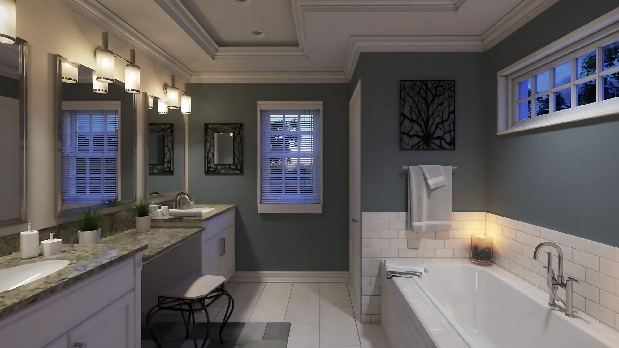
- Painting bathroom walls or cabinets in Bracing Blue helps create a luxurious bathing environment reminiscent of high-end resorts and day spas.
- The color naturally connects to water themes and sky imagery, making it psychologically fitting for a space dedicated to cleanliness and refreshment.
- When combined with proper lighting fixtures, the blue adds a touch of class and refinement that elevates even modest bathroom spaces.
- With careful color balancing through white fixtures and lighter accents, the blue helps maintain a sense of openness rather than making the room feel confined.
Key Consideration: Pair with adequate lighting to prevent the space from feeling smaller.
Kitchen
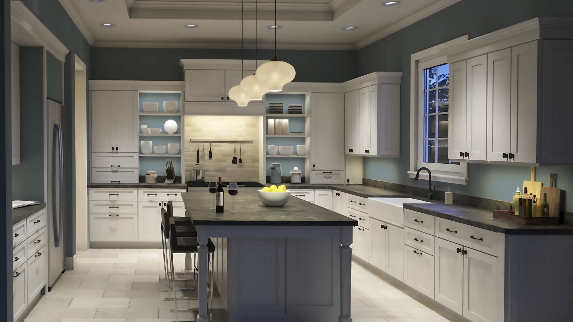
- Applying Bracing Blue to kitchen cabinets or an island creates a bold visual point that brings personality to what might otherwise be a purely functional space.
- The color works well with white countertops, light wood, or neutral backsplashes, creating depth and visual interest without being overwhelming.
- Adding this color in strategic locations gives the space a unique character and personality while preserving the clean, fresh atmosphere essential in cooking spaces.
Key Consideration: Balance with lighter elements to prevent overwhelming the space.
Exterior
- Using Bracing Blue on your home’s exterior instantly makes your property more noticeable and memorable from the street, setting it apart from neighboring houses.
- The color works wonderfully on entrance doors, window frames, but can also be used for the entire house exterior with stunning results.
- Unlike some colors that fade or look washed out in outdoor settings, this particular blue maintains its depth and visual impact even when exposed to the elements.
Key Consideration: Test in natural sunlight to ensure the color reads as intended outdoors.
Perfect Color Pairings for This Bold Blue Shade

Neutral companions bring out the best in Bracing Blue by providing balance and contrast.
Icicle (SW 6238) is a lighter blue option that perfectly complements Bracing Blue. This paler shade works well in adjoining spaces or as a ceiling color when using Bracing Blue on walls, creating a cohesive color story throughout your home.
Double Latte (SW 9108) brings warmth to balance the cool tones of Bracing Blue. This neutral beige tone softens the impact of the blue while creating a welcoming atmosphere in any room.
Sleepy Hollow (SW 9145) offers a deeper, more subdued partner that can work as an accent in spaces where Bracing Blue is the main color. This pairing creates depth and visual interest without clashing.
Pure White (SW 7005) creates a clean, crisp pairing that highlights the blue’s depth without competing for attention.
For a softer look, Agreeable Gray (SW 7029) offers a warm neutral base that lets the blue shine while adding a hint of coziness to the overall palette.
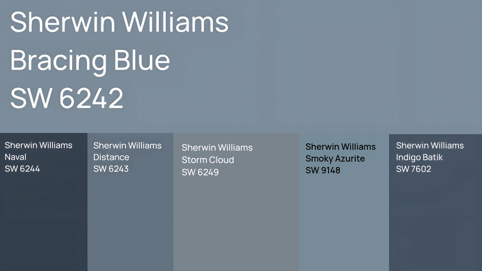
Sherwin-Williams Shades That Echo This Bold Blue Hue
Looking for options close to Bracing Blue? Having similar shades in your color toolkit gives you more flexibility when designing your space.
These alternatives offer excellent choices if you need complementary colors for a cohesive look or slight variations to find the perfect tone.
| Color Name | Description | Best Used In | Key Pairings |
|---|---|---|---|
| Naval (SW 6244) | Deep, bold navy that intensifies Bracing Blue’s depth while staying sophisticated. | Dining rooms, studies | Brass fixtures, warm wood tones |
| Distance (SW 6243) | Soft, dusty blue-gray with calming vibes and subtle gray undertones. | Bedrooms, reading nooks | Light neutrals, soft fabrics |
| Smoky Azurite (SW 9148) | Modern blue with cooler undertones and vibrant energy, ideal for visual focal points. | Accent walls, statement furniture | Crisp whites, modern metals |
| Storm Cloud (SW 6249) | Moody gray-blue that shifts with lighting, offering a versatile and refined look. | Various rooms, transitional styles | Charcoal, taupe, natural textures |
| Indigo Batik (SW 7602) | Mid-toned blue with a hint of warmth, balancing between Bracing Blue and Naval in depth. | Living rooms, hallways, multipurpose | Cool and warm accent colors alike |
How to Choose the Right Shade
When selecting among these similar blues, consider:
- Compare color cards side by side in your actual space
- Test samples on different walls to see how light affects each shade
- Consider room purpose—deeper blues for focus, lighter blues for openness
- Examine undertones—some lean more green, others more purple
- Think about existing furnishings and how each shade works with your current pieces
Testing colors in your specific environment is essential as blues respond significantly to light quality and surrounding colors. Take time with samples before making your final decision.
Paint Finishes & Application Tips
Choosing the right finish and applying Bracing Blue properly can make all the difference—here’s how to get a smooth, stunning result.
Recommended Finishes For Rooms
For living areas and bedrooms, a matte or eggshell finish minimizes light reflection, allowing the true color to show while hiding minor wall imperfections.
In bathrooms and kitchens, a satin finish provides needed durability and moisture resistance while maintaining the color’s rich appearance. For trim work and doors, semi-gloss or gloss brings out the depth of the blue while allowing for easy cleaning.
Application Tips
- Start with two coats of tinted primer (gray-based, not white). Use high-quality brushes and short-nap rollers for smooth application.
- Work in smaller sections than with lighter colors for even coverage. Apply paint in “W” patterns to maintain wet edges.
- Fill and sand all wall imperfections before painting. Allow longer drying time between coats for true color development. Lightly sand between coats with fine-grit sandpaper for smoother results.
- Consider boxing paint (mixing cans) for consistent color. Apply the final coat in one continuous session to avoid color variances.
- Test in different lighting conditions before committing to the full room.
Conclusion
Sherwin Williams’ Bracing Blue is a versatile color that adds depth and character to any space.
Its rich tone works across different lighting conditions while creating a grounded atmosphere.
This shade works best in spaces where you want to create focus, add visual weight, or establish a sense of calm. Its balanced intensity benefits living rooms, bedrooms, and even exterior applications.
Before making your final decision, we recommend testing a sample in your space.
Ready to bring this beautiful blue into your home?
Paint a large board or section of wall and observe how the color changes throughout the day with varying light conditions. This important step ensures you’ll be satisfied with your color choice for years to come.