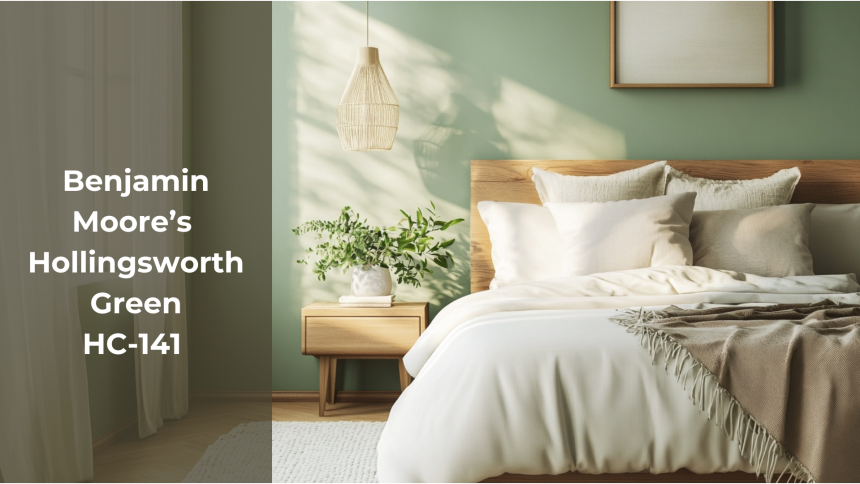
Looking for the perfect green paint that offers subtlety and balance for your interior spaces? Many homeowners face this common challenge when selecting the ideal shade for their residences.
Hollingsworth Green HC-141 presents a compelling option for consideration. This soft, muted green introduces tranquility to any environment without appearing lackluster or uninspired.
In this comprehensive review, I will provide a thorough examination of this distinguished Benjamin Moore selection.
The analysis will include its presentation under various lighting conditions, optimal room applications, and effective color coordination possibilities.
Upon conclusion, you will possess sufficient information to determine if Hollingsworth Green constitutes an appropriate selection for your home.
Basic Details of Hollingsworth Green Hc-141
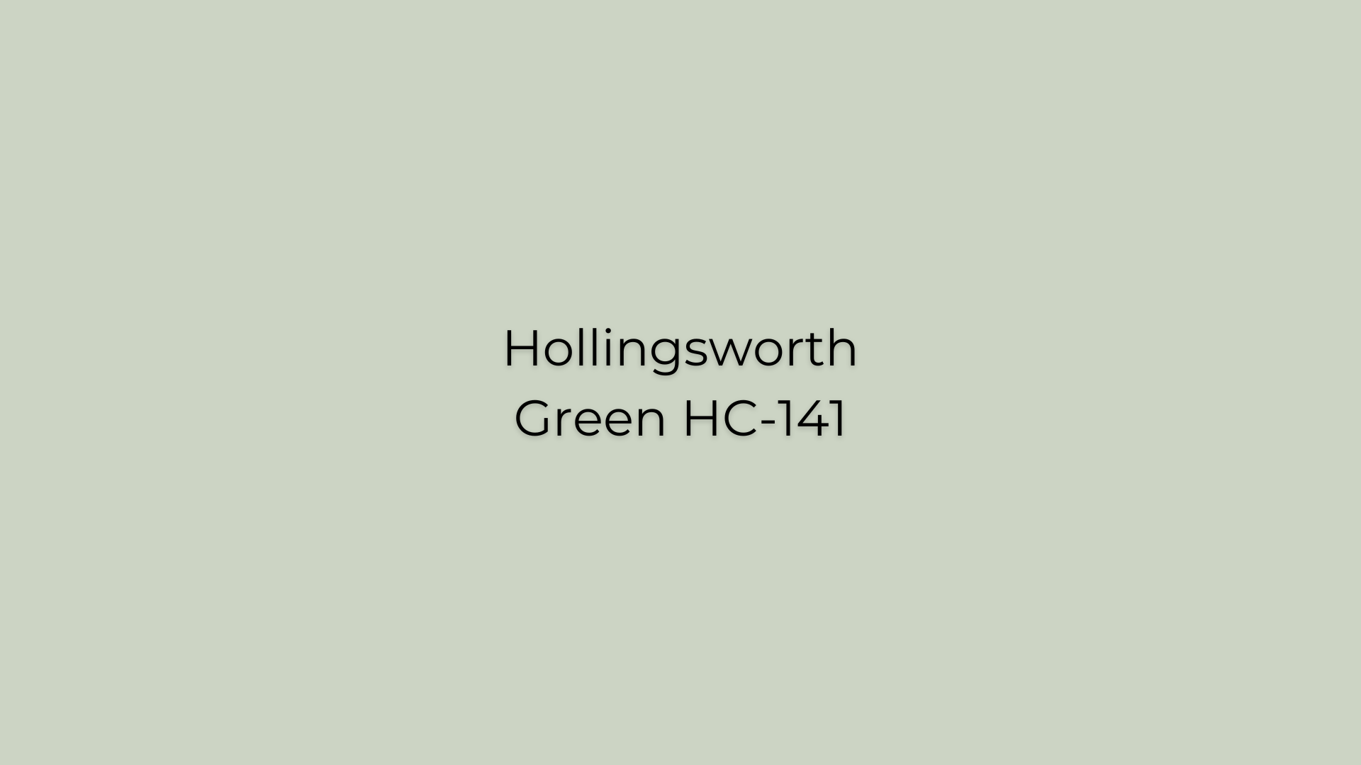
Benjamin Moore’s Hollingsworth Green HC-141 is a soft, muted green that brings a sense of calm and sophistication to any space. Its understated style makes it a versatile choice for various interior settings.
This color can be used in living rooms, dining areas, or bedrooms, creating a grounded and serene atmosphere.
Its ability to pair seamlessly with natural materials like wood and stone further enhances its appeal, making it a classic and adaptable option for your home.
| Aspect | Details |
|---|---|
| Type of Paint | Water-Based (Latex): Fast drying, easy cleanup, low odor. |
| Paint Finish | Available in Matte, Eggshell, Satin, and High Gloss finishes. |
| LRV (Light Reflectance Value) | Approximately 63.25; this medium LRV indicates a balanced color that reflects a good amount of light, contributing to a bright and welcoming atmosphere. |
| Color Category | Soft, muted green with subtle gray undertones, offering a unique and calming presence. |
| RGB Value | Red: 204, Green: 212, Blue: 196 |
| Hex Code | #CCD4C4 |
Hollingsworth Green HC-141 is part of Benjamin Moore’s Historical Colors collection, featuring 191 time-honored hues inspired by America’s historic landmarks.
Detailed Analysis of Hollingsworth Green HC-141
Now, let’s dive into the key elements of Hollingsworth Green HC-141 to better understand how it performs across different spaces and its overall aesthetic appeal.
Durability
Hollingsworth Green HC-141 maintains its beauty over time, especially when applied with high-quality finishes.
Using premium paints ensures the color resists wear and tear, preserving the room’s aesthetic in high-traffic areas.
The paint’s ability to resist fading, chipping, and scuffing is very helpful, particularly in high-traffic areas like hallways, living rooms, and dining rooms.
The Good: Long-lasting color retention, especially with quality finishes.
The Not-So-Good: Optimal durability requires selecting appropriate finishes.
Lighting Impact
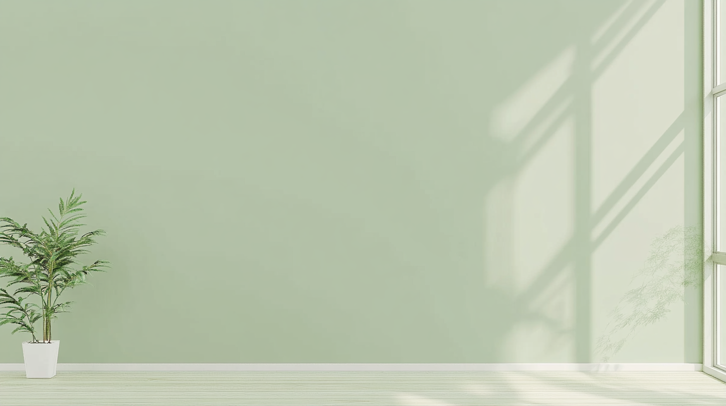
The appearance of Hollingsworth Green HC-141 varies under different lighting conditions.
In natural daylight, the color reveals a soft, fresh green tone that brings a sense of calm and openness to the space. However, under artificial lighting, subtle gray undertones emerge, giving the color a more muted, unique feel.
This adaptability allows the color to create different moods throughout the day.
The Good: Dynamic appearance that changes with lighting, offering design flexibility.
The Not-So-Good: In spaces with limited natural light, the color may appear more subdued.
Versatility
Hollingsworth Green HC-141’s balanced tone complements various design styles.
It pairs well with both warm tones, such as Benjamin Moore’s Albescent OC-40, and cool tones like Cloud White CC-40, creating a versatile palette for any room.
Integrating natural textures like wood and linen further enhances the depth and warmth of this captivating color.
The Good: Extremely versatile, blending well with a wide range of colors and styles.
The Not-So-Good: May not suit those seeking bold, dramatic color choices.
Maintenance Requirements
The maintenance of walls painted with Hollingsworth Green HC-141 largely depends on the type of finish selected.
Matte finishes, while offering a smooth, subtle look, can be more challenging to keep clean, as they tend to show fingerprints, smudges, and dust more readily. Regular touch-ups may be required to keep the walls looking fresh.
On the other hand, semi-gloss or gloss finishes provide a more durable surface, resistant to stains and easier to wipe clean.
The Good: Easy to clean with higher-sheen finishes; resistant to stains.
The Not-So-Good: Matte finishes may show wear more quickly and require more frequent touch-ups.
Timelessness
Hollingsworth Green HC-141 is a classic color that complements various design trends, ensuring it continues to enhance your space for years.
Its soft, muted green hue brings a sense of tranquility and charm that never feels out of place
its timeless appeal lies in its versatility—this shade remains as fresh and stylish today as it will be in the future, making it a smart long-term choice for homeowners looking to create a lasting, harmonious atmosphere.
The Good: Classic and versatile, offering lasting appeal.
The Not so Good: May not be bold enough for those looking for trend-driven, statement colors.
Texture and Finish Compatibility
Hollingsworth Green HC-141 works well with various textures and finishes, enhancing the natural beauty of materials like wood, stone, and metal.
Either on walls or furniture, this color complements both rustic and modern elements, helping to create a cohesive look throughout the space.
The Good: Pairs well with both natural and modern textures, ensuring a cohesive design.
The Not-So-Good: The subtle tone might get lost if used with highly textured finishes or bold design elements.
|
In summary, Benjamin Moore’s Hollingsworth Green HC-141 is a versatile, soft green that adapts beautifully to various lighting conditions and design styles. It offers durability, timelessness, and compatibility with diverse textures and finishes, making it a reliable choice for creating a serene and sophisticated atmosphere in your home. |
Hollingsworth Green HC-141 in Different Settings
Hollingsworth Green HC-141 brings a soft, serene green tone that enhances the ambiance of any room. Its subtle sophistication and calming qualities make it a versatile choice for a variety of spaces.
Let’s have a look at how this color may stylize different areas of your home.
Bedroom

Hollingsworth Green HC-141 makes the bedroom feel calm and peaceful. It’s a soft, relaxing color that helps you unwind and sleep better.
Use it on one wall or all around the room, and pair it with neutral bedding and wooden furniture for a cozy, soothing feel.
Living room
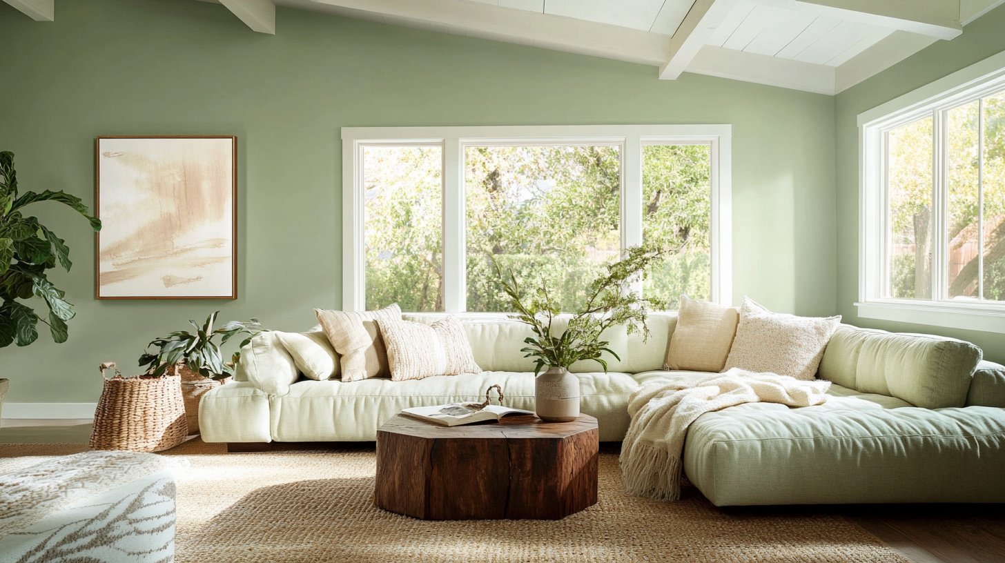
In the living room, Hollingsworth Green HC-141 gives a fresh, calm vibe. It works well with both modern and traditional furniture.
You can mix it with neutral colors or brighter accents like yellow or blue for a balanced, welcoming space where you can relax and enjoy time with family or friends.
Bathroom
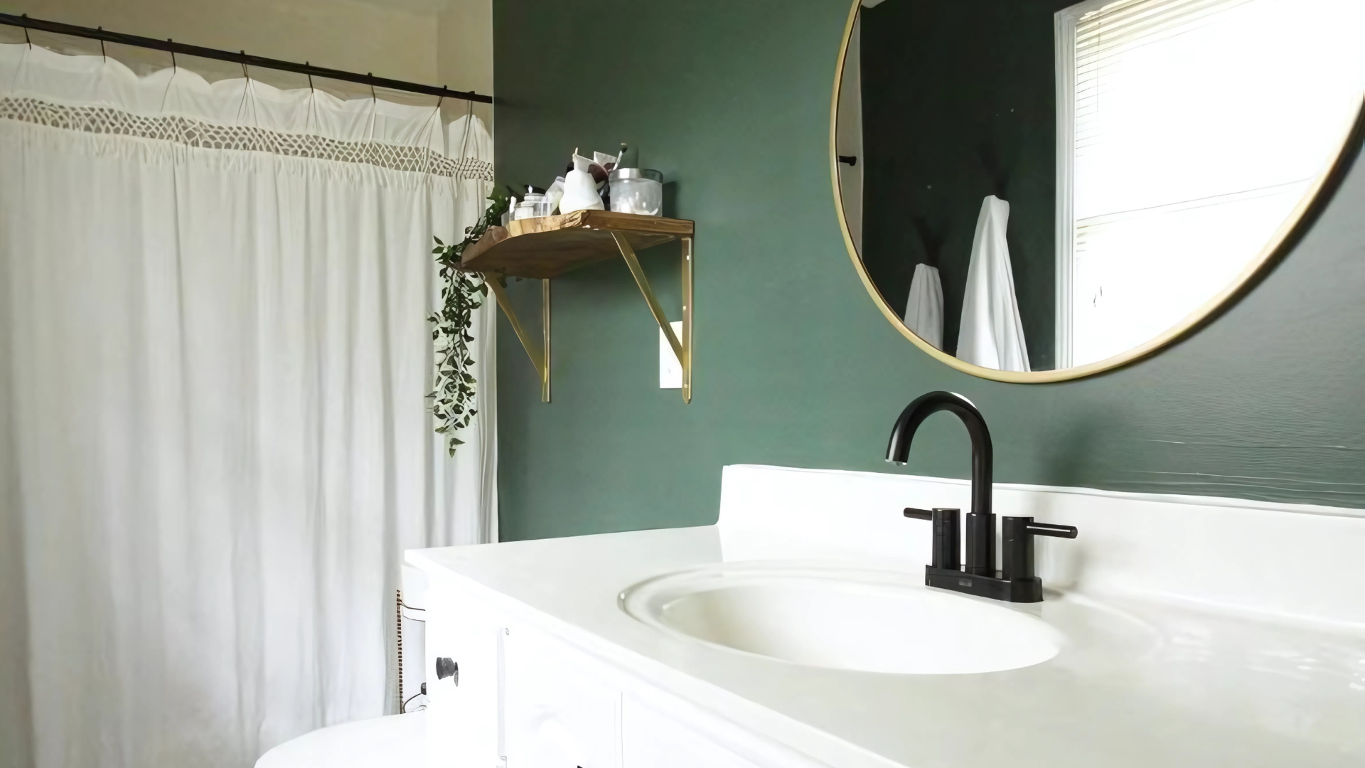
Hollingsworth Green HC-141 in the bathroom feels refreshing and calming, just like a spa. It pairs nicely with white or gray fixtures to keep the space feeling bright and clean.
Add a few plants or simple decor to make the space even more relaxing.
Kitchen
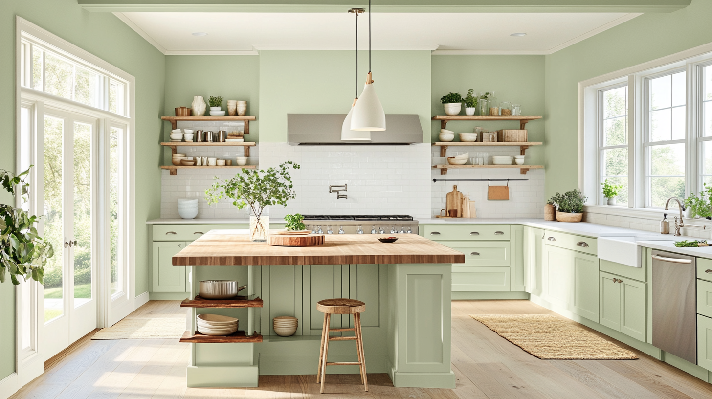
Hollingsworth Green HC-141 makes the kitchen feel fresh and calm. It works well with light wood cabinets and white countertops.
It can be used both on walls or cabinets, it creates a pleasant, inviting space for cooking and dining.
Dining Area
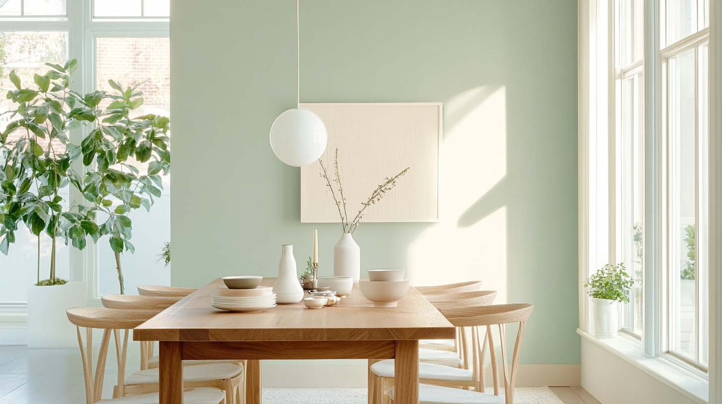
Hollingsworth Green HC-141 gives the dining area a soft, welcoming feel. It’s a great color for a place where you eat and spend time with others.
Pair it with a wooden table and light-colored chairs for a relaxed, comfortable setting that encourages good conversation.
Different Shades of Hollingsworth Green HC-141
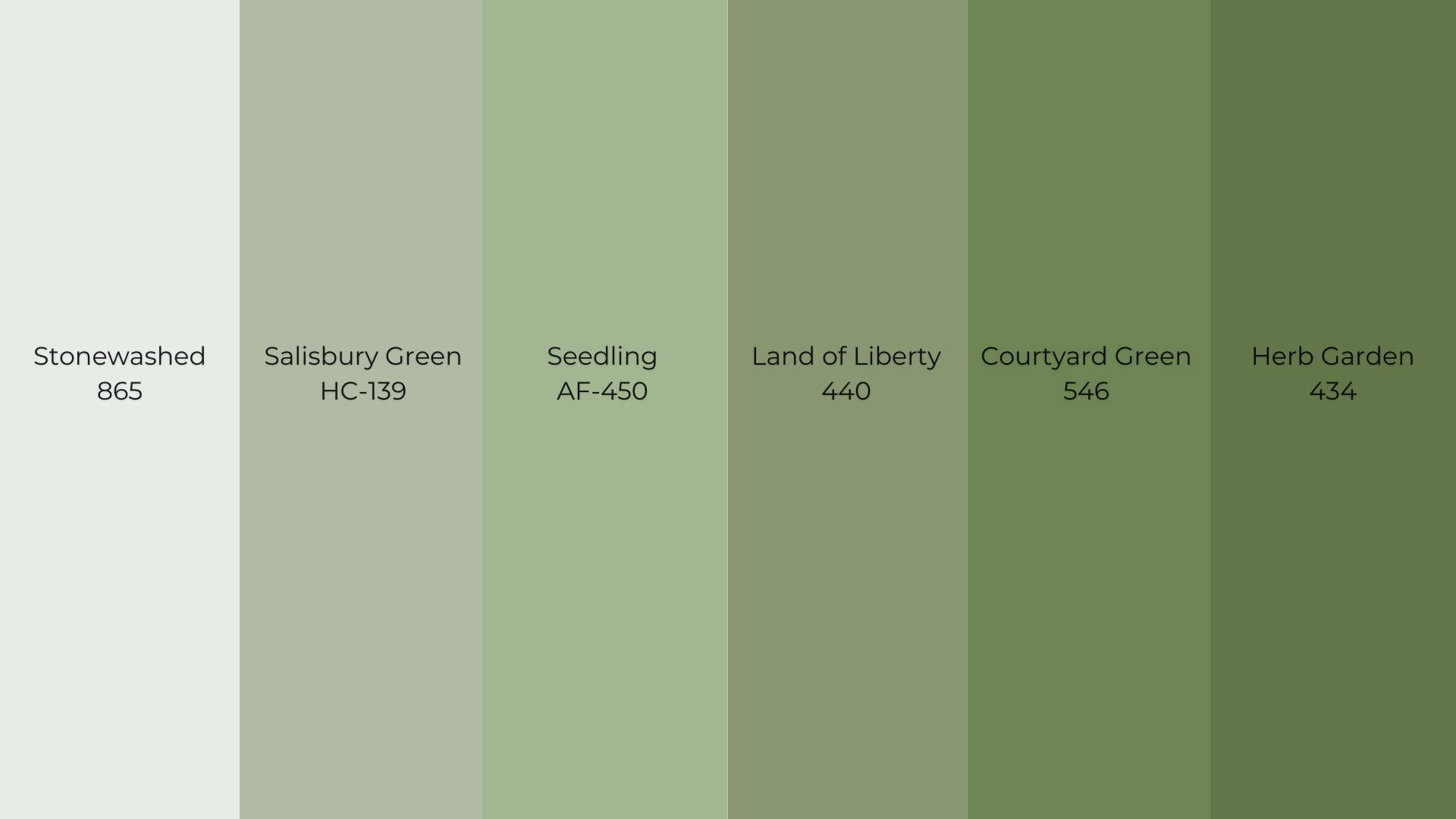
Hollingsworth Green HC-141 is a versatile, soft green shade that pairs harmoniously with a variety of colors.
Its adaptability allows it to complement numerous hues, enhancing the overall aesthetic of your space. Here are some complementary colors to consider:
Stonewashed 865:A light, minty-green shade with a fresh and airy feel, ideal for lively spaces like kitchens or bathrooms.
Salisbury Green HC-139:A mid-toned green with prominent gray undertones, offering a sophisticated and timeless look.
Seedling AF-450:A soft, muted green that imparts a sense of calm and serenity, versatile for various interior styles.
Land of Liberty 440: A rich, deep green with a touch of blue, evoking strength and tradition, suitable for bold statements.
Courtyard Green 546:A warm, earthy green that brings a grounded and inviting feel, complementing various design aesthetics.
Herb Garden 434:A fresh, vibrant green reminiscent of lush foliage, adding a lively and rejuvenating touch to spaces.
These colors all work beautifully with Hollingsworth Green HC-141, helping to create a balanced, soothing, and inviting atmosphere in your home.
Creating Cohesive Color Schemes with Hollingsworth Green
Hollingsworth Green HC-141 is a versatile and calming color that can be used to create a variety of beautiful color themes for your home.
Its soft, muted green tone pairs effortlessly with a range of other hues to create different moods and aesthetics.
1. Nature-Inspired Theme
Pair Hollingsworth Green with earthy tones like browns, beiges, and warm neutrals to bring a nature-inspired feel into your space. This theme creates a cozy, grounded atmosphere perfect for living rooms or bedrooms.
Other Recommended Paints:
2. Serene & Relaxing Theme
For a calming, serene vibe, combine Hollingsworth Green with soft whites and light grays. This color combination works well in spaces like bathrooms or relaxation areas, promoting a peaceful and soothing environment.
Other Recommended Paints:
3. Fresh & Inviting Theme
Mix Hollingsworth Green with lighter shades of yellow, cream, or soft pastels for a fresh and inviting look. This theme is perfect for kitchens, dining areas, or entryways, offering a warm and welcoming feel to guests.
Other Recommended Paints:
Final Thoughts
Hollingsworth Green HC-141 stands out as a thoughtful choice for homeowners seeking balance in their interior color schemes.
This muted green creates a composed atmosphere while maintaining visual interest.
Our review shows this Benjamin Moore selection performs well across multiple rooms, from kitchens to bedrooms. Its medium Light Reflectance Value of 63.25 ensures spaces remain bright without becoming overpowering.
The color shifts subtly between soft green in natural light to showing more gray undertones in artificial lighting, providing versatility throughout the day.
Its historical roots and capacity to work with numerous design styles make it a lasting option rather than a temporary trend.
For those seeking a refined, composed green that coordinates with numerous materials and color palettes, Hollingsworth Green HC-141 merits serious consideration for your next project.