The decision between Sherwin-Williams’ Tricorn Black and Iron Ore represents a pivotal choice in today’s design landscape, where dark exterior and interior colors dominate contemporary aesthetics.
While these neutral tones seem similar at first glance, they offer distinctly different effects that can dramatically impact your project’s final appearance.
Tricorn Black delivers true black intensity, while Iron Ore, with its charcoal undertones, provides a softer, more complex alternative.
Selecting between these powerhouse shades influences everything from perceived architectural lines to the overall mood of your space.
This guide cuts through the confusion, providing clear comparisons of undertones, lighting responses, and practical applications to ensure your investment in gallons of premium paint yields exactly the dramatic statement you envision.
Understanding Paint Color Basics
| Aspect | Tricorn Black (SW 6258) | Iron Ore (SW 7069) |
|---|---|---|
| LRV (Light Reflectance Value) | 3 | 6 |
| Color Category | Ultra-dark color (LRV | Very dark color (LRV 5-10) |
| Comparison | Pure white: ~90 LRV, Black: ~0 LRV | Pure white: ~90 LRV, Black: ~0 LRV |
| RGB Value | Red: 44, Green: 44, Blue: 44 | Red: 63, Green: 63, Blue: 65 |
| Hex Code | #2C2C2C | #3F3F41 |
| Undertones | Nearly neutral with minimal blue undertones | Noticeable brown and blue-gray undertones |
| Best Pairings | Pure whites, light grays, bright accents | Warm whites, greiges, muted earthy tones |
| Ideal for | Bold, dramatic, contemporary spaces | Sophisticated, complex, transitional spaces |
Key Differences Between Tricorn Black and Iron Ore

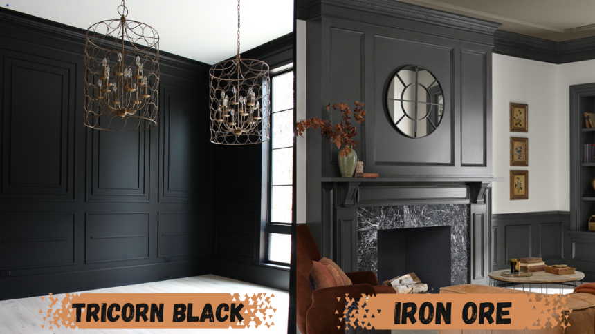
Tricorn Black is deeper and more consistent in appearance, while Iron Ore is slightly lighter with visible undertones.
Iron Ore shifts more with lighting, showing warmth and depth, especially in natural light.
Tricorn Black delivers a bolder contrast; Iron Ore feels softer and more flexible in different settings.
Overall, Iron Ore is more versatile, while Tricorn Black is more dramatic and pure.
| Feature Area | Tricorn Black (SW 6258) | Iron Ore (SW 7069) |
|---|---|---|
| Depth | Intense, solid black | Slightly lighter charcoal |
| Undertones | Nearly neutral with minimal undertone | Brown and blue-gray undertones |
| Lighting Response | Consistent throughout day | Changes noticeably with lighting |
| Best in Natural Light | Remains very dark | Reveals warmth and texture |
| Contrast with Light Colors | Sharp, dramatic contrast | Softer, more seamless transition |
| Versatility | Best for bold, high-contrast designs | Works across more styles and lighting conditions |
Room-by-Room: Tricorn Black vs. Iron Ore
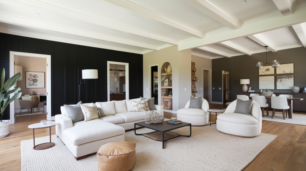
Living Spaces and Open Floor Plans

Tricorn Black makes a bold statement on accent walls but can overwhelm smaller spaces without abundant natural light.
Iron Ore works better for larger wall areas in living spaces, offering depth without the intensity of pure black.
For built-ins and architectural details, Tricorn Black creates a more dramatic definition against light walls.
Iron Ore appears more forgiving on surfaces with imperfections due to its slightly higher light reflectance.
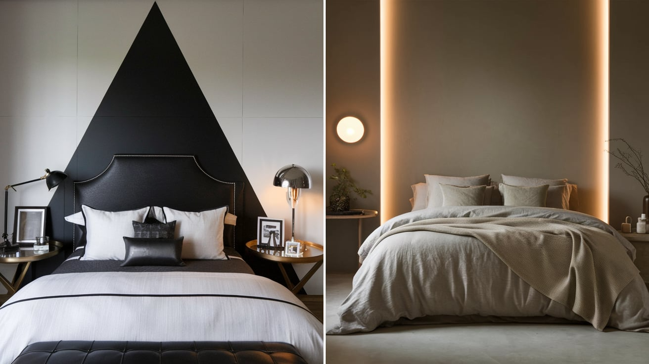
Bedrooms and Relaxation Areas

Tricorn Black can create a dramatic, cocooning effect but may feel too intense for some bedroom settings.
Iron Ore offers a moody, sophisticated option that feels less severe while still creating a restful environment.
For furniture pieces, Tricorn Black delivers a more contemporary look, while Iron Ore feels slightly more traditional.
Both colors pair beautifully with brass or gold accents in bedroom settings.
Bathrooms

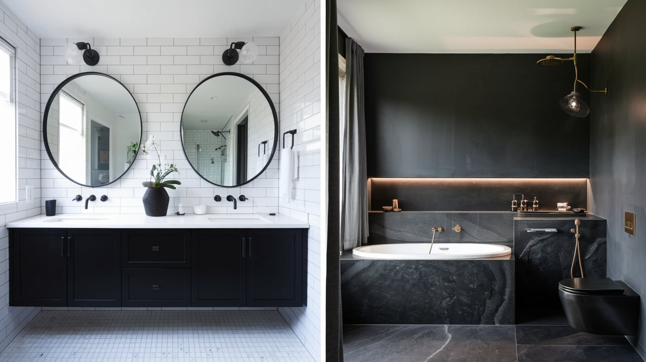
Iron Ore performs better in bathrooms with limited natural light, preventing the space from feeling too dark.
Tricorn Black excels on vanities and doors, creating a crisp contrast against white fixtures and tiles.
For smaller bathrooms, Iron Ore provides drama without the space-shrinking effect that can come with Tricorn Black.
Both colors look stunning with marble and brass fixtures, though Iron Ore allows more of the stone’s detail to shine through.
Tricorn Black vs Iron Ore for Exterior Use

When used outdoors, both Tricorn Black and Iron Ore offer a striking impact.
Tricorn Black delivers bold contrast on doors and trim, while Iron Ore works beautifully as a softer, full-body exterior color.
In sunny climates, Iron Ore is often preferred for its subtlety and ability to showcase texture.
- Tricorn Black adds bold contrast to doors, shutters, and window trim.
- Iron Ore is ideal for full exteriors, offering softness and depth.
- Iron Ore reflects sunlight more gently, making it better for hot, bright regions.
- Tricorn Black can fade faster, so high-quality UV-resistant paint is essential.
- Iron Ore enhances texture and architectural features on large surfaces.
Tricorn Black vs Iron Ore: Which One is More Timeless?

Current Color Trends & Long-Term Appeal
These two shades have established themselves as modern classics, often used by designers for their timeless elegance and dramatic impact.
Tricorn Black stands out for its pure, no-nonsense simplicity. Its neutral undertone and rich depth give it an enduring quality that never feels outdated.
On the other hand, Iron Ore carries a bit more complexity and softness. With subtle brown and blue-gray undertones, it brings depth without the harshness of a true black.
Because of its softness and versatility, Iron Ore may have a broader long-term appeal as it can last alongside changing décor and color trends more easily than stark black.
Both colors are safe choices when you’re looking for something stylish now and still relevant years down the line.
Versatility Across Changing Decor
Tricorn Black works best with contemporary, modern, and industrial aesthetics that emphasize contrast.
Iron Ore bridges traditional and modern styles more effectively, offering greater adaptability as decor changes.
Both colors coordinate well with changing accent colors, making them solid long-term investments.
Can You Use Tricorn Black and Iron Ore in the Same Home?
Yes, these colors can work together effectively when used purposefully.
Use Tricorn Black for smaller accents that need maximum impact (doors, mirror frames, furniture).
Apply Iron Ore to larger surfaces where a softer approach is needed (cabinetry, accent walls).
The key is consistency – use each color for specific purposes rather than mixing them randomly.
Mistakes to Avoid While Choosing: Tricorn Black vs. Iron Ore
Selecting between these deep tones requires careful consideration beyond just liking their appearance in photos.
Many homeowners rush their decisions without proper testing, leading to disappointing results. Understanding how these dark colors behave in your particular space often makes the difference between success and regret.
Here are key mistakes to avoid:
- Choosing Tricorn Black for poorly lit spaces where it appears flat and overwhelmingly dark.
- Using Iron Ore alongside true black elements where its undertones become obviously mismatched.
- Skipping testing of both colors in your actual space at different times of day.
- Ignoring how finish affects appearance – semi-gloss Tricorn Black looks dramatically darker than matte Iron Ore.
Final Thoughts
In the end, the distinction between Tricorn Black and Iron Ore comes down to your specific design goals and environmental conditions.
Tricorn Black commands attention with its bold, true black presence—ideal for creating sharp contrasts and architectural definition.
Iron Ore offers more flexibility with its softer charcoal quality that responds beautifully to changing light conditions.
Both colors have earned their place as designer favorites for a good reason, each delivering its own specialty when applied thoughtfully.
Which of these rich neutrals have you used in past projects, and how did they perform in your space?
Share your experiences in the comments to help fellow readers with their decision!

