Looking for a blue that feels both fresh and calm?
Sherwin Williams Upward (SW 6239) offers the perfect balance. This versatile blue-gray shade creates spaces that feel open and tranquil without overwhelming your home’s design.
What makes Upward stand out is its gentle blue undertones with just enough gray to keep it refined.
Morning light brings out its clear blue qualities, while evening transforms it into a soft, muted backdrop. This adaptable color works wonderfully with whites, wood tones, and even metallic accents.
Need a paint for multiple connected rooms?
Upward maintains its identity throughout the day while creating a cohesive flow from space to space.
Let’s examine how this thoughtful blue might transform your home.
Understanding Paint Color Basics
Color Terminology
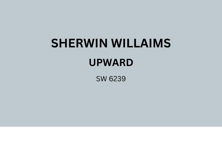
| PROPERTY | VALUE |
|---|---|
| LRV (Light Reflectance Value) | 54 |
| Color Category | Considered a mid-tone color (LRV > 50) |
| Comparison | Pure white: ~90 LRV, Black: ~0 LRV |
| RGB Value | Red: 188 Green: 198 Blue: 208 |
| Hex Code | #BCC6D0 |
Undertones
- Upward has soft blue-gray undertones
- It’s a balanced blue with subtle gray influence
- Not a saturated or vibrant blue, but a thoughtful blue-gray
Psychology of Blue Colors
- Soft blues like Upward create a sense of calm and openness
- Blue-gray tones: Offer tranquility and adaptability
- Cool neutrals: Evoke serenity, quiet sophistication, and timeless appeal
- Benefits: More substance than lighter colors, provides visual interest while remaining neutral, and creates a soothing backdrop for other design elements.
Why Choose Upward SW 6239?
Sherwin Williams Upward SW 6239 creates a serene, balanced atmosphere that combines freshness with subtle sophistication. It is ideal for creating inviting yet composed spaces.
Key Features
Sherwin Williams Upward SW 6239 offers remarkable flexibility with fixed elements like marble countertops and natural wood flooring, creating harmonious transitions between spaces.
It provides enough color to feel refreshing while maintaining a neutral, enduring quality that will remain relevant through changing interior design trends.
Durability
Sherwin Williams Upward, particularly in premium finishes like Duration or Emerald, delivers excellent durability with superior washability in high-traffic areas.
Its subtle depth and blue-gray undertones help disguise minor wall imperfections better than lighter neutrals while maintaining its composed appearance.
This paint withstands daily use when properly applied and maintains color consistency even in busy family rooms and entryways.
Texture Patterns
Sherwin Williams Upward creates a gentle, layered texture that adds depth to walls without dominating the space.
Its blue-gray undertones produce subtle light variations that enhance natural lighting and add visual interest to architectural details.
It can accentuate trim work when applied to different finishes while maintaining a uniform, integrated appearance throughout connected rooms.
Why It Works
Sherwin Williams Upward works because it perfectly balances color and neutrality, providing enough blue to feel refreshing without overwhelming a space.
Its gray undertones complement warm wooden elements and cool stone features, while its moderate LRV (Light Reflectance Value) ensures rooms feel bright yet grounded.
This versatile blue-gray adapts beautifully to changing daylight conditions, maintaining its composed character from morning to evening.
Upward SW 6239 in Interior Design
Upward infuses interiors with calm freshness and balance. Its soft, blue-gray hue creates welcoming spaces that feel open yet composed.
This versatile color pairs naturally with both cool and warm tones for a timeless, refined look.
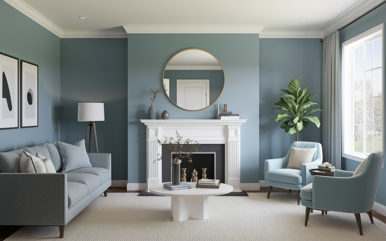
Living Room
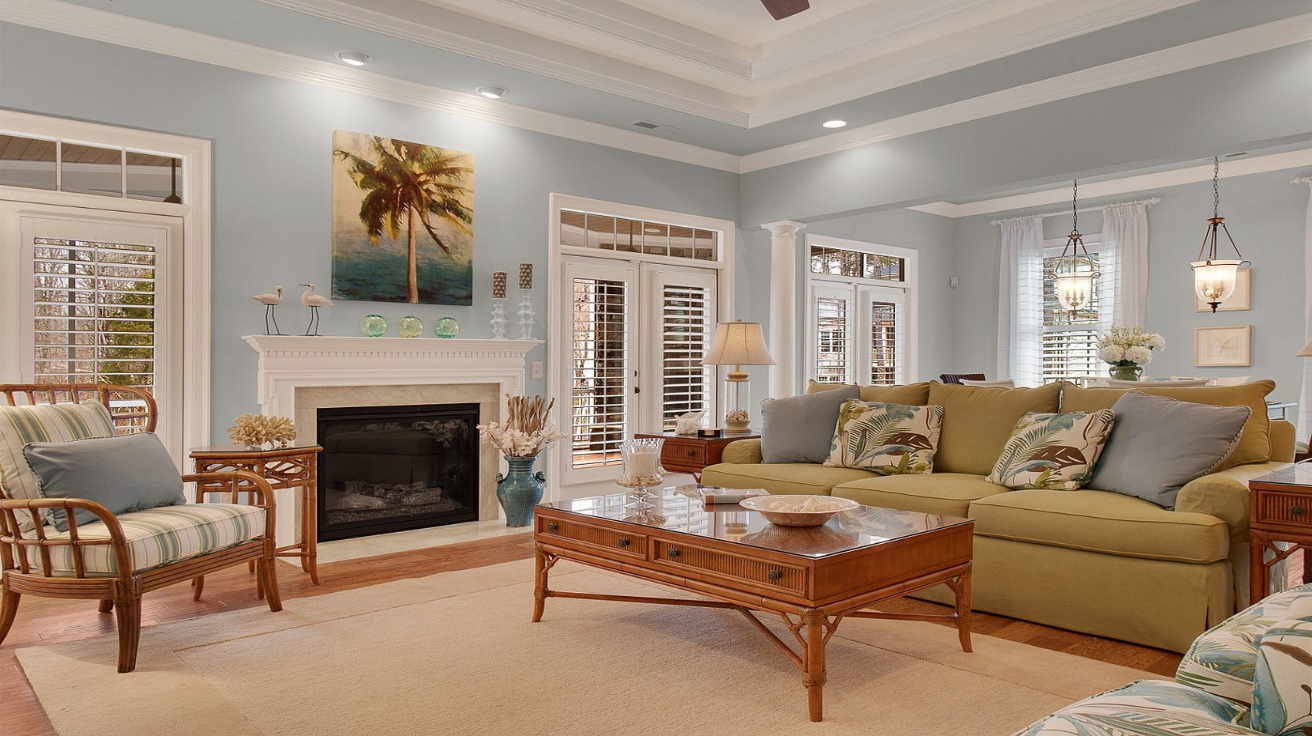
- Perfect for creating serene, welcoming spaces
- Enhances architectural details
- Complements various textures
- Works with multiple design styles
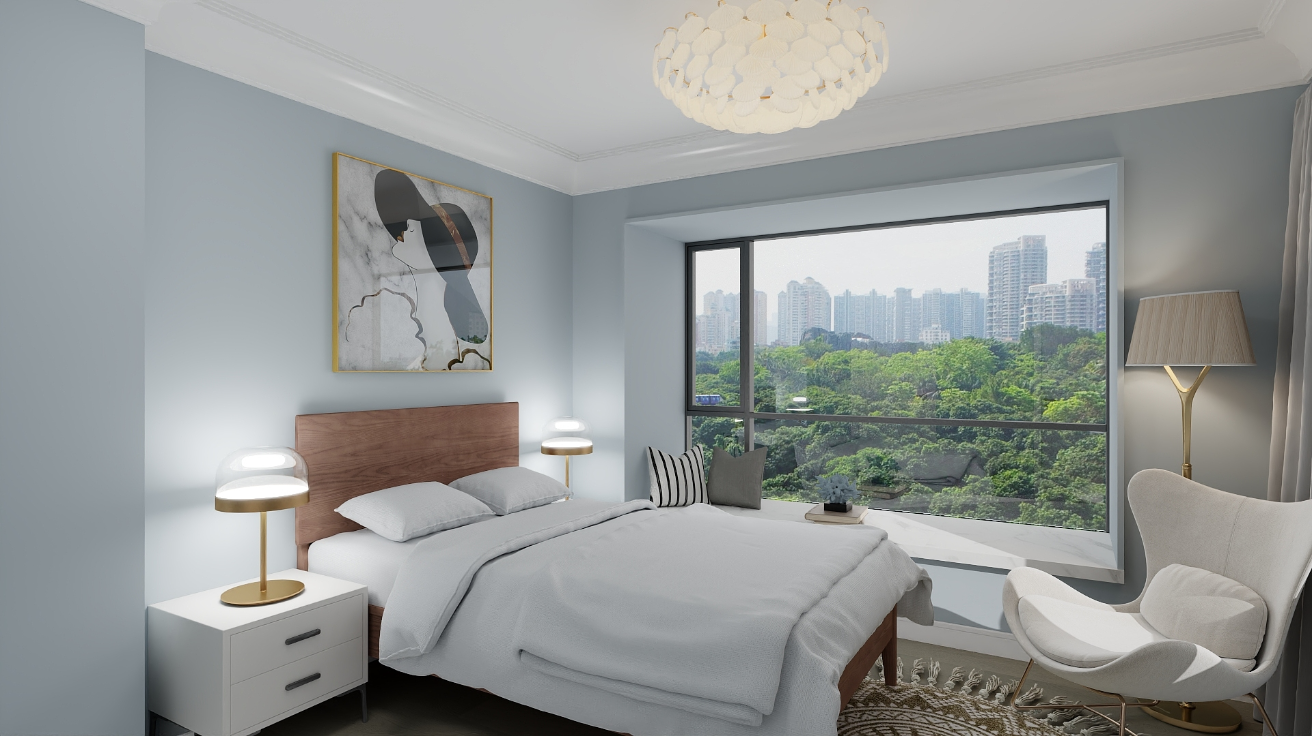
Bedroom
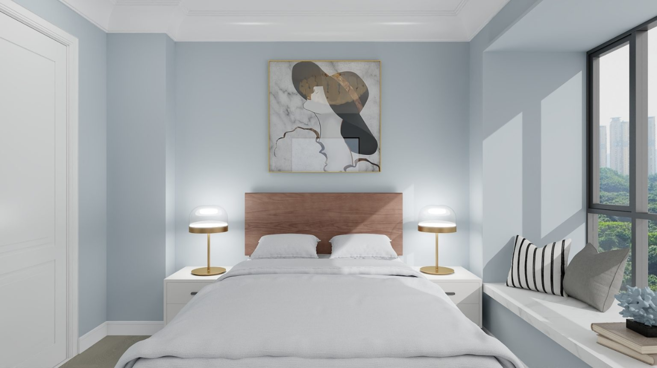
- Fosters relaxing atmosphere
- Evening light softens its blue tones
- Creates a restful retreat space
- Suits bedrooms of any size
Kitchen & Dining
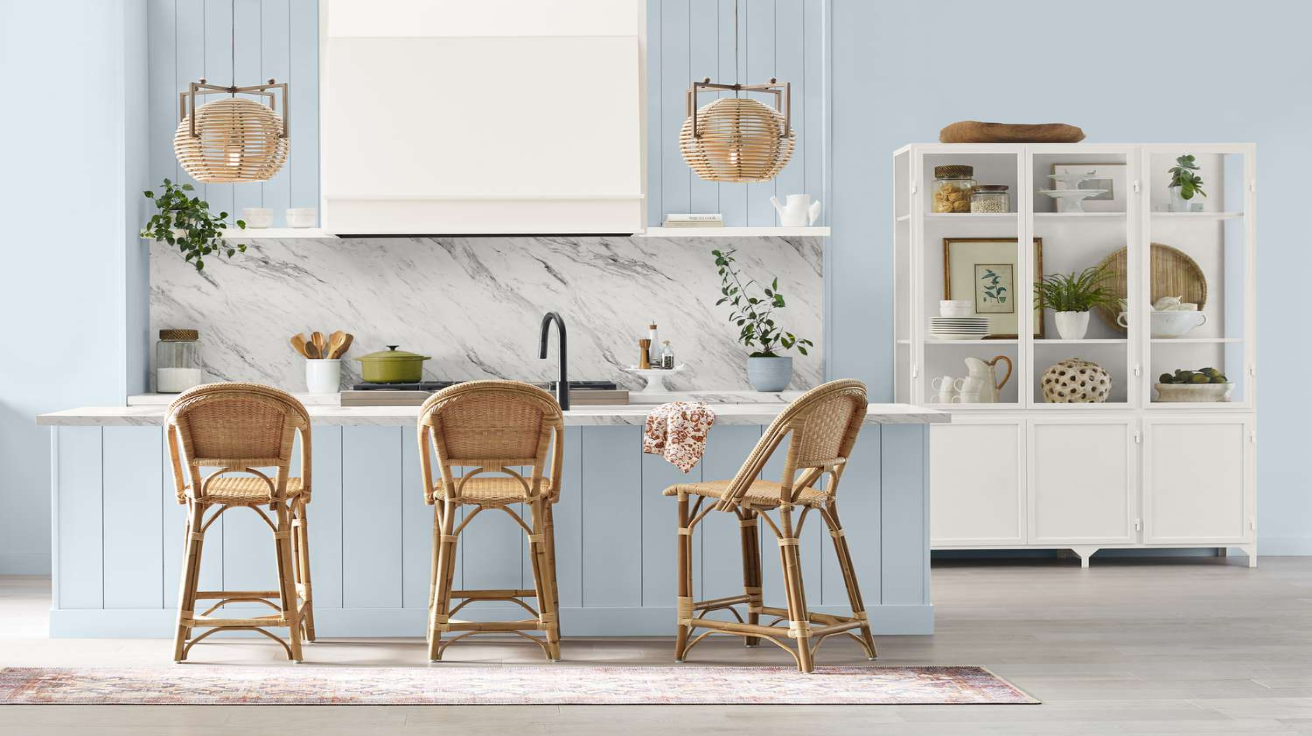
- Offers a clean, polished appeal
- Complements white cabinetry beautifully
- Provides visual harmony
- Maintains its composed appearance
Bathroom
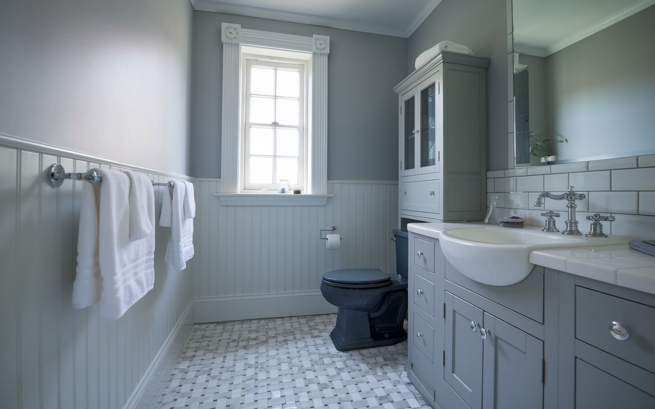
- Creates a refreshing spa-like environment
- Adds subtle color to complement chrome fixtures
- Pairs well with marble, tile, and porcelain surfaces
- Maintains color stability in humid environments
Color Pairings and Combinations for Upward SW 6239

- Extra White SW 7006 – A clean, bright white that creates clear contrast with Upward while highlighting its blue undertones and composed appeal.
- Alabaster SW 7008 – A soft, warm white that balances Upward’s coolness while maintaining its subtle character without creating stark contrast.
- Sea Salt SW 6204 – A light green-gray with blue undertones that adds complementary color while harmonizing with Upward’s neutral base, creating a balanced and inviting palette.
Creating Cohesive Color Schemes
Upward SW 6239 is a gentle blue-gray with balanced undertones, creating a refreshing neutral feel perfect for adaptable, welcoming spaces.
Monochromatic Scheme:
- Upward (SW 6239) for main walls
- Extra White (SW 7006) for trim
- High Reflective White (SW 7757) for ceilings
- Blustery Sky (SW 9140) for accent pieces or adjoining rooms
Cool Color Scheme:
- Upward (SW 6239) for main living areas
- North Star (SW 6246) for the dining room
- Misty (SW 6232) for hallways
- Online (SW 7072) for bedrooms
Warm-Cool Balance Scheme:
- Upward (SW 6239) for main walls
- Creamy (SW 7012) for bathrooms
- Agreeable Gray (SW 7029) for bedrooms
- Modern Gray (SW 7632) for home office
These colors maintain a cohesive, balanced palette that works wonderfully with Upward as the foundation.
They provide options for coordinating colors while maintaining a gentle, harmonious atmosphere throughout your home.
Paint Colors: Perfect Alternatives to Upward

- SW 6240 Windy Blue – A slightly deeper blue-gray that intensifies Upward’s color while maintaining its tranquil character
- SW 6233 Saros – A lighter blue-gray that creates a softer, airier version of Upward while preserving its balanced cool tones
- SW 6234 Uncertain Gray – A refined gray with subtle blue undertones that offers a more neutral progression from Upward while complementing its character
- SW 7072 Online – A balanced gray with blue undertones that enhances the coolness of Upward while maintaining its versatile, timeless appeal
Wrapping It Up
Upward continues to impress with its ability to shift and adapt to any room. This thoughtful blue-gray creates spaces that feel both open and composed.
For those wanting a refreshing yet timeless backdrop, Upward delivers without fail. Its balanced undertones—never too bold or muted—support both contemporary and classic decorating approaches.
The real value of Upward lies in its staying power.
As your furnishings change and styles evolve, this composed blue remains relevant. It’s more than just paint; it’s the foundation for spaces that continue to feel fresh and welcoming year after year.
Ready to bring this versatile blue-gray home?
Try a sample of Upward today and watch your space transform from ordinary to refreshingly composed—one thoughtful wall at a time.