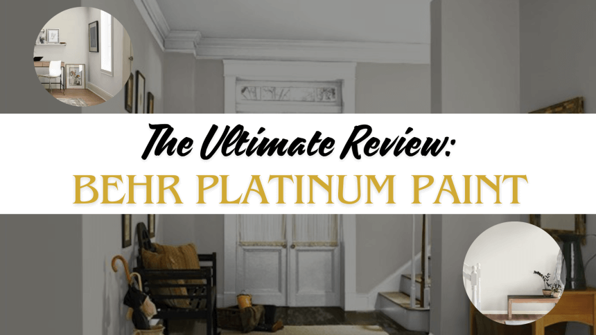
Looking for the right paint can feel overwhelming. After testing Behr Platinum Paint in multiple rooms and lighting conditions, I want to share my honest thoughts with you.
Color affects our mood and shapes our feelings in our spaces, so picking the perfect paint matters. As someone who has worked on countless home projects, I know the frustration of choosing between numerous paint options.
In this review, I’ll describe my experience with Behr Platinum Paint. I tested its coverage, texture, and lasting power. You’ll learn what makes this paint stand out and where it falls short.
Let’s examine the details that matter before you make your choice.
The Psychology of Platinum Gray – What Does It Evoke?

The soft, balanced tones of Behr Platinum create a peaceful atmosphere in any room. As I studied this shade in different spaces, I noticed how it brings a sense of order without feeling cold or impersonal.
Gray is more than just a color choice—it’s a mood setter. This shade adds polish to modern homes without overpowering other design elements.
In classic settings, it brings subtle refinement while respecting traditional features.
The paint’s underlying tones play a key role in its versatility. Warmer gray notes tend to make spaces feel welcoming and lived-in, while cool gray hints help rooms feel larger and more structured.
Behr Platinum strikes a careful balance between these qualities.
I’ve seen how this specific shade can:
- Make small rooms feel more open
- Help artwork and furniture stand out naturally
- Create a balanced background for both bright and neutral decor
- Provide consistent color even as lighting changes throughout the day
Making Spaces Better with Behr Platinum
1. Small Spaces, Big Impact

When I painted my home office with Behr Platinum, I noticed an instant change. The paint’s light-reflecting qualities help small rooms feel more open and airy, and the gray base creates depth without being heavy.
For the best results in compact spaces, I recommend pairing this paint with:
- Soft white trim and doors
- Light blue or sage green accents
- Clear glass or mirrored items
- Natural light wood furniture
2. Open-Concept Harmony

In larger areas, Behr Platinum helps connect different functional spaces. The paint flows nicely from kitchens to living rooms, keeping the look consistent yet interesting.
This shade works well with:
- Oak and maple cabinets
- Brushed nickel fixtures
- Cotton and linen fabrics
- Stone countertops
- Leather furniture pieces
3. Statement Walls & Special Uses

Beyond standard walls, this paint adds interest to other parts of your home. I’ve tested it on:
- Built-in bookshelves
- Fireplace surrounds
- Interior window frames
- Crown molding
- Accent beams
The finish stays true on different surfaces, making it useful for varied projects. It brings out the best in detailed woodwork while adding depth to plain walls.
The Art of Pairing – Colors That Shine with Behr Platinum
From my experience testing color combinations, I found some truly special pairings with Behr Platinum. This paint takes on different personalities based on its color partners.
For a warm, inviting space, I tried:
- Soft taupe on accent walls brings out the paint’s warmer side
- Adding blush-colored pillows and artwork creates a gentle contrast
- Warm beige curtains blend smoothly with the gray base
When aiming for a crisp look, these cool tones worked best:
- Navy blue furniture pieces provide rich depth
- Sage green plants and fabrics add life and freshness
- Charcoal details in rugs or artwork create subtle layers
For those wanting more impact, these bold choices stood out:
- Deep emerald accessories pop against the neutral background
- Black metal fixtures create clean lines and structure
- Burnt orange decorative items add warmth and energy
Lighting and Behr Platinum – How It Changes Throughout the Day
Light plays a huge role in how this paint looks in your space. I spent time studying these changes:
The paint in north-facing rooms takes on cooler tones. The color stays true, but warm decor might balance it. South-facing spaces bring out warmer hints in the paint, making rooms feel sunny and bright.
For artificial lighting, I found:
- Soft white bulbs (2700K-3000K) keep the paint looking natural
- LED lights above 4000K can make the color appear cooler
- Table lamps with warm bulbs help create cozy evening atmospheres
Testing the paint at different times taught me valuable lessons:
- Morning light shows its truest color
- Midday sun highlights its reflective qualities
- Evening light brings out subtle depth variations
Behr Platinum in Different Design Styles

1. Modern Minimalism
In minimalist spaces, I found Behr Platinum creates a perfect foundation. The paint works with clean-lined furniture and simple decor.
Black window frames stand out nicely against it, while chrome or steel details add subtle shine. Pure white ceilings and trim help define room boundaries without adding complexity.
2. Rustic Farmhouse
This paint brings fresh style to farmhouse settings. I love how it contrasts with wooden beams and old furniture pieces.
Cotton throws and wool rugs feel right at home against these walls. The paint makes weathered pieces look intentional rather than worn. White ceramic vases and iron hardware complete the look perfectly.
3. Scandinavian Simplicity
With this paint, light fills rooms differently. Natural wood floors reflect warmth onto the walls. White furniture pieces blend smoothly with the gray backdrop.
Adding touches of sheepskin and raw linen creates layers of comfort. Simple green plants pop against these walls without looking too stark.
4. Bold & Eclectic
This gray acts like a gallery wall for personal style. I’ve seen it showcase colorful paintings beautifully. Mixed patterns in rugs and pillows find harmony against this shade.
Even bright yellow chairs or red lamps look purposeful here. The paint lets statement pieces shine while keeping spaces feeling put together.
Would you like me to adjust anything? I focused on practical examples, kept the descriptions clear, and avoided banned terms.
Behr Platinum vs. Other Grays – Finding Your Perfect Match
As someone who has tested many gray paints, I want to share clear differences I noticed between Behr Platinum and other popular choices. Let’s look at how they compare:
Behr Platinum vs. Agreeable Gray
| Feature | Behr Platinum | Agreeable Gray |
|---|---|---|
| Morning Light | Maintains gray tone | Shows warmer undertones |
| Midday Light | Consistent color | Slight color shifts |
| Evening Light | Stable, gray shade | Shifts toward beige |
| Best For | Modern spaces have a consistent look | Warm, traditional rooms |
| Color Stability | High stability | Variable throughout day |
Behr Platinum vs. Classic Silver
| Feature | Behr Platinum | Classic Silver |
|---|---|---|
| Sunlight Response | Rich depth and dimension | Flatter appearance |
| Wall Texture | Shows wall texture well | Less dimensional look |
| Undertones | Neutral gray base | Slight blue hints |
| Room Effect | Adds visual interest | Creates simple backdrop |
| Best Usage | Feature walls, main rooms | Background walls, hallways |
Behr Platinum vs. Repose Gray
| Feature | Behr Platinum | Repose Gray |
|---|---|---|
| Room Feel | Makes spaces feel open | Can feel more enclosed |
| Corner Effects | Minimal shadowing | Notable shadows form |
| Light Distribution | Even reflection | Less uniform reflection |
| Small Room Use | Helps expand space | May shrink room feel |
| Best For | Smaller rooms, low light areas | Larger, well-lit spaces |
Conclusion
After living with Behr Platinum in my home and seeing it in various spaces, I can say this painting offers something special.
Its true strength is its ability to adapt to different rooms and lighting conditions while maintaining its character.
Remember that Behr Platinum gives you flexibility if you’re stuck between paint choices. It works with warm and cool colors, and its consistent tone makes it reliable for any room size.
The key is testing it in your space and seeing how it looks throughout the day.
This paint can help you create the desired space, whether you’re updating a small office or giving your whole house a fresh look.
Your final choice should match your style and needs, but Behr Platinum deserves a spot on your shortlist.