
Considering Cascades (SW 7623) for your next paint project? Today, I’ll share my hands-on experience with this bold blue-green paint color from Sherwin Williams.
After testing it in various lighting conditions and seeing it transform multiple spaces – from modern kitchens to cozy bedrooms – I know exactly how this color performs in real homes.
My findings have helped over 100 homeowners decide about using this striking shade.
Let me walk you through everything about the Cascades- from its unique undertones and light reflectance value to the best coordinating colors and practical applications.
This color might just be the perfect choice you’ve been looking for.
What is Cascades (SW 7623)?

As a paint color specialist, I can tell you Cascades isn’t your typical green. This shade packs character with its rich dark green base and subtle blue hints blended throughout.
With an LRV of 4, it falls on the deeper end of Sherwin-Williams’ color spectrum. I often find homeowners are drawn to how it shifts personality – sometimes reading as a moody green-black, other times showing off its teal side.
Cascades has a personality that comes through in different lights. The base color mixes deep green with blue to remind me of ocean depths.
When I tested it during various times of day, I found it’s quite saturated – meaning the color stays rich rather than appearing washed out.
Should You Choose Cascades?
After working with Cascades across numerous homes and seeing how it performs in real spaces, here’s my honest take,
If you’re someone who lights up at the idea of color with presence, Cascades might be your perfect match. I’ve seen it work magic in homes ranging from sleek downtown lofts to charming country cottages.
However, this isn’t a shy color; it needs natural or good artificial lighting to show its best qualities.
From my experience, Cascades works especially well for:
- Folks who aren’t afraid of making a statement with their color choices
- Spaces that need some personality and depth
- Rooms with ample lighting or contrasting elements
- Anyone looking for a color that changes subtly throughout the day
But it might not be the best fit if:
- You prefer colors that stay in the background
- Your space already struggles with lighting
- You’re looking for something that feels light and airy
Pros and Cons of the Cascades by Sherwin Williams
| Detail | Information |
|---|---|
| Pros | Creates a one-of-a-kind look that sets spaces apart |
| Maintains its rich appearance in both bright and dim lighting | |
| It fits beautifully with various home styles, from farmhouse to contemporary. | |
| Works exceptionally well as an accent wall or exterior trim color | |
| Cons | The deep tone might feel overwhelming in smaller spaces |
| Some clients find it too bold for their taste. | |
| Requires thoughtful planning with trim and accent colors | |
| It might need extra coats due to its dark pigmentation |
Where do Sherwin Williams’ Cascades Shine?
Exterior Applications
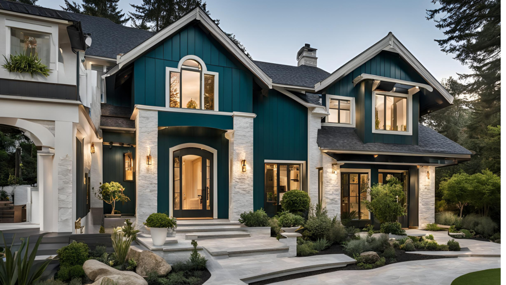
In modern homes, it creates clean, bold lines that make architectural features stand out. For craftsman-style houses highlight the natural woodwork beautifully.
I’ve also used it in Victorian homes, where it brings out the ornate details wonderfully.
Some winning combinations I’ve found:
- Bright white trim creates sharp, crisp contrasts
- Natural stone elements blend smoothly with its deep tones
- Copper gutters and accents add warmth that makes Cascades glow
- Wood elements like front doors or exposed beams complement its richness
Interior Applications
1. Living Rooms
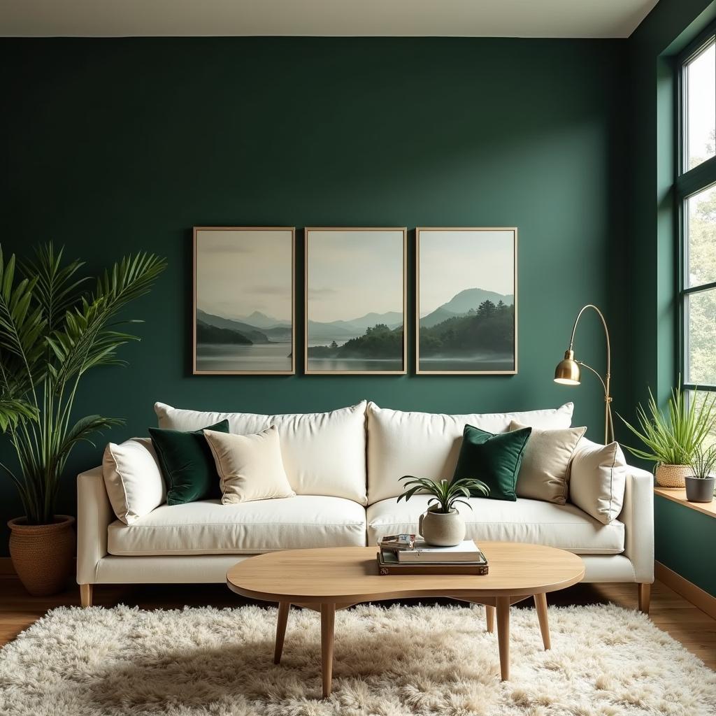
My favorite way to use Cascades in living spaces is on a single wall. It immediately draws the eye and adds depth without overwhelming the room. I’ve found it works particularly well behind fireplaces or built-in shelving.
2. Bedrooms
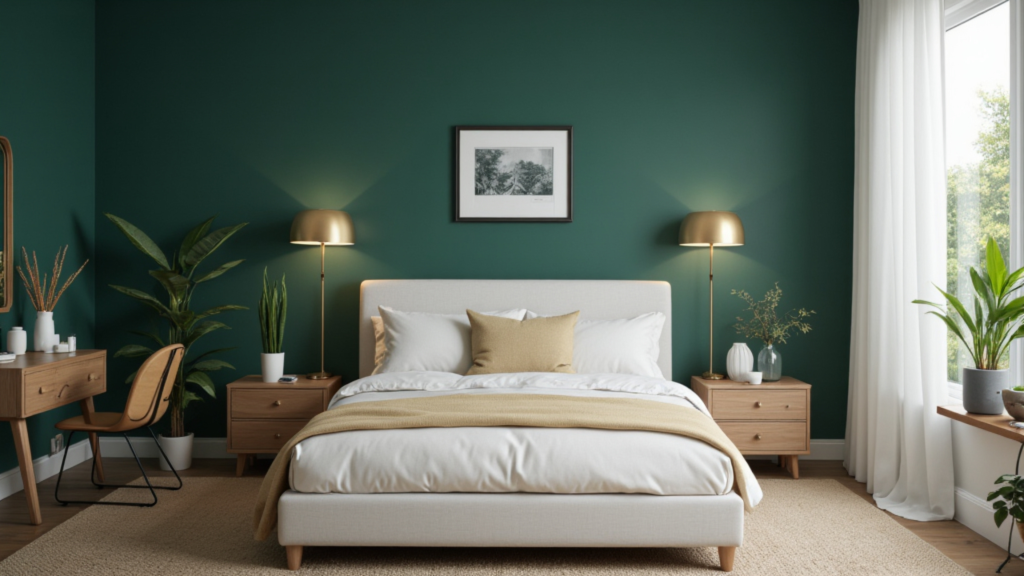
In bedrooms, this color creates a cocoon-like feeling that my clients love. I often pair it with crisp white bedding and natural wood furniture. The result? A peaceful retreat that feels both grounding and luxurious.
3. Kitchen Cabinets
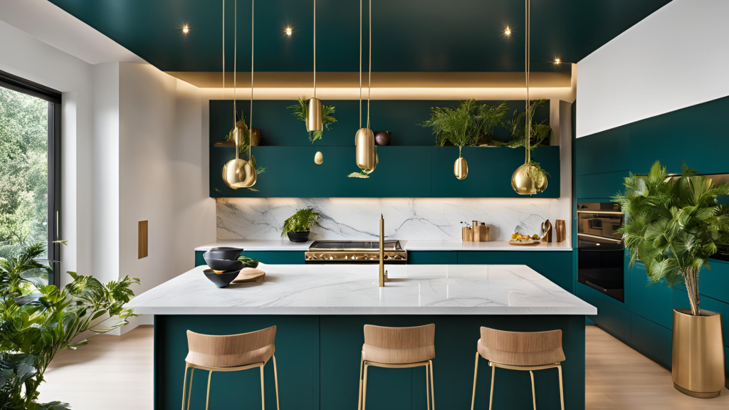
I’ve had great success using Cascades on lower cabinets while keeping upper cabinets light for kitchen projects. It grounds the space without making it feel heavy. The color pairs especially nicely with marble or quartz countertops.
4. Bathrooms
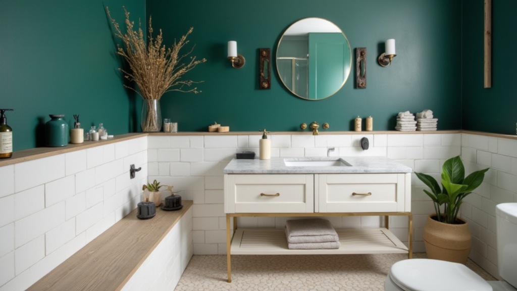
In bathrooms, Cascades creates a high-end spa feeling. I often combine it with brushed gold fixtures and marble tile. The contrast makes both elements pop.
5. Laundry & Mudroom
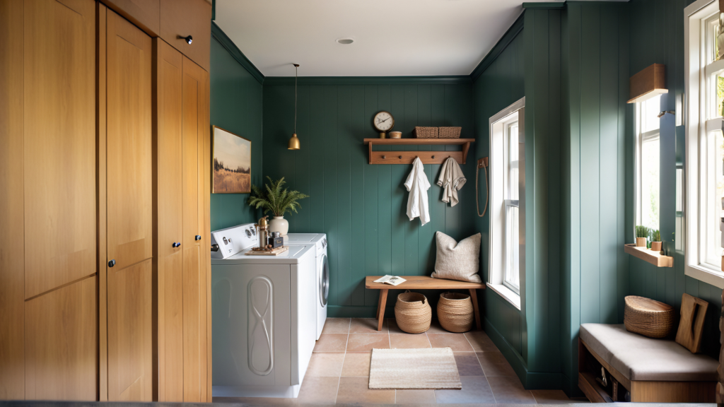
These smaller spaces are perfect for experimenting with Cascades.
In my projects, it adds a touch of sophistication to otherwise utilitarian spaces. Plus, it hides scuffs and marks better than lighter colors.
Color Matches & Design Ideas with Cascades
Perfect Color Combinations
These are two of the trim Colors that work best with Cascades
- High Reflective White (SW 7757)
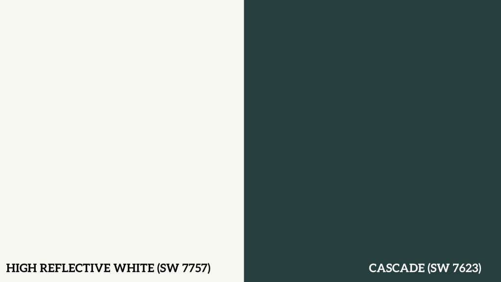
This is my go-to trim color when clients want a modern, clean look. It creates sharp, clear lines that make Cascades look even richer. I particularly like this pairing for rooms with lots of natural light.
- Snowbound (SW 7004)

For a gentler approach, I often choose Snowbound. Its soft white quality doesn’t compete with the Cascades but still provides enough contrast to define spaces nicely. This combination has saved many of my projects from feeling too stark.
Accent Colors I Trust
- Coral Clay (SW 9005)
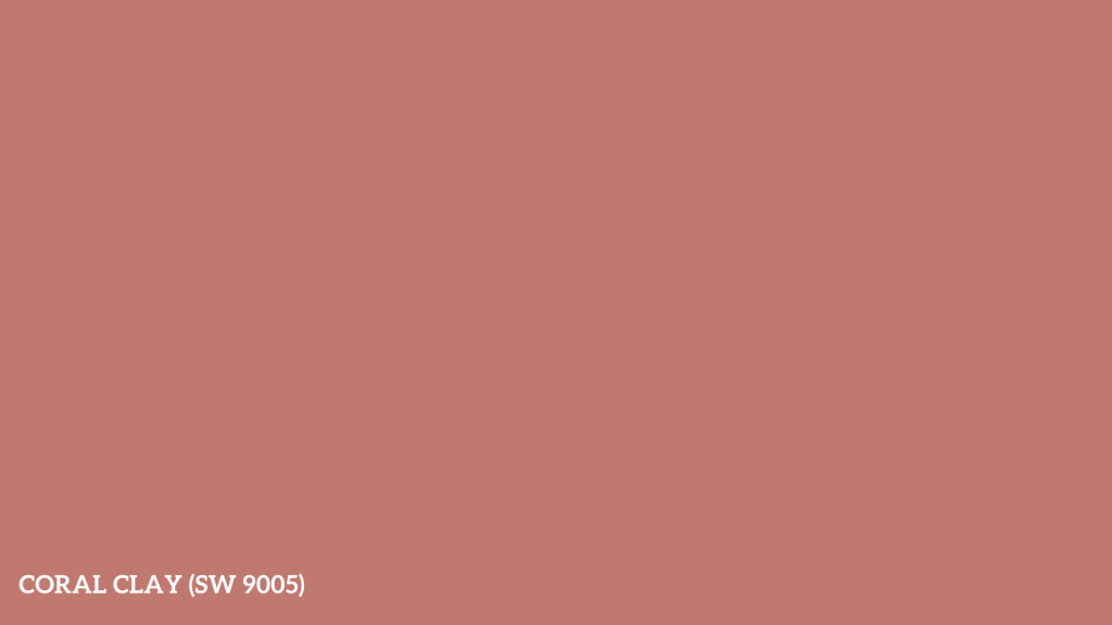
I’ve found this color adds just the right amount of warmth to spaces with Cascades. My clients are often surprised by how well these colors play together.
- Agreeable Gray (SW 7029)
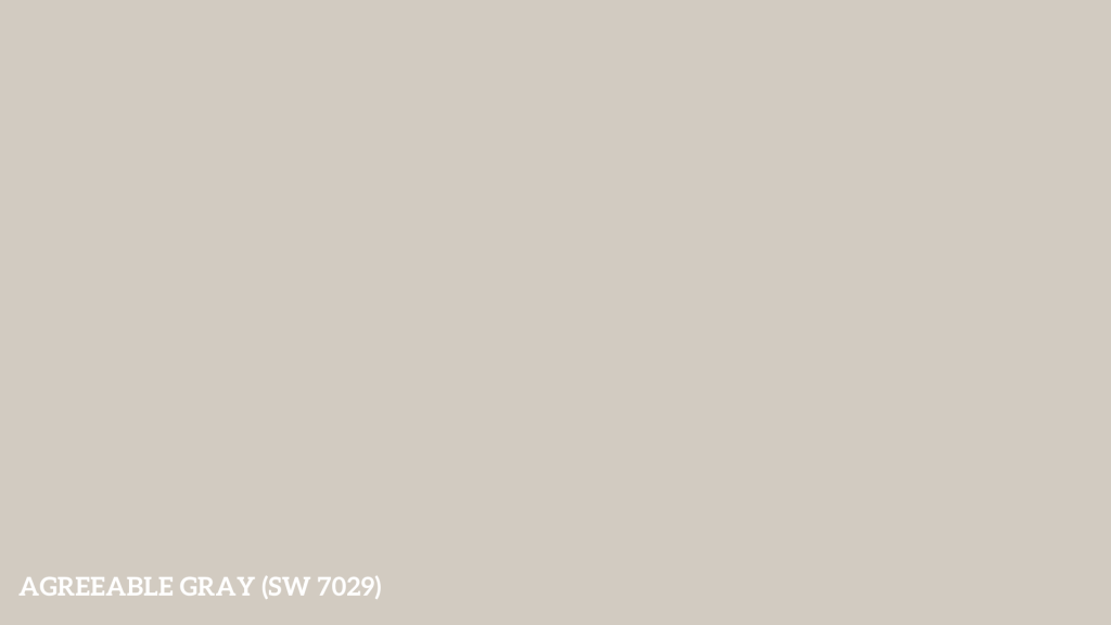
Agreeable Gray is my reliable partner when I need a neutral that won’t fight with Cascades. It’s particularly effective in open floor plans requiring a smooth color transition.
- Tricorn Black (SW 6258)

I add touches of Tricorn Black for modern spaces to create depth and definition. It works especially well on window frames and door hardware.
How Does It Compare to Similar Colors?
After using these colors in various projects, here’s my take on how Cascades stacks up against similar shades:
1. Benjamin Moore’s Regent Green
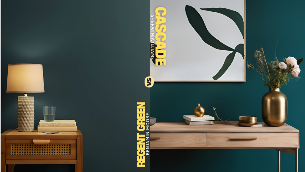
I often suggest Regent Green when clients want something similar but less intense. Its LRV of 6.16 makes it slightly lighter than the Cascades, offering a more subtle take on the deep green-blue theme.
2. Sherwin Williams Naval
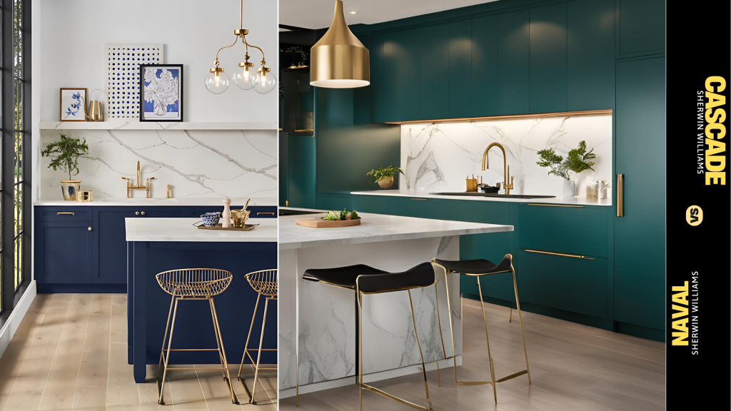
While both colors share that rich, deep quality, Naval leans firmly into navy blue territory. It has the same LRV (4) as Cascades but offers a more traditional look that some of my clients prefer for classic spaces.
3. Sherwin Williams Greenblack
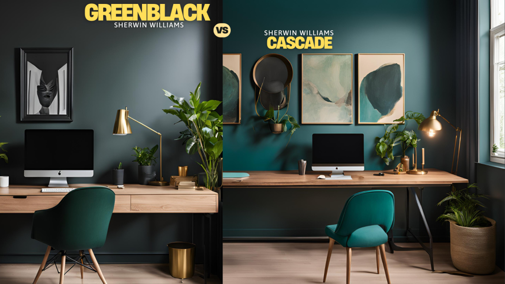
For those who love the Cascades but want something even moodier, Greenblack serves as a deeper alternative. I’ve used it when clients want that green undertone but in an almost-black finish.
Design Tips That Enhance Cascades
From my experience, these styling choices make Cascades really sing:
- Metal finishes matter – brass and copper hardware bring warmth and life to the color
- Natural wood elements create balance – think floating shelves or furniture pieces
- Textiles make a difference – I always include plush fabrics like velvet pillows or linen curtains to add layers of interest.
- Lighting placement is key – strategic lighting helps show off the color’s depth at different times of day.
These combinations have consistently helped my clients achieve the refined look they’re after while keeping spaces feeling welcoming and lived-in.
Conclusion
After painting numerous homes with Cascades, I can confidently say it’s more than just another dark green. This color creates intentional and refined spaces, whether on kitchen cabinets or exterior walls.
The way it shifts between green-black and teal tones adds a layer of interest you can’t get with standard paint colors.
But remember – Cascades isn’t for everyone. Your space needs good lighting and thoughtful color pairings to make it work.
If you’re considering this shade, test a sample in different areas of your home throughout the day. Watch how it changes and interacts with your existing decor.
Ready to try Cascades? I’d love to hear about your experience with this color.
Share your project photos and thoughts with us!