Standing in front of white paint swatches, feeling overwhelmed?
You’re not alone.
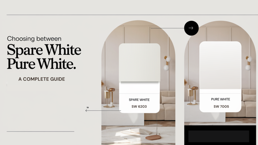
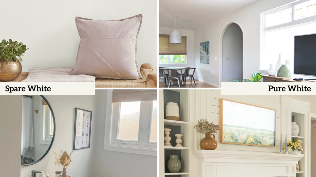
The choice between Spare White and Pure White can seem impossibly subtle – until you see them transform your space differently.
Like many homeowners, you might wonder if there’s any difference between these popular whites.
While they might look identical on small swatches, their unique undertones and light-reflecting properties can completely change your room’s atmosphere.
These two whites each bring distinct qualities to your walls.
What if you could understand exactly how they’ll look in your space before making your decision?
Let’s explore what makes these whites uniquely different.
Understanding The Basics Of Spare White vs Pure White
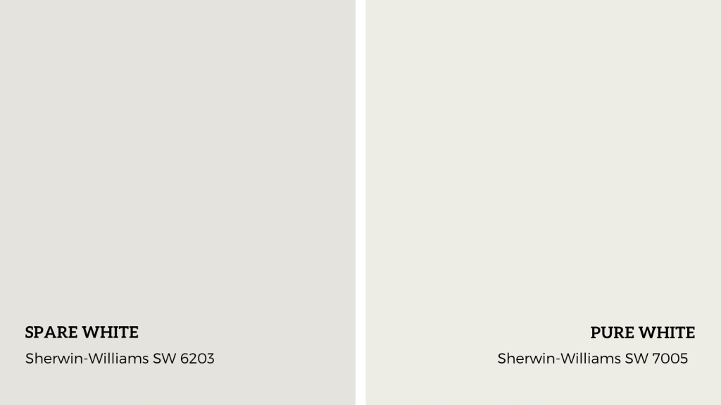
Spare White
- Paint Code: Sherwin-Williams SW 6203
- Light Reflectance Value (LRV): 83.25
Spare White confidently represents the sophisticated whites category, balancing warmth and coolness.
This versatile hue has subtle greige undertones—an elegant mix of gray and beige—that add character.
Spare White adapts to any space, with gentle undertones shifting with light, balancing warmth and coolness.
This is crucial when natural and artificial light transitions throughout the day.
What sets Spare White apart is its ability to provide depth without heaviness.
Pure White
- Paint Code: Sherwin-Williams SW 7005
- Light Reflectance Value (LRV): 84.87
Pure White embodies its name, featuring an impressively clean and crisp look.
In contrast to many whites that tend to lean warm or cool, Pure White offers a nearly neutral tone, with just a faint warm undertone that keeps it from appearing stark or clean.
Its slightly higher Light Reflectance Value (LRV) allows it to reflect more light than Spare White, making it especially effective in areas where enhancing brightness is essential.
Pure White’s neutrality makes it ideal for trim, ceilings, and walls.
It creates clean lines and sharp definitions without conflicting undertones, allowing other design elements to shine.
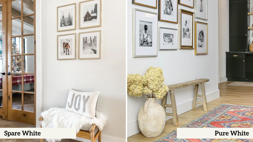
Room-By-Room Analysis – Interiors
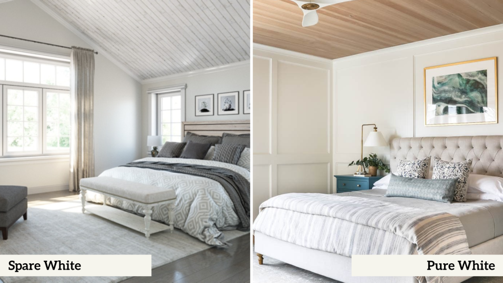
1. Bedroom
| Spare White | Pure White |
|---|---|
| Creates a cocooning effect with its gentle greige undertones | Maximizes natural light reflection for a bright, airy feeling |
| It provides a sophisticated backdrop that’s especially flattering in the evening light | Creates crisp boundaries that define architectural features |
| Partners beautifully with textural elements like linens and woven materials | Provides a clean canvas for colorful bedding and artwork |
| Maintains its character even as natural light shifts throughout the day | Appears particularly fresh in morning light |
2. Living Room
| Spare White | Pure White |
|---|---|
| Adds subtle depth that photographs beautifully | Maximizes the sense of space with its higher light reflectance |
| Creates an elegant atmosphere without feeling too formal | Creates a gallery-like setting for showcasing furniture and decor |
| Balances well with both natural and artificial light sources | Maintains consistency across different lighting conditions |
| Provides a sophisticated backdrop for art collections | Offers exceptional versatility with any color scheme |
3. Bathroom
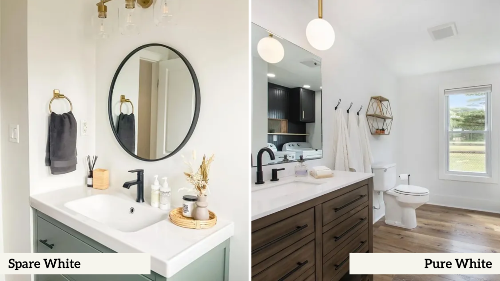
| Spare White | Pure White |
|---|---|
| Works harmoniously with marble and stone surfaces | Provides a clean, fresh appearance that suggests pristine cleanliness |
| Creates subtle depth that prevents the space from feeling clinical | Creates beautiful contrast with chrome and polished nickel fixtures |
| It pairs exceptionally well with brushed nickel and bronze fixtures | Reflects light effectively in smaller bathroom spaces |
| Maintains its warmth under both natural and artificial light | Coordinates seamlessly with white porcelain fixtures |
4. Kitchen
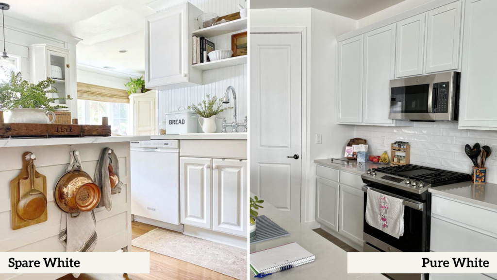
| Spare White | Pure White |
|---|---|
| Provides depth and interest to cabinet faces | Offers a clean, fresh appearance that suggests cleanliness |
| Creates subtle contrast with stainless steel appliances | Creates striking contrast with colorful appliances and accessories |
| Works beautifully with natural stone countertops | Reflects under-cabinet lighting effectively |
| Maintains its sophisticated appearance under task lighting | Makes the space feel larger and more open |
Exterior Applications
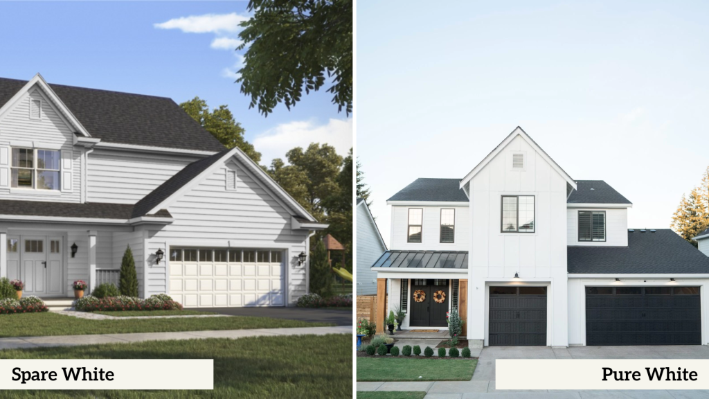
Regarding exterior use, Spare White and Pure White each bring distinct characteristics that can dramatically impact your home’s curb appeal.
| Spare White | Pure White |
|---|---|
| Presents a sophisticated, slightly muted appearance | Delivers a bright, clean appearance that catches the eye |
| Shows subtle depth variations throughout the day | Maintains crispness even on overcast days |
| Maintains its greige undertones even in bright sunlight | Can appear slightly stark in direct sunlight |
| Creates a modern yet timeless exterior presence | Creates a classic, timeless exterior look |
| Tends to show less dirt and environmental wear | May require more frequent cleaning to maintain its pristine appearance |
Application Tips for Exterior Use
For Both Colors:
- Always use high-quality exterior paint.
- Apply multiple coats for the best coverage.
- Consider local climate conditions.
- Test large sample areas before committing.
- Evaluate during different times of the day.
Performance in Different Lighting Conditions
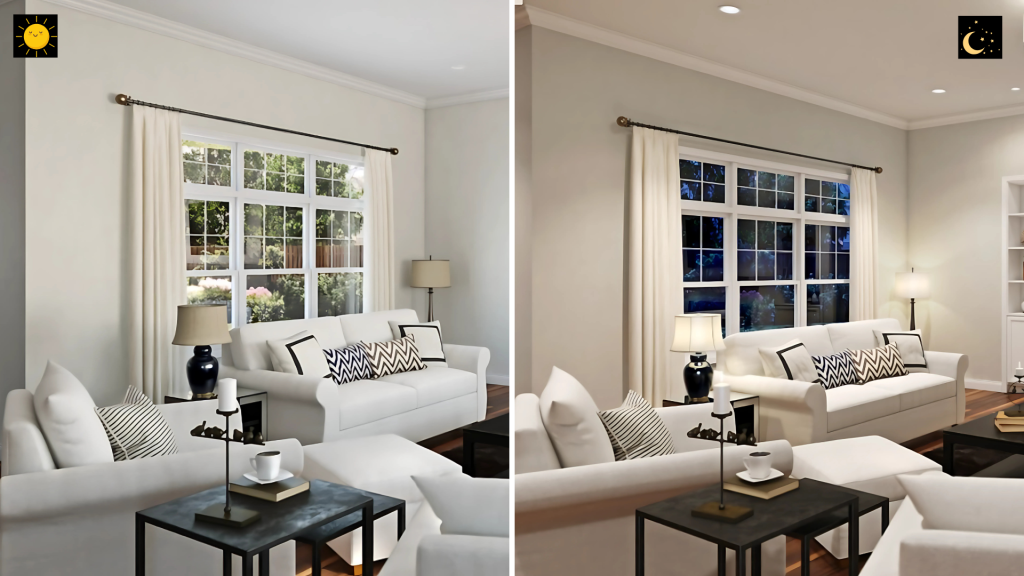
Understanding how these whites behave in different lighting conditions is crucial for making the right choice for your space.
Natural Light
Morning:
- Spare White: Soft and muted, it reveals greige undertones as morning light strengthens, creating a gentle atmosphere ideal for slow transitions.
- Pure White: Brightens with first light, creating a crisp, energizing morning presence that maximizes daylight, making spaces feel fresh.
Midday:
- Spare White: It appears balanced, with visible but subtle undertones. It moderates intense natural light without glare.
- Pure White: It showcases peak brightness, creating a bright atmosphere but may need light control in direct sun.
Evening:
- Spare White: Transitions gracefully to warmer tones as daylight softens and maintains depth and character even as natural light diminishes.
- Pure White: Preserves its crispness until the last moments of daylight also creates beautiful contrast with lengthening shadows.
Artificial Light
- Spare White: Warms beautifully under artificial light and adapts well to various bulbs, from LEDs to incandescent, with minimal color shifting.
- Pure White: Maintains a bright look under artificial light, creating a fresh atmosphere in the evening. Works well with LED lighting, especially in spaces where clarity is essential.
Color Analysis: Spare White vs Pure White
1. Similarities
Base Properties:
- Both provide excellent coverage in 2-3 coats
- Both are available in multiple finishes (flat, eggshell, satin, semi-gloss)
- Both work well in modern and traditional settings
- Both offer good durability and washability
Application Versatility:
- Suitable for both interior and exterior use
- Can be used on walls, trim, and ceilings
- Compatible with standard primers
- Work well with most painting techniques
2. Visual Distinctions
Undertones
- Spare White: Features subtle greige (gray-beige) undertones that become more noticeable in shadow
- Pure White: Carries minimal undertones, maintaining a cleaner, more neutral appearance
Depth Perception
- Spare White: Creates more visual texture and depth on walls
- Pure White: Produces a flatter, more uniform surface appearance
Factors Affecting Color Appearance
Room Orientation
| Orientation | Spare White | Pure White |
|---|---|---|
| North-Facing Rooms | Maintains warmth despite cooler light, helping balance the space | It can appear slightly cooler, creating a clean, crisp atmosphere |
| South-Facing Rooms | It shows its greige undertones more prominently, adding sophistication | Brightens considerably, maximizing natural light |
| East-Facing Rooms | Provides gentle morning warmth, transitions well throughout the day | Creates an energizing morning atmosphere, and stays crisp as light changes |
| West-Facing Rooms | Handles afternoon warmth gracefully, maintaining balance | May appear slightly warm in evening light, but maintains clarity |
Surface Texture Effects
Smooth Walls:
- Spare White: Shows subtle depth variations even on smooth surfaces
- Pure White: Creates a clean, uniform appearance
Textured Walls:
- Spare White: Enhances texture visibility with subtle shadowing
- Pure White: Provides sharp definition of texture patterns
Making Your Choice
1. When to Choose Spare White
Perfect For:
- Sophisticated spaces that need subtle depth
- Rooms with mixed lighting conditions
- Spaces with natural materials and textures
- Traditional or transitional design styles
- Areas where walls might get occasional scuffs
- Rooms where you want to minimize glare
Best Applications:
- Living rooms with varied decor styles
- Master bedrooms seeking sophistication
- Home offices requiring focused atmosphere
- Exterior walls in varied climates
- Spaces with architectural interest
2. When to Choose Pure White
Perfect For:
- Modern, minimalist spaces
- Rooms needing maximum light reflection
- Art galleries or display areas
- Clean, contemporary designs
- Spaces requiring crisp definition
- Areas where brightness is a priority
Best Applications:
- Contemporary kitchens
- Art studios
- Modern bathrooms
- Trim and moldings
- Bright, airy living spaces
Conclusion
Both Spare White and Pure White are excellent choices for your home, each with its own special qualities.
Spare White brings a soft, sophisticated look with its subtle gray-beige undertones, making it perfect for spaces where you want warmth and depth.
Pure White offers a clean, bright look that’s ideal for modern homes and spaces where you want maximum light.
The best choice depends on your space and what you want to achieve.
Take time to test both colors in your room, look at them at different times of day, and think about how they work with your furniture and lighting.
Remember, there’s no wrong choice – it’s all about what makes your space feel right to you.