Have you ever stared at Valspar Warm Putty walls, feeling unsure about the right colors to pair with them?
Many homeowners struggle to find the perfect color matches for this versatile neutral shade.
They often end up with combinations that look flat, boring, or just don’t work together. This common paint dilemma can make any room feel uninspired.
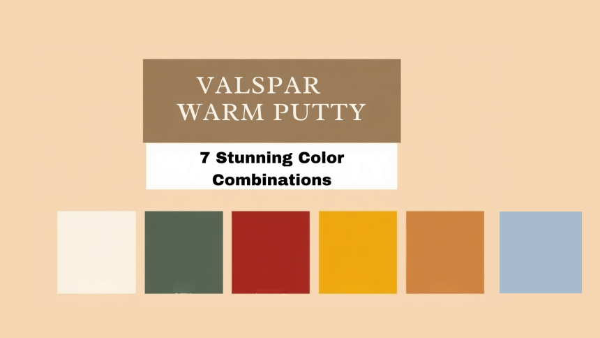
But here’s the good news: You don’t need to be a color expert to create stunning combinations with Valspar Warm Putty. We’ve carefully selected seven color pairings that will transform your space from basic to beautiful.
These tried-and-tested combinations work in any room, from living areas to bedrooms. Get ready to see how simple changes in color can make your Warm Putty walls stand out in ways you never imagined.
7 Beautiful Combinations for Your Valspar Warm Putty
Valspar Warm Putty is a versatile neutral that adds warmth and sophistication to any space. Pairing it with the right colors can enhance its beauty and create a cohesive, stylish look.
Here are seven stunning color combinations to elevate its charm.
1. Classic White & Warm Putty

White trim and Warm Putty walls create a timeless combination that brightens any space. The clean lines of white moldings make a clear statement against the soft putty background. This pairing brings both comfort and style to your home.
Valspar Ultra White offers the perfect contrast for your putty walls. Its clean, bright tone helps define spaces and highlight architectural features.
Swiss Coffee provides a gentler alternative, with its soft white hue that feels warm and inviting.
Tips for Using This Combination
- Paint all trim, crown moldings, and baseboards in white for a consistent look
- Choose white curtains or blinds to create a flowing visual effect
- Select white furniture pieces like sofas or chairs to connect the design elements
- Follow the 70% putty to 30% white ratio for the most pleasing balance
- Use white picture frames to create eye-catching wall displays
- Add white bedding in bedrooms to extend the color scheme
Best Rooms for This Combination
- Living rooms: Creates an open, bright atmosphere
- Bedrooms: Promotes rest and relaxation
- Kitchens: Makes the space feel clean and fresh
- Home offices: Helps with focus and concentration
2. Earthy Greens & Warm Putty

Green paired with putty brings nature’s harmony indoors. Valspar Olive Sprig creates a connection to the outdoors when combined with Warm Putty walls. This combination feels fresh and natural in any lighting.
Sherwin-Williams Evergreen Fog offers a sophisticated alternative. Its subtle green tone perfectly harmonizes with putty to create spaces that feel grounded and refreshed. The combination suits both modern and traditional homes.
Ways to Use This Pair Effectively
- Create an accent wall in green to add visual interest
- Choose green upholstered chairs or sofas as focal points
- Layer different green tones through plants, pillows, and throws
- Incorporate natural wood elements to enhance both colors
- Use green curtains against putty walls for subtle contrast
- Add green ceramic vases or sculptures as decorative elements
Room-Specific Applications
- Living rooms: Green accent walls with putty surrounding walls
- Dining rooms: Green chairs against putty backgrounds
- Studies: Green bookshelves with putty walls
- Bedrooms: Green bedding against putty walls
3. Soft Blues & Warm Putty

Soft blues combine with Warm Putty to create spaces that feel like peaceful retreats. Valspar Celestial Blue adds a touch of sky-like serenity to any room. Benjamin Moore Hale Navy provides a stronger presence while maintaining a calming effect.
This combination creates different moods throughout the day. As the sun moves across the sky, this combination shifts in mood and feeling throughout the day.
The blues take on a crisp, fresh look in the morning, making spaces feel clean and bright. By afternoon, both colors soften, creating a soothing atmosphere perfect for work or rest.
When evening comes, the pair transforms again, combining putty and blue tones to form a cozy, intimate setting that helps people unwind and relax.
Perfect Places for This Pairing
- Main bedrooms: Creates a peaceful sleep environment
- Home offices: Helps maintain focus without feeling cold
- Bathrooms: Brings a spa-like quality to the space
- Reading nooks: Sets the tone for relaxation
- Children’s rooms: Provide a calm but playful atmosphere
Design Tips for Maximum Impact
- Use blue in varying shades through pillows, throws, and artwork
- Paint built-in shelves in blue against putty walls for depth
- Select light blue curtains to soften natural light
- Add silver or chrome accents to enhance both colors
- Include glass elements to reflect both tones
- Layer different textures in both colors
4. Charcoal Gray & Warm Putty
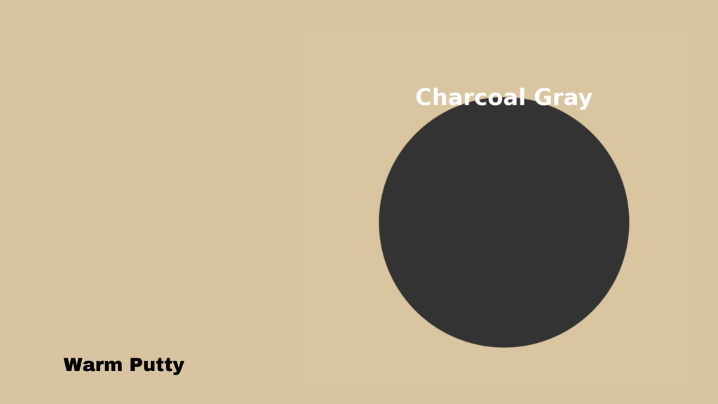
Charcoal gray brings a modern touch when paired with Warm Putty. Valspar Chimney Smoke creates strong visual interest without feeling heavy. Sherwin-Williams Peppercorn’s rich, deep tone makes putty walls look sophisticated.
The contrast between these shades creates visual depth in any room. The putty’s gentle warmth softens the charcoal’s boldness. Together, they strike a perfect balance between light and shadow.
In natural daylight, this combination shifts and changes. Morning light brings out the warm notes in both colors. The afternoon sun highlights their subtle differences. Evening light contrasts feel cozy and intimate.
This Combination Works in Many Ways
- Main walls in putty with charcoal gray accent features
- Gray furniture against putty walls
- Gray and putty pattern tiles in bathrooms
- Two-tone wall treatments with gray below and putty above
Best Uses in Different Rooms
- Kitchen: Gray cabinets with putty walls
- Living room: Gray sofas against putty backgrounds
- Home office: Gray desk and shelving with putty walls
- Dining room: Gray chairs with putty wall backdrop
5. Warm Terracotta & Warm Putty

Terracotta brings a sun-kissed feel to spaces with Warm Putty. Valspar Red Clay creates a natural, welcoming mood. Behr Canyon Dusk offers a softer option that still adds warmth to any room.
This combination brings Mediterranean charm to modern spaces. The earthy red tones complement the putty’s neutral base perfectly. Like sunset meeting sand, these colors create spaces that feel both fresh and timeless.
Perfect Combinations for
- Mediterranean style homes
- Southwest inspired spaces
- Casual living areas
- Outdoor-indoor transition spaces
Best Room Applications
- Entryways: Creates a warm welcome
- Kitchens: Adds a cozy, lived-in feel
- Sunrooms: Brings natural warmth
- Dining spaces: Makes meals feel more inviting
6. Rich Burgundy & Warm Putty

Burgundy paired with Warm Putty creates spaces that feel both bold and comfortable. Valspar Classic Burgundy makes a strong statement while keeping rooms cozy. Sherwin-Williams Rookwood Red adds depth without feeling too intense.
This rich combination brings traditional sophistication to any space. Like fine wine meeting creamy linen, these colors create rooms that feel cultured yet welcoming. The deep red notes make putty walls look refined and intentional.
Perfect for Creating
- Formal Dining Spaces: Burgundy chairs around a wooden table create an inviting setting for special meals.
- Library Settings: Burgundy bookshelves against putty walls are perfect for quiet reading time.
- Wine Rooms: The rich burgundy accents match wine storage perfectly, creating a sophisticated tasting space.
- Master Bedrooms: Burgundy bedding and curtains add warmth, while putty walls keep the room peaceful.
Implementation Ideas
- Paint one wall in burgundy as a focal point
- Use burgundy curtains against putty walls
- Add burgundy chairs or sofas
- Include burgundy rugs for floor interest
- Mix in burgundy throws and pillows
- Create contrast with gold or brass accents
7. Muted Mustard & Warm Putty
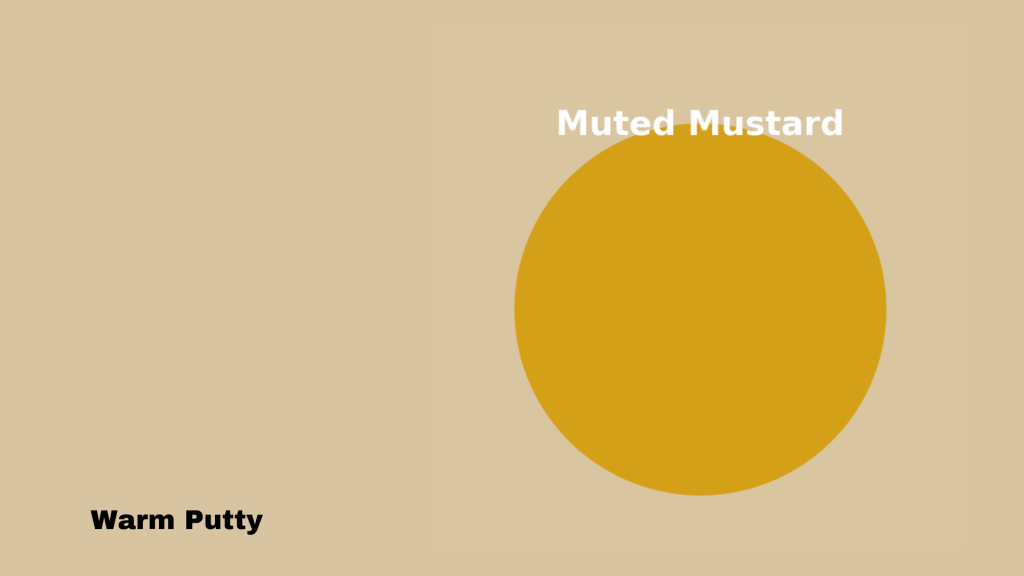
Muted mustard paired with Warm Putty creates spaces that feel fresh and inviting. Valspar Golden Maize works wonderfully in bright rooms, making them feel sunny and open.
Benjamin Moore’s Spiced Mustard offers a richer tone that adds interest without feeling too strong.
Ways to Use This Combination
- Paint a feature wall in mustard with putty on other walls
- Select mustard cushions or throws for seating areas
- Add a mustard-colored area rug to define spaces
- Choose mustard curtains to frame windows
- Place mustard-toned artwork against putty walls
- Use mustard light fixtures as focal points
- Include small mustard accessories like vases or bowls
Perfect Room Applications
- Living rooms: Create warm gathering spaces
- Kitchens: Make cooking areas feel cheerful
- Home offices: Help maintain focus with gentle color
- Bedrooms: Build restful but interesting spaces
- Dining rooms: Set a welcoming tone for meals
Conclusion
Selecting the right color pairs for Warm Putty walls opens up many design possibilities. From clean white contrasts to rich burgundy accents, each combination offers its own unique feel.
These seven color choices work well across different rooms and lighting conditions.
White brings clean lines and brightness, while greens add natural touches. Blues create calm spaces, and charcoal adds modern contrast. Terracotta warms up rooms naturally, burgundy brings richness, and mustard adds subtle character.
Remember that colors look different as light changes throughout the day. Test your chosen combinations with paint samples in your space.
Watch how they change from morning to evening. Take time to see how the colors make you feel in your room before making your final choice.