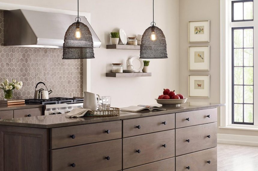
Ever thought about how your personality and nature influence your choice of wall colors? It’s immensely suitable how different shades can reflect our unique qualities. Some people like white’s calmness or cream’s reliability, while others tend towards gray.
Are you also seeking a calm, sophisticated look and the perfect hue to paint your interior walls? We introduce you to Modern Gray Sherwin Williams. The color reflects a sense of calmness, is serene, and is soothing. Its tone is excellent, striking a perfect balance between dark and light. But yeah, choosing the right shade requires careful consideration.
We’ll guide you through all the specifications, pros-cons, and the suitability of SW modern gray. Let’s explore the color to its full potential!
Is SW Modern Gray a Warm or Cool Paint Color?
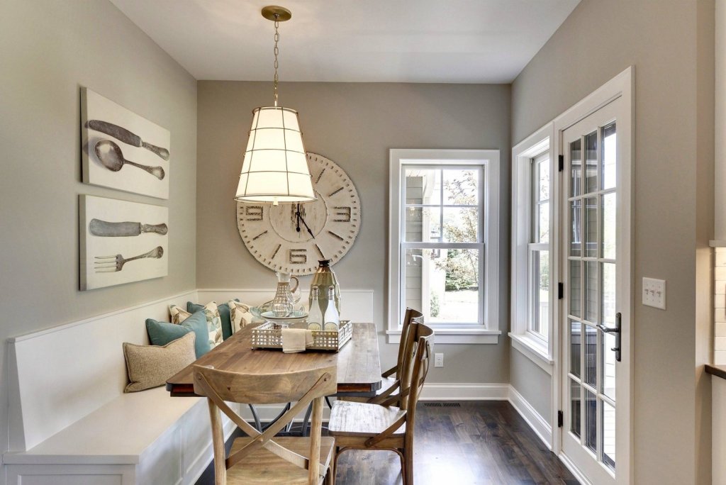
Sherwin William Modern Gray has a pinch of ‘taupe’ and weighs toward a warmer tone. It is more of a light beige shade when exposed to bright light. The hue is so light colored that it looks like it changes its shade with every falling ray of light or coordinating colors. We’ll get back to this in a bit!
First, quickly look over the details and specifications of SW 7632.
Insights on Modern Gray Sherwin Williams
Every color has unique properties like Light Reflectance Value or LRV, RGB value, and hex codes. All these help identify particular colors and are also a separating factor. Let’s examine the first aspect, ‘LRV and its importance.’
- Light Reflectance Value: – LRV is a factor that helps you decide how light or dark a particular color is. This also helps professionals decide whether to use a particular color over a wall finish. So what LRV modern gray has? It’s 62. The second and third aspects are related, so I’m covering both under one. Both of these aspects express what all compositions of a hue entail.
- RGB and Hexcode: – RGB tells you about RED, GREEN, and BLUE proportions in any hue, and hex codes are the hexadecimal value, reflecting the RGB format. The composition of Red, Green, and Blue in modern gray is in the equation of 214, 206, and 195, respectively. Last, yet another technical aspect that has an immense role to play and determines the overall appearance in combination with others is that of the hex code, which is #d6cec3.
Alternatives to Modern Gray
Several colors in the color deck match with modern gray Sherwin Williams. Some are lookalike versions, but you know they are meant to deceive you visually. All these alternatives vary with LRVs or with undertones. It’s impossible to mention all, so I’m listing the best three that look like a copy of SW modern gray.
1. Agreeable Gray SW 7029
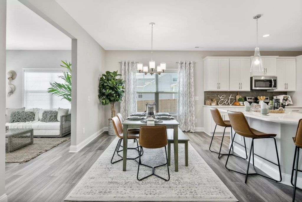
Agreeable Gray is a soft, warm gray color with beige-green undertones. The color’s neutral tone goes well with every other hue. When compared visually, both look the same, but on careful consideration, you can find agreeable gray is darker, and modern gray tends towards a pinkish tone. Also, modern gray has taupe(pink/purple) undertones with an LRV of 62.
2. Reticence SW 6064
The hue belongs to the red color family and is too light in tone, owing to its LRV of almost 62. Reticence makes no difference when placed side by side with modern gray. But if you’re an excellent discerner, you can observe its reddish tone matching well with neutral-toned modern gray, like a nuanced primerbringing out its perfect harmony.
3. Pediment SW 7634
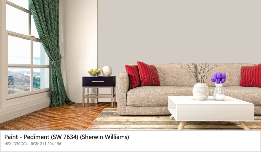
SW Pediment is a ‘TAUPE’ color paint and hence is warm. It has some greige undertones but tends more towards taupe, even in bright light. When exposed to south-facing lights, modern gray Sherwin Williams reveals a pinkish tone, but the pediment rests neutrally, being warmer.
4. Modern Gray SW 7632
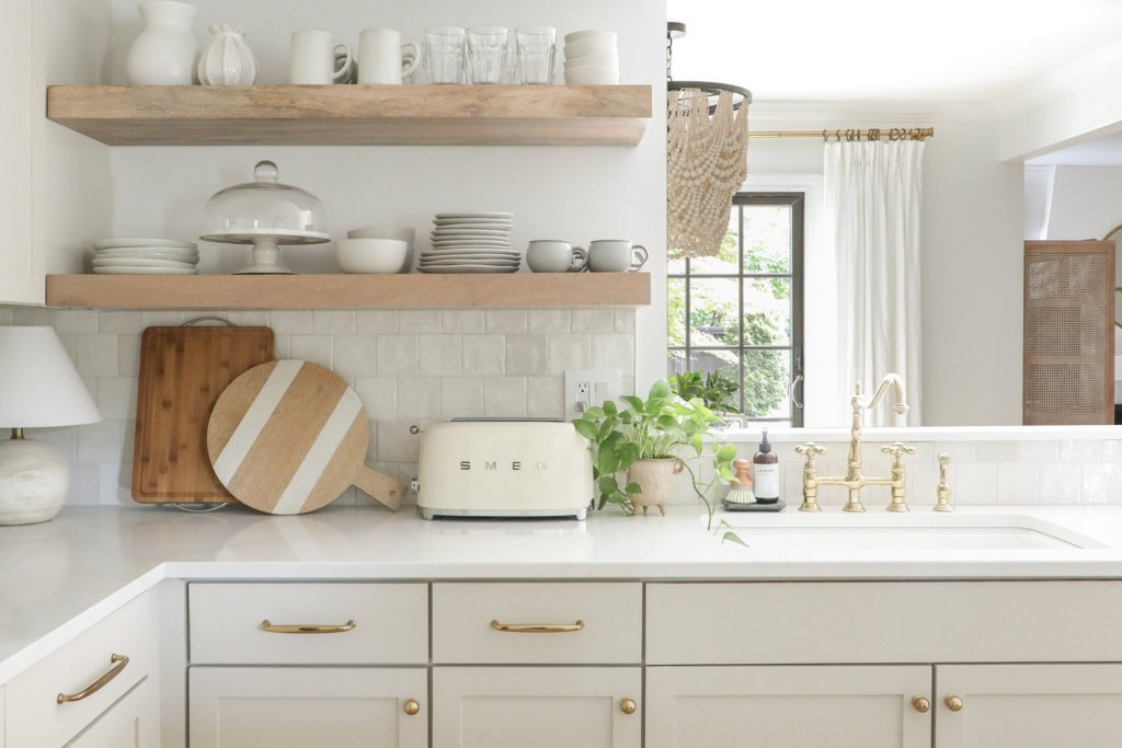
Baby fawn is a warm, greige paint color. It has an overpowering greyish tone and a moderate beige. The color is versatile and adds depth and warmth to any space. Is it better than modern gray? ‘NO. ’ Modern Gray neutral tone creates a luxurious look in the dark, and when in bright light, it just makes your home elegant and captivating. While BM Baby Fawn somewhat loses its neutrality when faced with bright lights.
Which Colors Compliment SW 7632 Modern Gray Perfectly?
Best part! Once you know the perfect pair, the hue will shine with its full potential. Also, complementary colors look dynamic, creating a vibrant natural illusion that captivates attention. Modern Gray is minimalistic and hence pairs up nicely with many colors. But few are there that stand out as the best-coordinating pairs.
1. Snowbound SW 7004
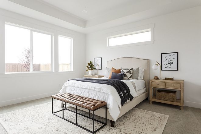
Snowbound, with its pinch of gray, is a versatile cool white that pairs well with sw modern gray, creating a seamless blend like a professional, clear coatapplication. Both create a contemporary look with timeless charm and a serene atmosphere. Snowbound soft and muted tones and modern gray pair up beautifully, creating a calming and inviting atmosphere. The combination brings about a refined look suitable for modern interiors.
2. Icicle SW 6238
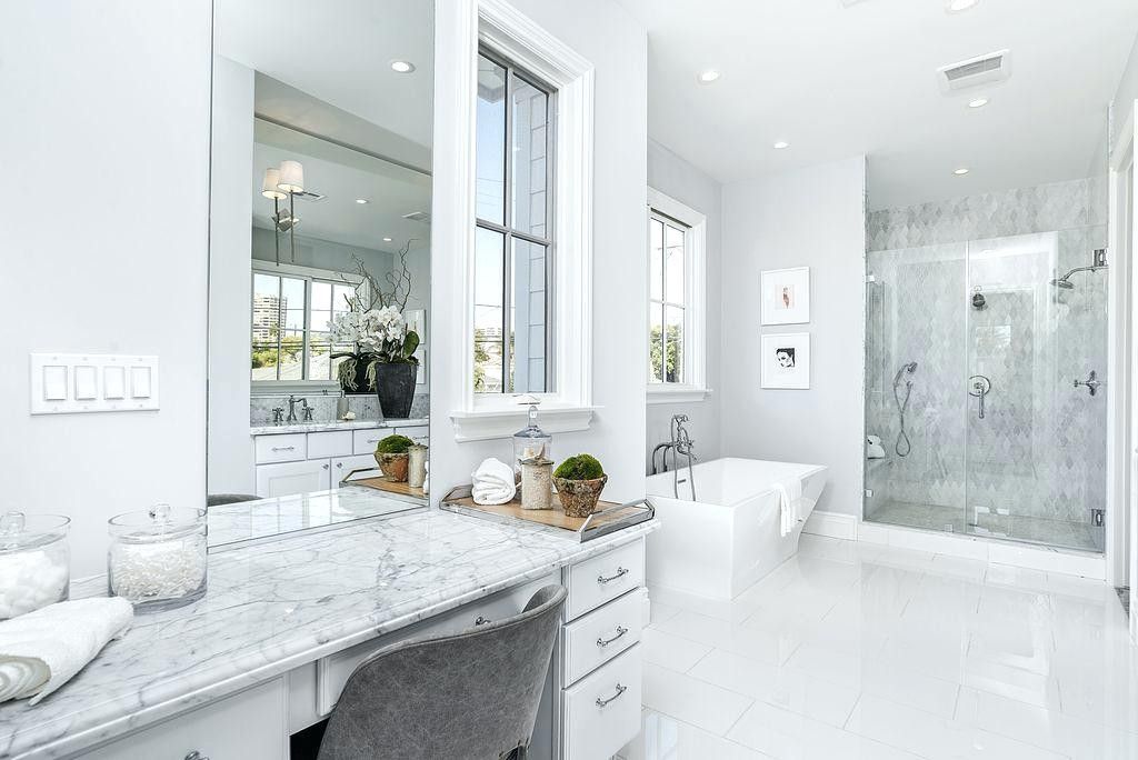
Icicle and modern gray sw on coordination make a distinct atmosphere evoking coolness and tranquillity. With its bright and pure tone, the icicle brings a refreshing ambiance. Modern gray Sherwin Williams, on the other hand, reflects a traditional and refined look. They make a serene and stylish atmosphere suitable for modern interiors when paired.
3. Morris Room Gray SW 0037
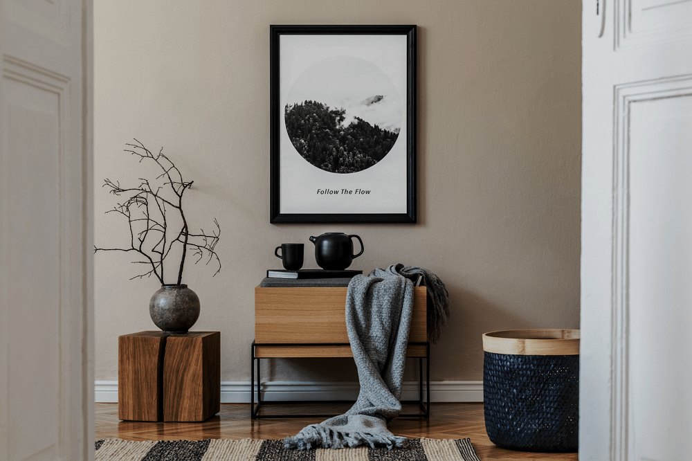
Morris’s gray room reflects a heritage look. The hue’s depth and warmth create a cozy and inviting atmosphere, the epitome of luxurious, old-world charm. Complementing modern gray adds a sleek and minimalist element to the atmosphere with a modern touch. This balances the traditional looks of the Morris room. Together they create an atmosphere that imparts both a classic and contemporary design.
4. Plum Dandy SW 6284
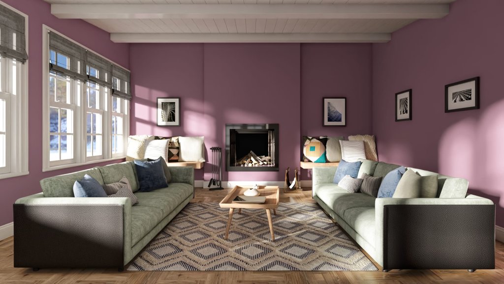
The deep hue brings a sense of elegance and richness as if expertly applied with a paint sprayer. It adds warmth and depth to the ambiance. In comparison, the modern gray SW, with its neutral contrast, adds to the overall contrast in a traditional sense. Coordinating creates a captivating and balanced atmosphere that mixes and matches richness with a traditional taste.
Is Modern Gray SW a Good Choice for Your Home?
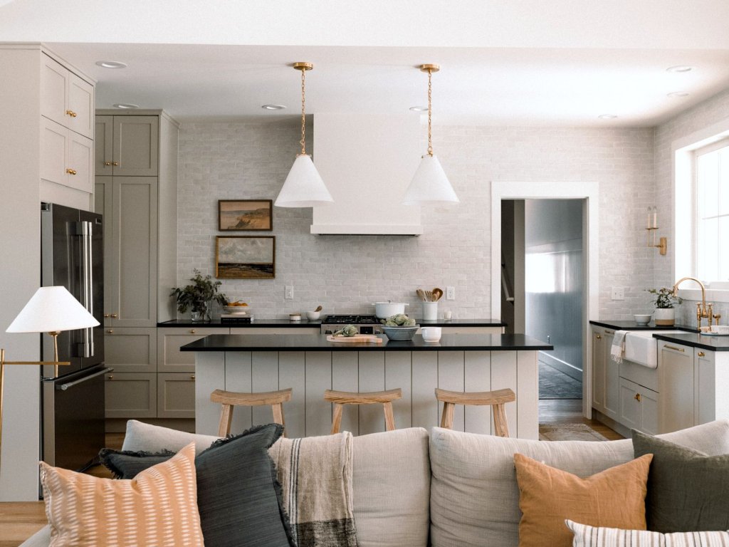
The ultimate decision is definitely yours, but I would like you to explore below first. It will provide you with what modern gray feels like in space. Also, what effect light has on it, the cabinet and trim colors, and many more. All these will help you to make informed decisions. As said, modern gray Sherwin Williamsis a warm color; it adds a cozy and welcoming feeling to a space. Also, it creates a sense of comfort and relaxation, making the area inviting and harmonious. But all you need is to take care of proper lighting, as it changes the shade of gray and the ambiance. So before you get started painting with your paintbrush, it’s better to do a sample test on colorless walls.
Modern Gray creates a perfect balance between warm and cool colors. It is neither too cool like some other grays nor too warm with overpowering beige or taupe. This helps create a balanced atmosphere reflecting calmness and relaxation. Does it feel different in the living room, bedroom, or other room?
1. Living Room
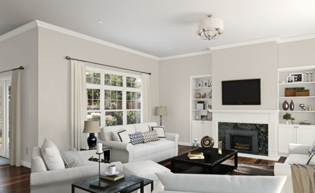
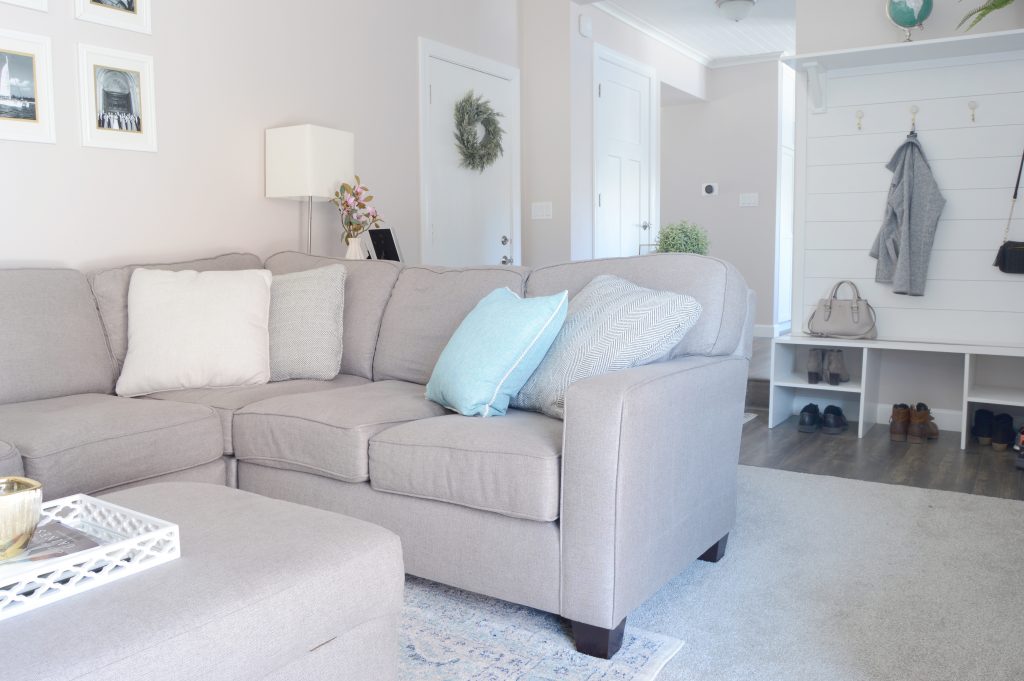
Modern gray color with warm lighting creates a clean, organized, and cohesive ambiance. It adds an inviting touch, making the atmosphere gentle and welcoming. Want to feel? Look at the picture above! Thinking of giving your living room a similar look? Consider adding a luxurious creamy white velvet couch adorned with glittery fur pillow and complemented by an antique white metal shade ceiling light. Together these elements will harmoniously work together to create a sense of cohesiveness throughout your cherished living space.
2. Dining Room
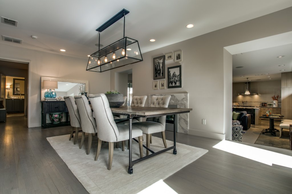
Modern gray sherwin williams in a dining room is a good choice. It creates a serene atmosphere, soothing your mind. When in bright light, its taupe and light beige tone give a touch of elegance and comfort throughout, just like the image above! Looks cohesive, right? In case you want a simple dining place, you can have a round glass dining table to increase the overall ambiance of your place. A rug with a geometric accent alongside the Pure white artificial tulips also makes up a great choice that can be taken to increase the overall serenity of the place where the paint has been applied.
However, gray isn’t a good choice for bedrooms, but if your room is south facing and has bright artificial light, its undertone can make it work. The pinkish effect will make your bedroom inviting with an intimate atmosphere. Finalizing the perfect wall color doesn’t make your color decision finished. The trim and cabinets’ color matter as it affects the overall look of a space.
So, is modern gray a good fit for your cabinets? White would be perfect for providing a united, balanced, and clean look if your wall finishes are of the same hue. However, a dark shade of grey, like Accessible beige, can also work, adding to the silent atmosphere. Talked a lot about interiors. Let’s head on outside!
3. For Exterior
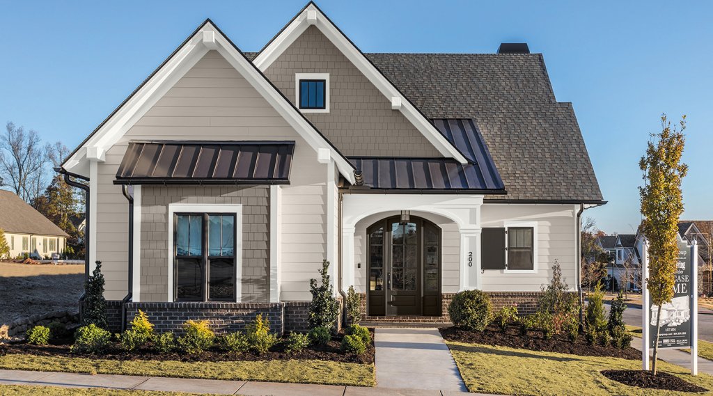
With its minimalistic sense, the hue makes your home appear larger and more inviting. Also, the neutral tone imparts a sense of tranquillity, creating a serene atmosphere around. Further, modern gray creates a win-win situation as the color stands out in light and dark conditions. When in light, the taupe and pinkish tone gives your home a mix of modern and traditional looks, imparting a sense of luxuriousness.
Impact of Light on SW 7632
It’s no new whether it’s an artificial or natural light; both will glow up your space. But are you aware the kind of ray falling has the potential to change the shade of any hue? If not, here is how modern gray sherwin williams is being affected by light.
First is the cooler lights that north-facing rooms get. These lights can reduce the warmness of gray and make it a bit darker but not on the cold side. It creates a comfortable, elegant, and soothing vibe throughout your space. On the other hand, in south-facing rooms, the hue’s undertones activate; hence, it tends its shade toward taupe and a touch of pink. The warmer shade creates a more welcoming atmosphere, giving your place a classy look. Now that we know what role light plays, let’s quickly explore how modern gray sherwin williams feels in different rooms.
The living room, with modern gray, looks excellent and minimalistic. All you need is to take care of proper lighting, irrespective of warm or light color. Here is how a living room would look with a warm light.
Conclusion
Modern Gray Sherwin WIlliams is perfect for those seeking a calm and composed atmosphere in their interiors. With its neutral light tone, the hue strikes a balance between dark and light, reflecting a sense of serenity. SW modern gray gives outstanding results when coordinated with complementary colors like Snowbound, Morris room gray, and Plum Dandy. Together they create a vibrant and attractive atmosphere, reflecting a mix of modern and traditional tastes.
Modern gray is versatile, i.e., suitable for various rooms, such as living rooms, dining rooms, and even bedrooms, if properly illuminated. The hue creates an atmosphere of calmness, relaxation, and inviting warmth. It’s also an excellent choice for exteriors, making the home appear larger and more welcoming. It stands out in dark and light conditions, exuding elegance and class.
Therefore it’s a timeless choice with the potential to convert your space into a peaceful and comforting environment.
Frequently Asked Questions
What Undertones Does Modern Gray Have?
Modern gray has taupe undertones with a pinch of pink and purple effects. The hidden undertones come into play in bright light; otherwise, the neutral effect of gray overpowers, making it a versatile and intriguing color choice for contemporary spaces.
Which Color is Darker than Modern Gray?
Color darker than modern gray sherwin williams is SW 7036 (Accessible beige), with an LRV of 58. Both the colors have contrasting undertones, beige with its brown and green undertones, faces modern gray taupe undertones.
Is Modern Gray Complete Neutral?
No, it has taupe undertones and also possesses a pinch of pink. Both are reflected well when modern gray sw is exposed to bright light. Additionally, the taupe undertone and hint of pink add depth and warmth to the overall look of the space, making it versatile.

